
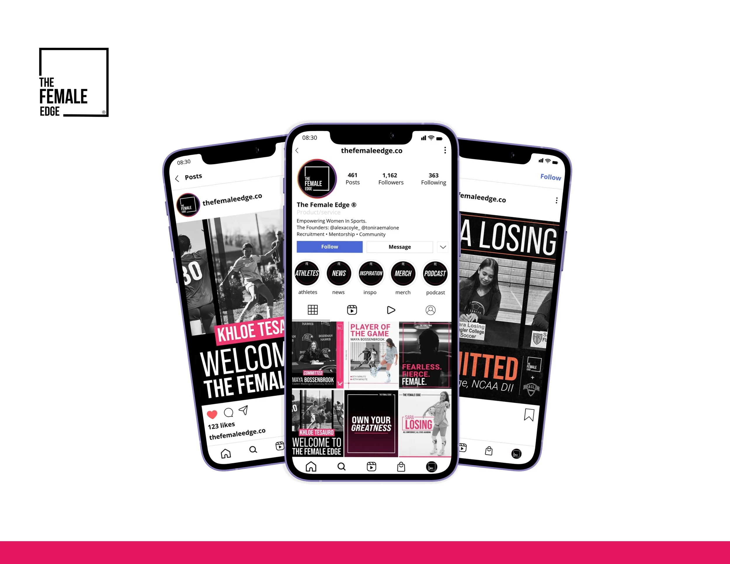
The Female Edge came to the project with an established logo, typeface, and core color palette, but needed a stronger visual presence across its growing digital and physical touchpoints.
GOAL: Build a cohesive visual system that could make the brand feel more elevated, energetic, and recognizable while giving the client flexible tools they could continue using independently.

THE FEMALE EDGE
BRANDING MATERIALS
SOCIAL MEDIA DESIGN · MOTION · MERCHANDISE · PRESENTATION DESIGN | WOMEN’S SPORTS · MENTORSHIP
THE BRIEF
THE DESIGN STRATEGY
STRUCTURE THAT MAKES INFORMATION WORK.
01 — PUSH THE PERSONALITY
Translate the idea of “EDGE” into a stronger visual language without losing the existing brand identity.

03 — DESIGN FOR REAL USE
Develop flexible, editable assets that would allow the client to maintain consistency without needing a designer for every post.
02 — BUILD A SYSTEM
Create recognizable visual patterns that could work across social media, motion, merchandise, and presentations.
CREATIVE DIRECTION
HOW FAR COULD “EDGE” GO AS A VISUAL IDENTITY?
To kick off the project, I started with stylescapes to set the tone and visual direction for all designs moving forward. The client wanted to explore new color combinations and expand their brand aesthetic beyond the existing palette. I presented three stylescape directions — mild, medium, and spicy — each exploring a different interpretation of the word “EDGE”:

Mild — clean, minimal, and feminine, leaning into the box motif from their logo.

Medium — sharper, with angular shapes, contrast, and attitude to reflect “EDGE” more literally.

Spicy — bold and gritty, using strong textures, deep pinks, black, and a moody palette.
THE FINAL CREATIVE DIRECTION
The client was most drawn to the boldness of the Spicy direction, which became the foundation for the final visual language. I refined the direction by pairing its energetic color palette with the clean structure and box motif from the Mild concept, while introducing pops of orange and dialing back the heavier textures. The result was a more balanced system that felt bold, energetic, and distinctly The Female Edge.
SOCIAL MEDIA TEMPLATES
A TEMPLATE SYSTEM BUILT FOR FLEXIBILITY.
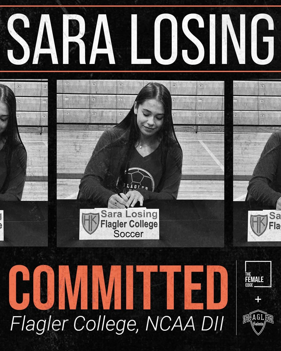
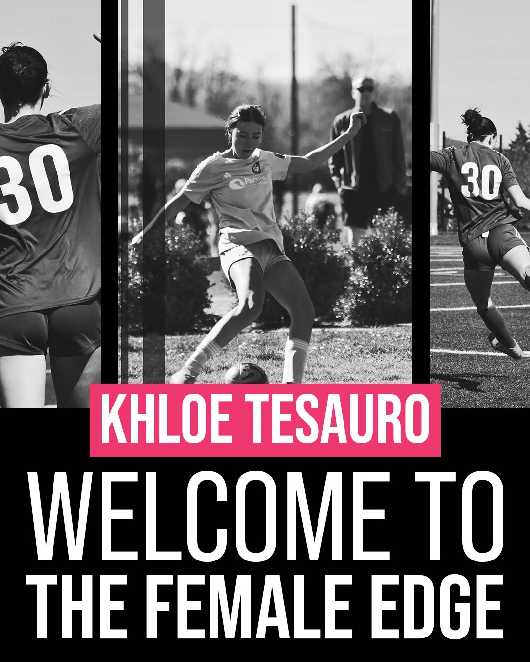
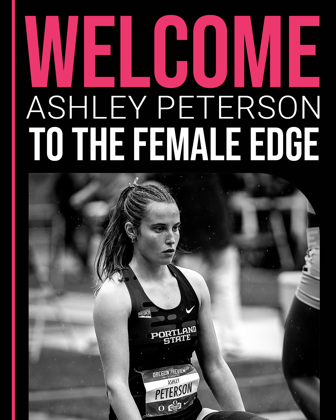
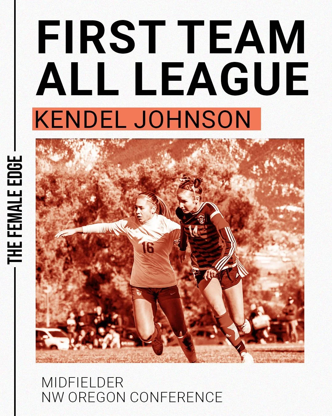
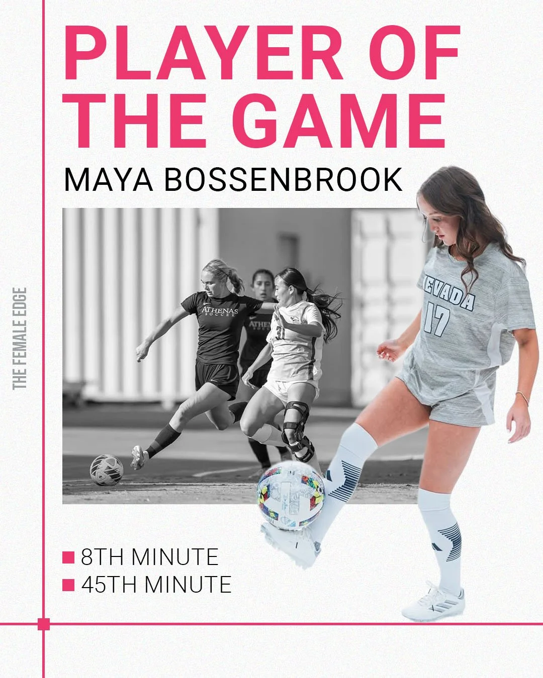
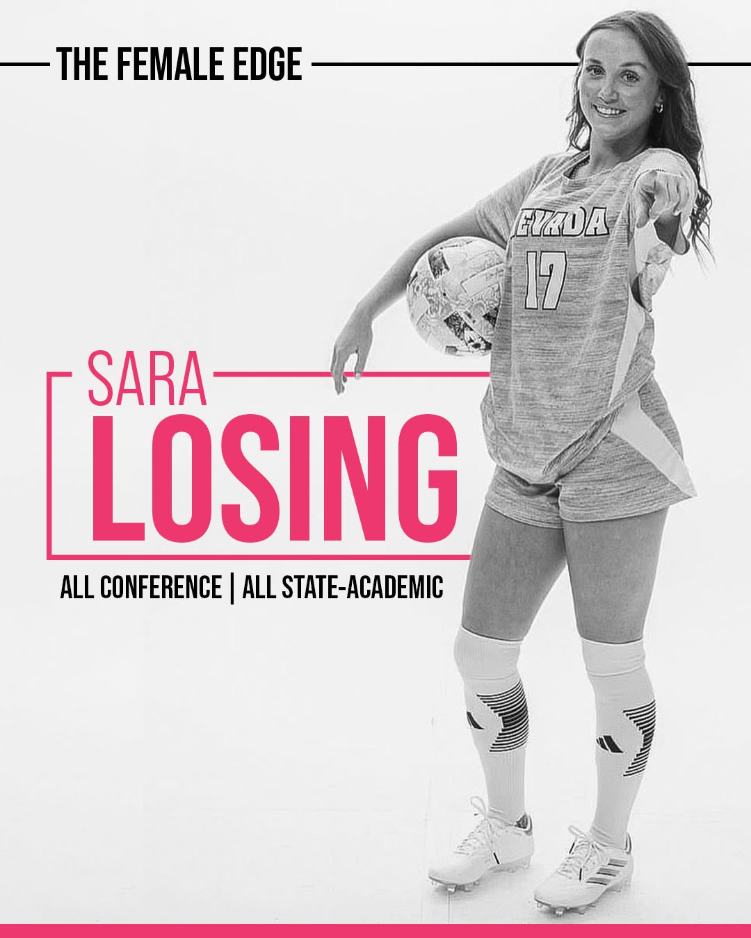
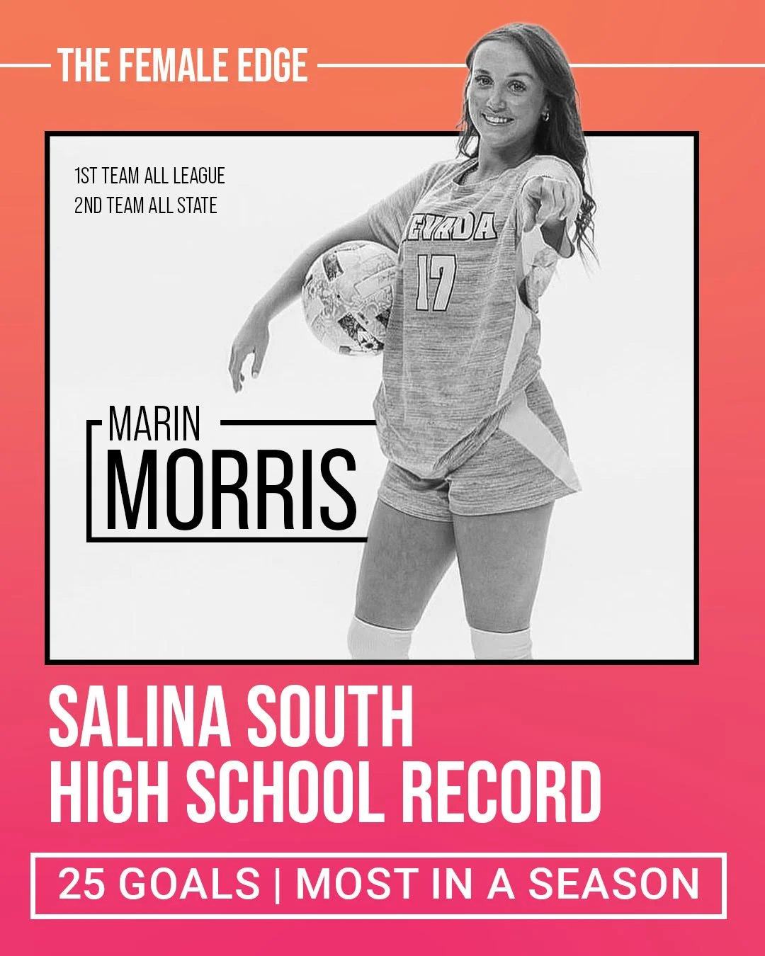
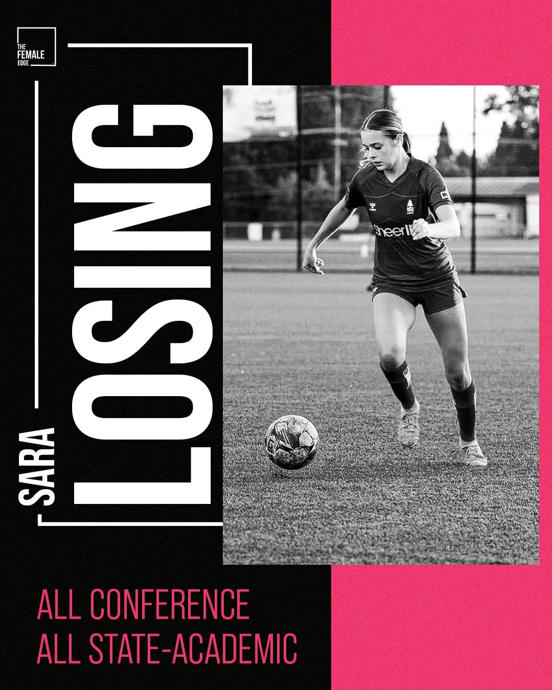
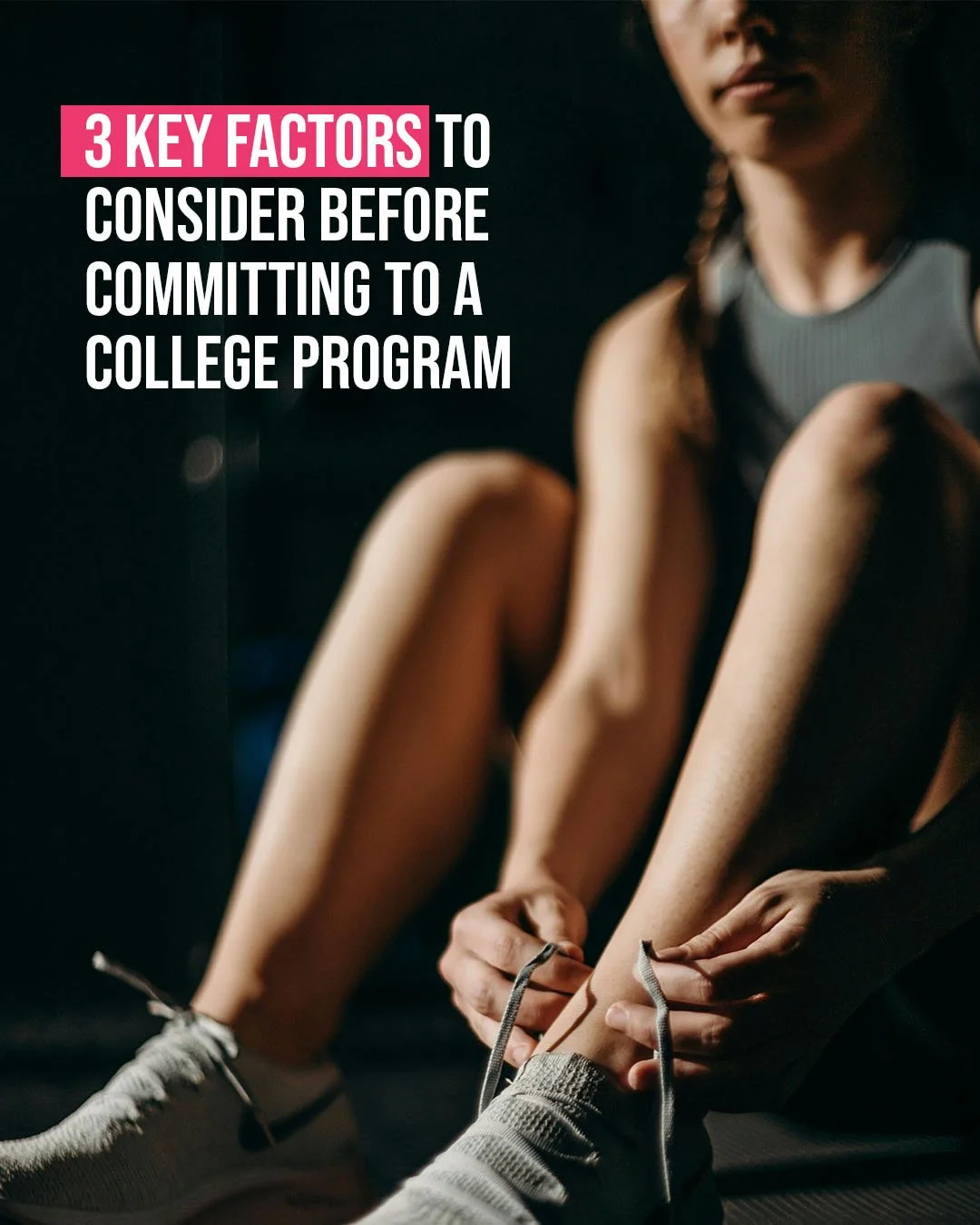
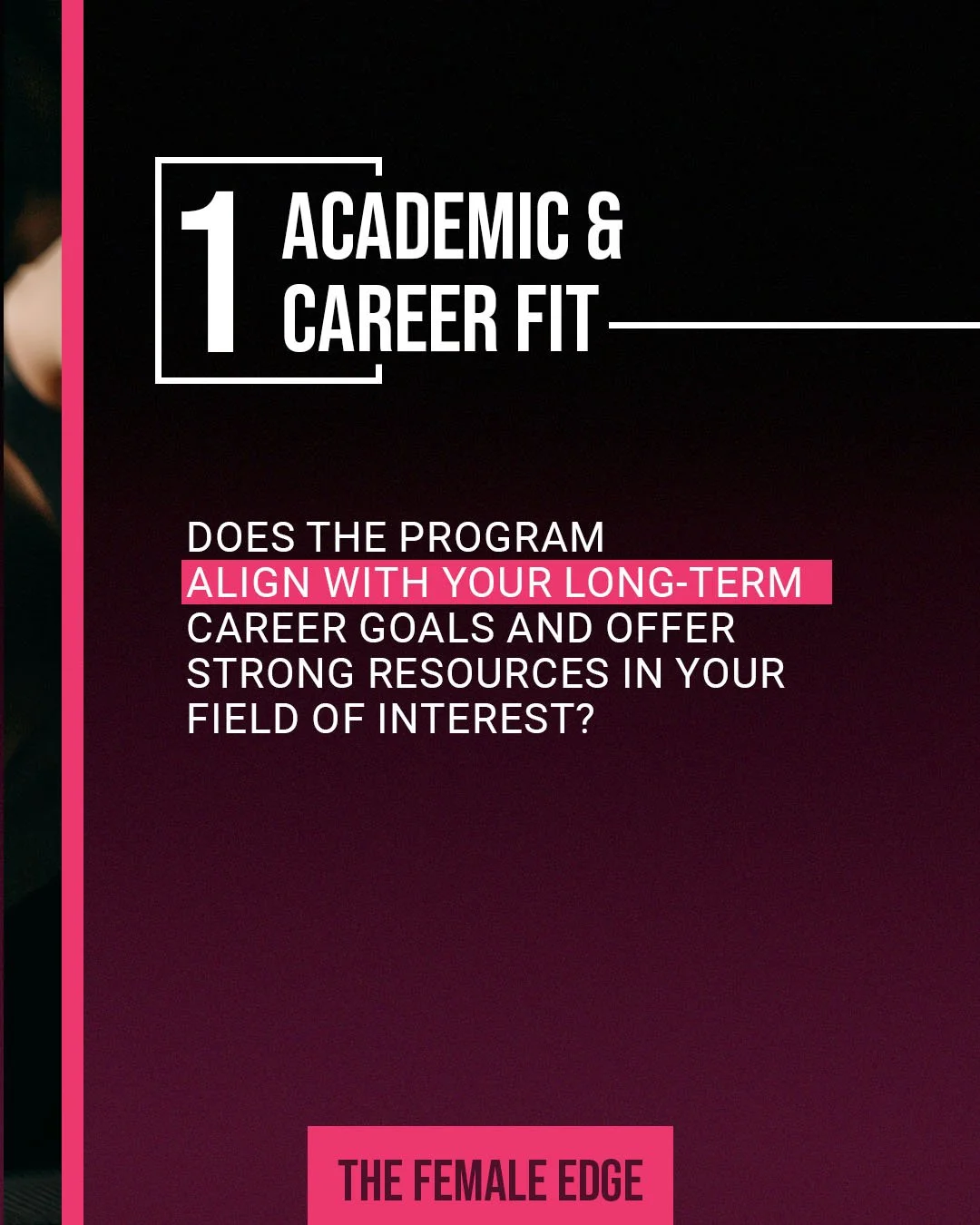
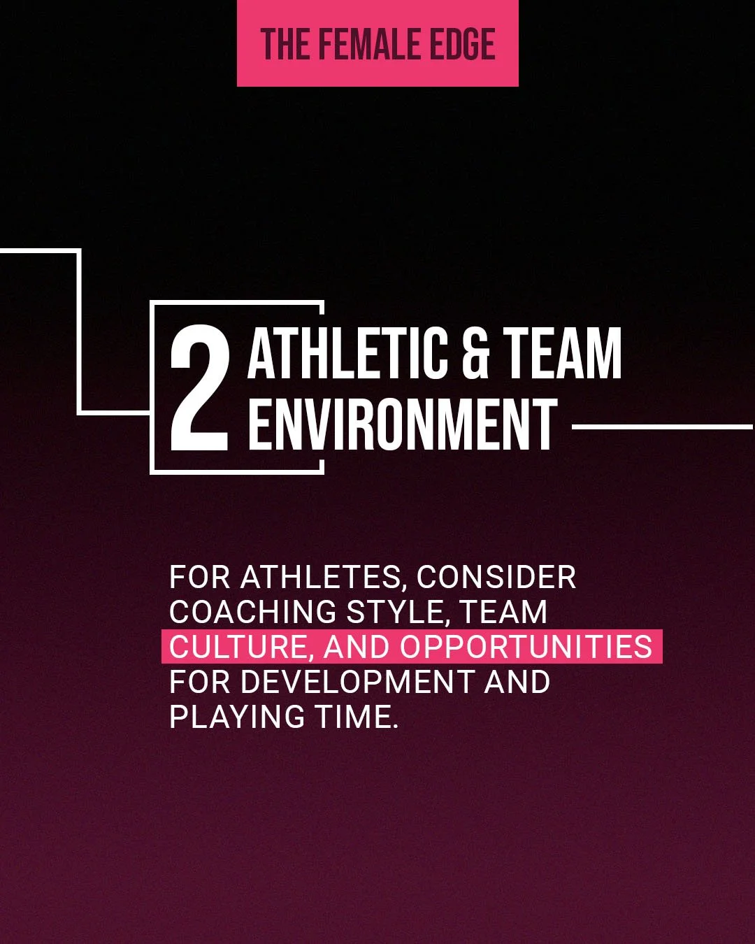
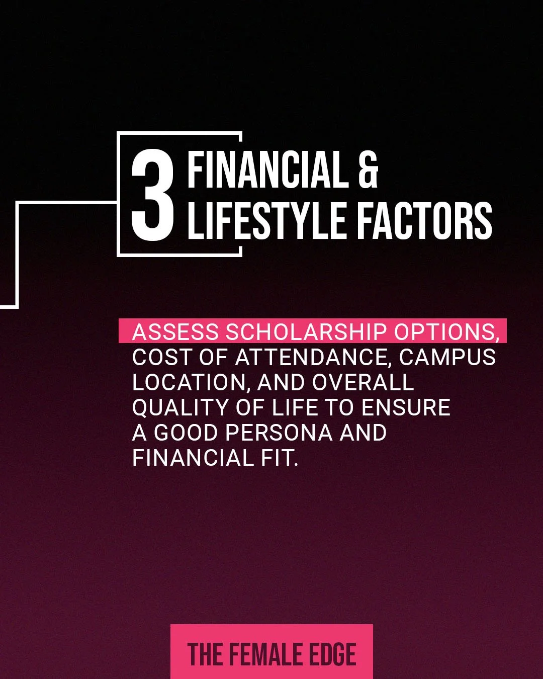
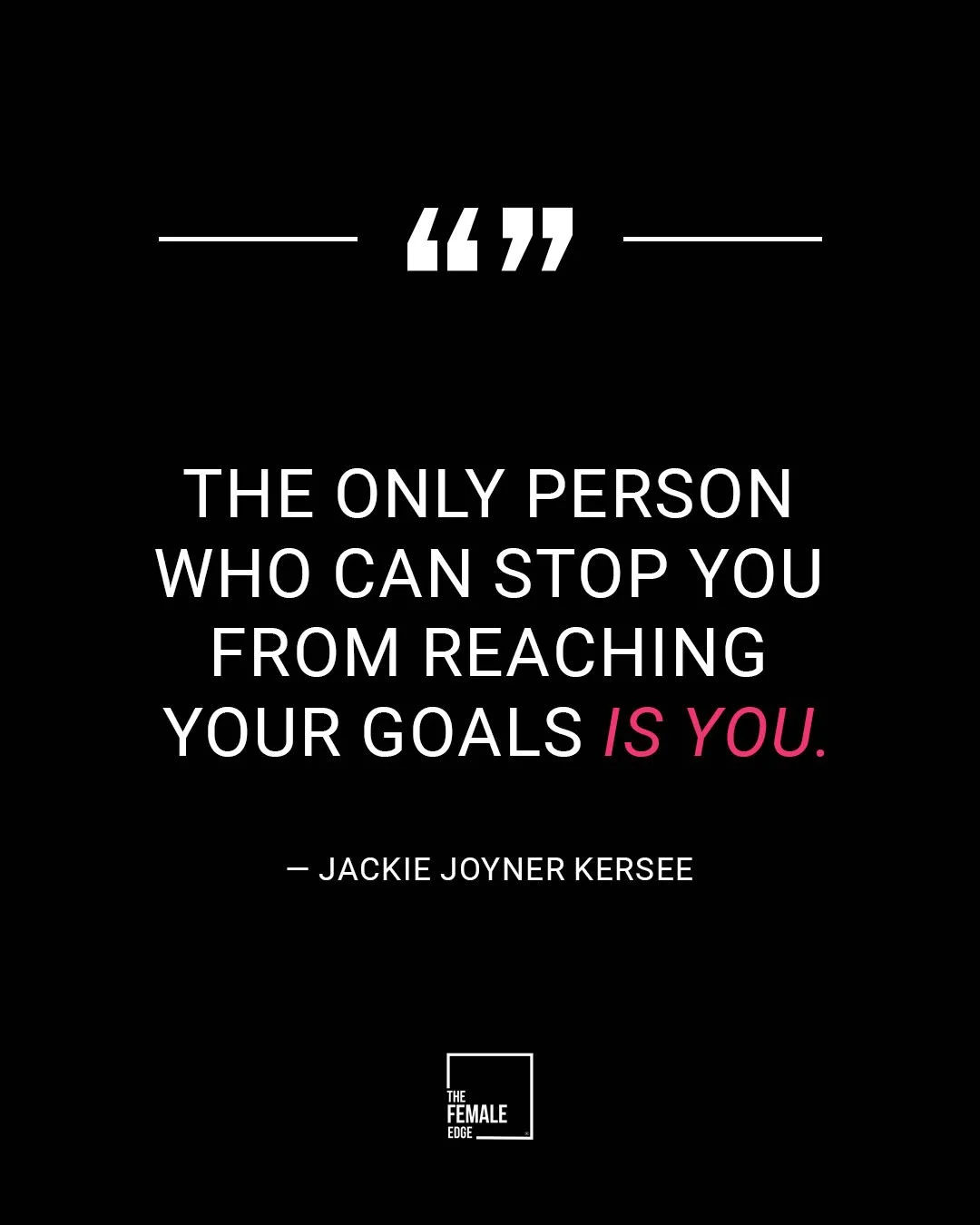
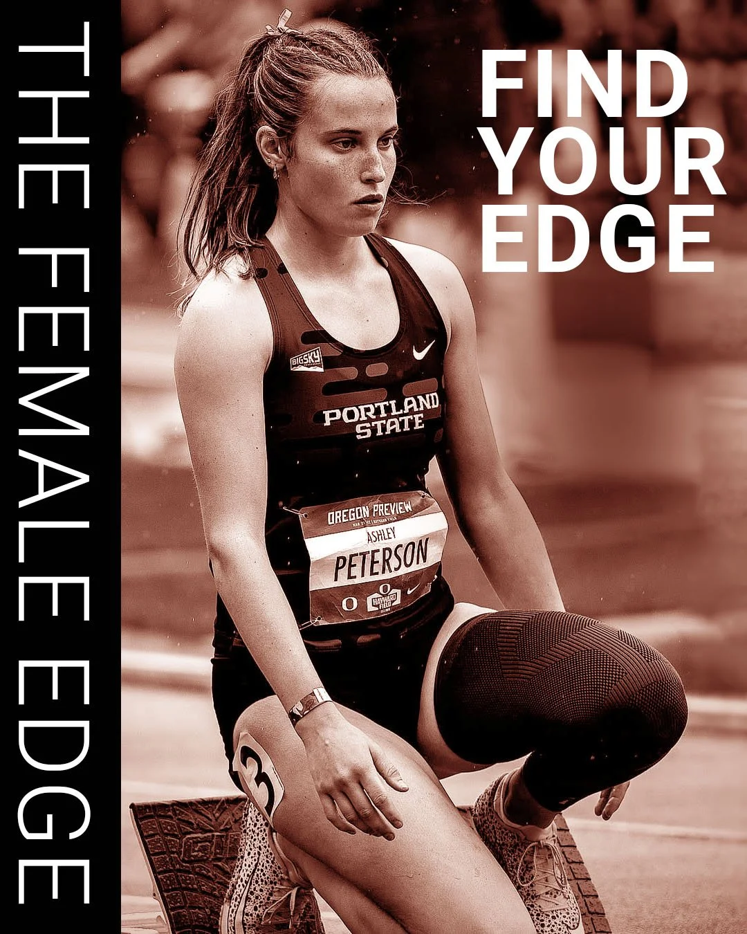
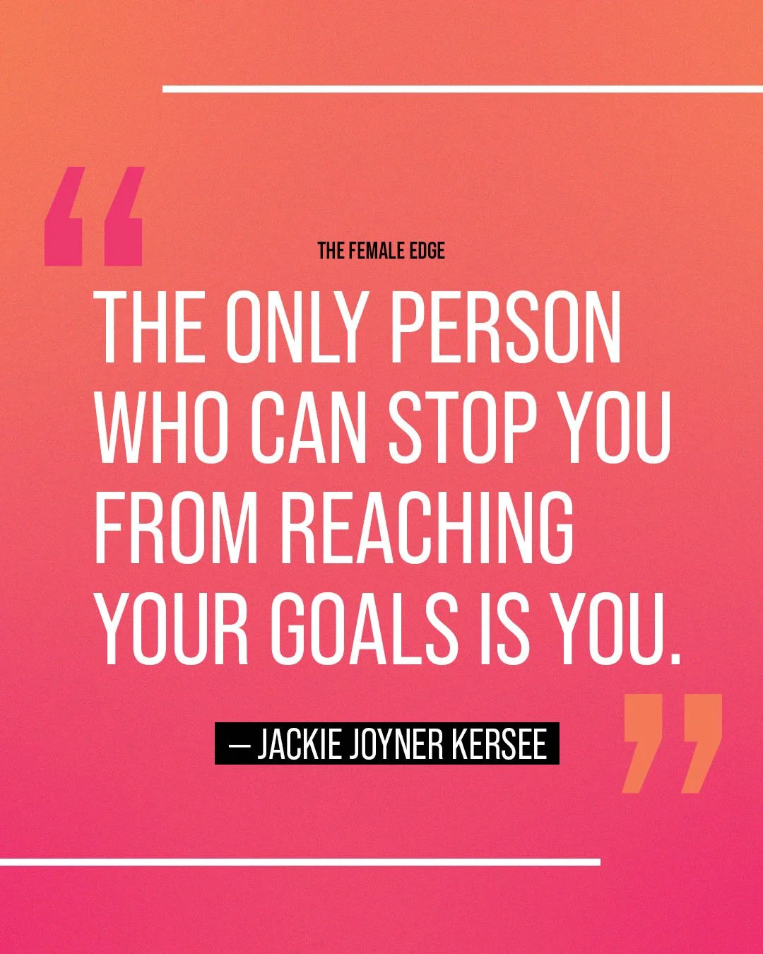
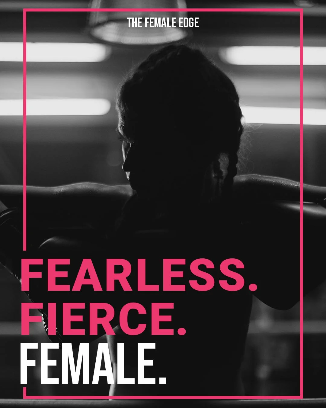
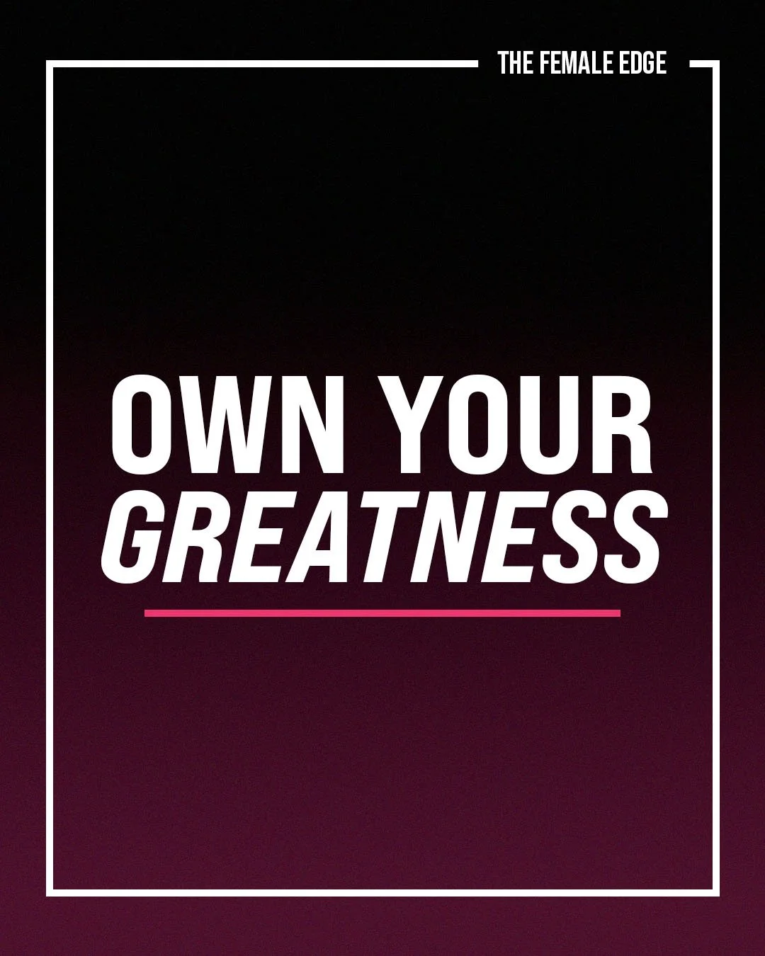
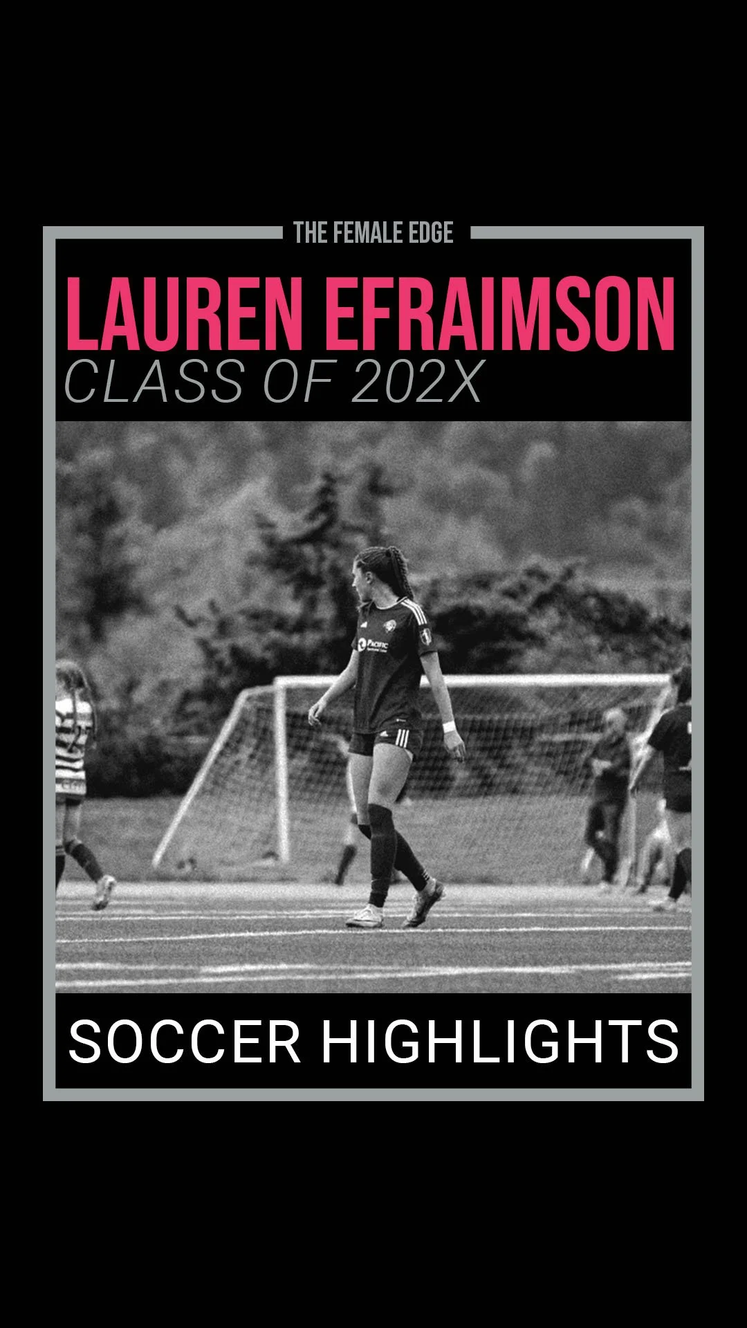
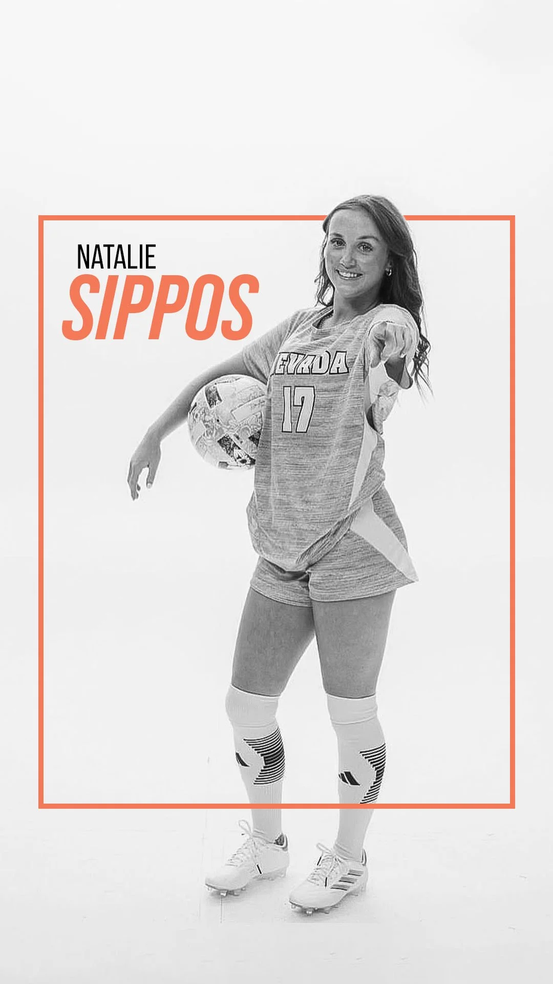
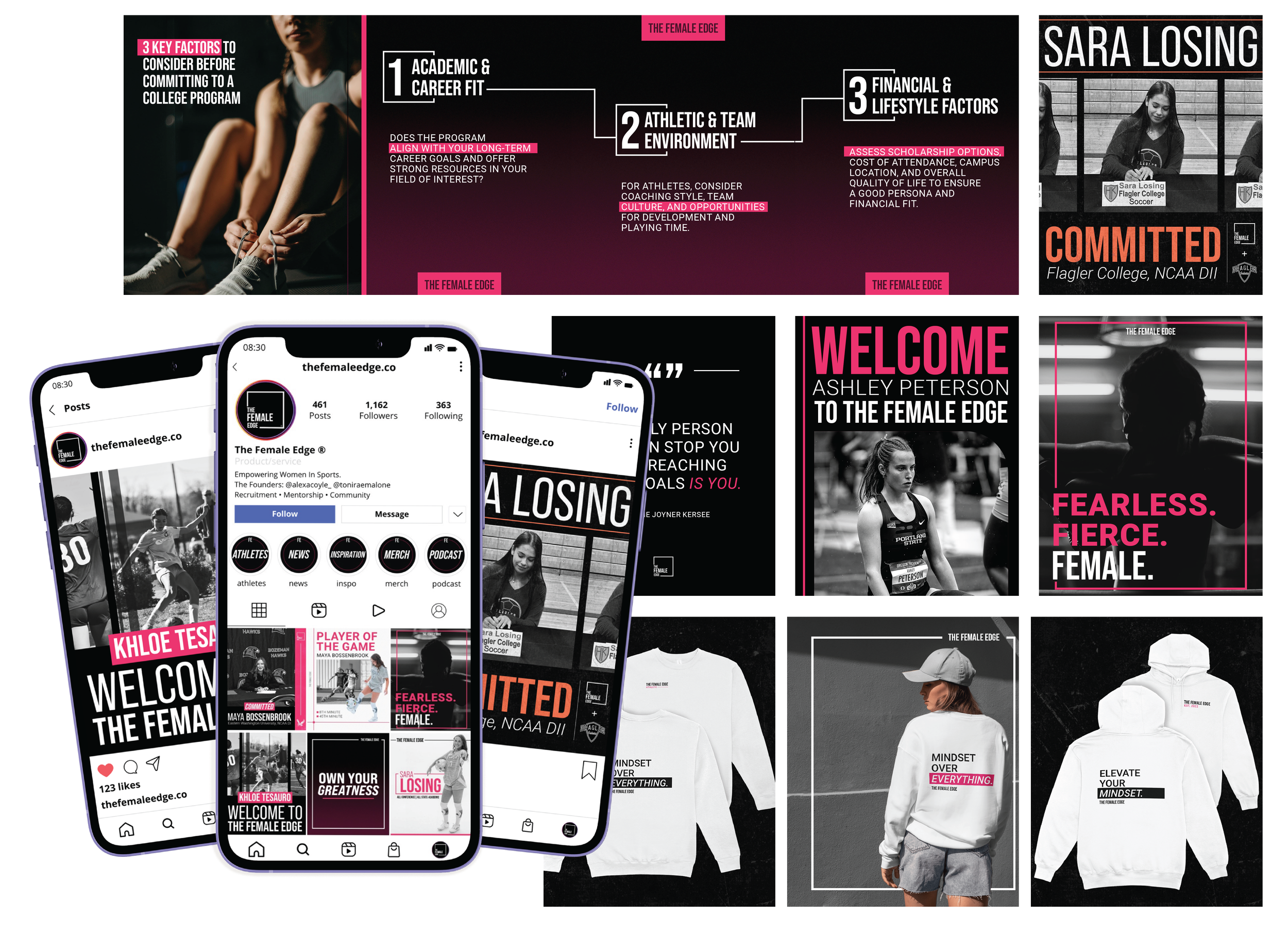
Once the stylescape was approved, I translated the direction into a flexible set of social media templates designed to give The Female Edge a consistent presence while allowing each type of content to feel distinct. The signature box motif became a recurring visual element, supported by bold typography, color, and image treatments.
Each template was designed in Photoshop and built for easy editing in Canva, giving the client a polished toolkit they could confidently use and adapt independently. The system included templates for Committed Athletes, New Athletes, Athlete Achievements, Inspirational Content, and Athlete Highlight Reels, with a minimum of two options per category to create variety without losing consistency.

THE SYSTEM IN MOTION
EXPANDING THE SYSTEM THROUGH MOTION
I extended the visual system into a series of motion graphics designed for Instagram Reels, bringing the brand’s taglines and logo into movement. The animations used The Female Edge’s core pink, black, and white palette alongside lines and box elements to create rhythm and reinforce the visual language established across the brand. To keep the assets flexible across different content, each animation was delivered in both light and dark background versions.
BEYOND THE FEED
TAKING THE BRAND BEYOND SOCIAL.
The visual system was designed to extend beyond Instagram, creating a cohesive brand experience across physical and presentation-based touchpoints. I carried the established colors, typography, graphic elements, and visual language into merchandise and a branded slide deck, allowing the brand to stay consistent across both digital and physical applications.
MERCHANDISE
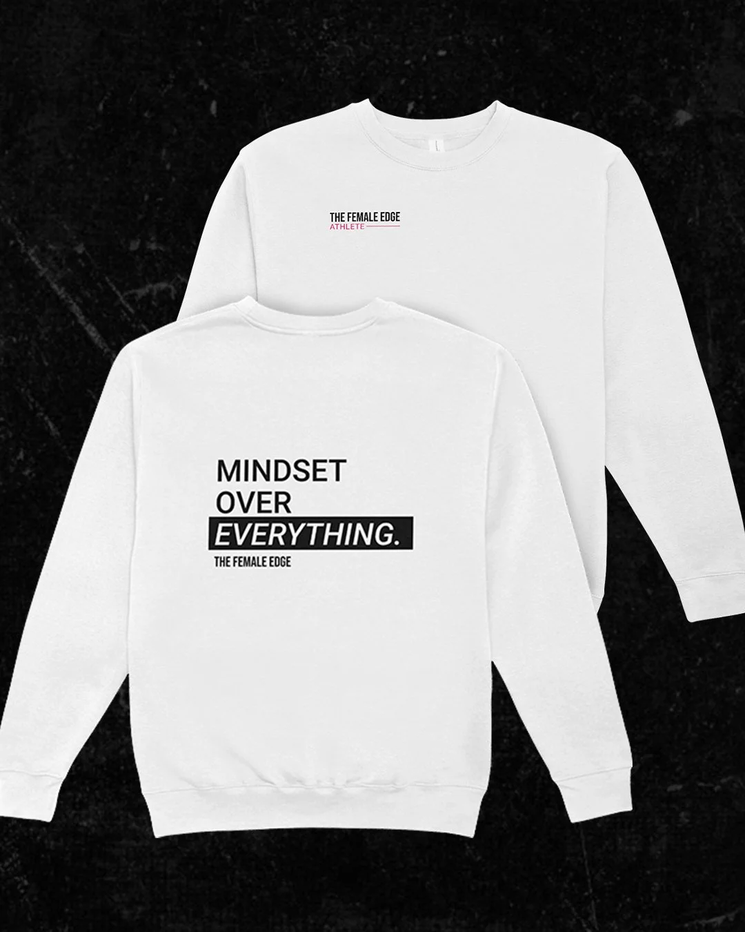
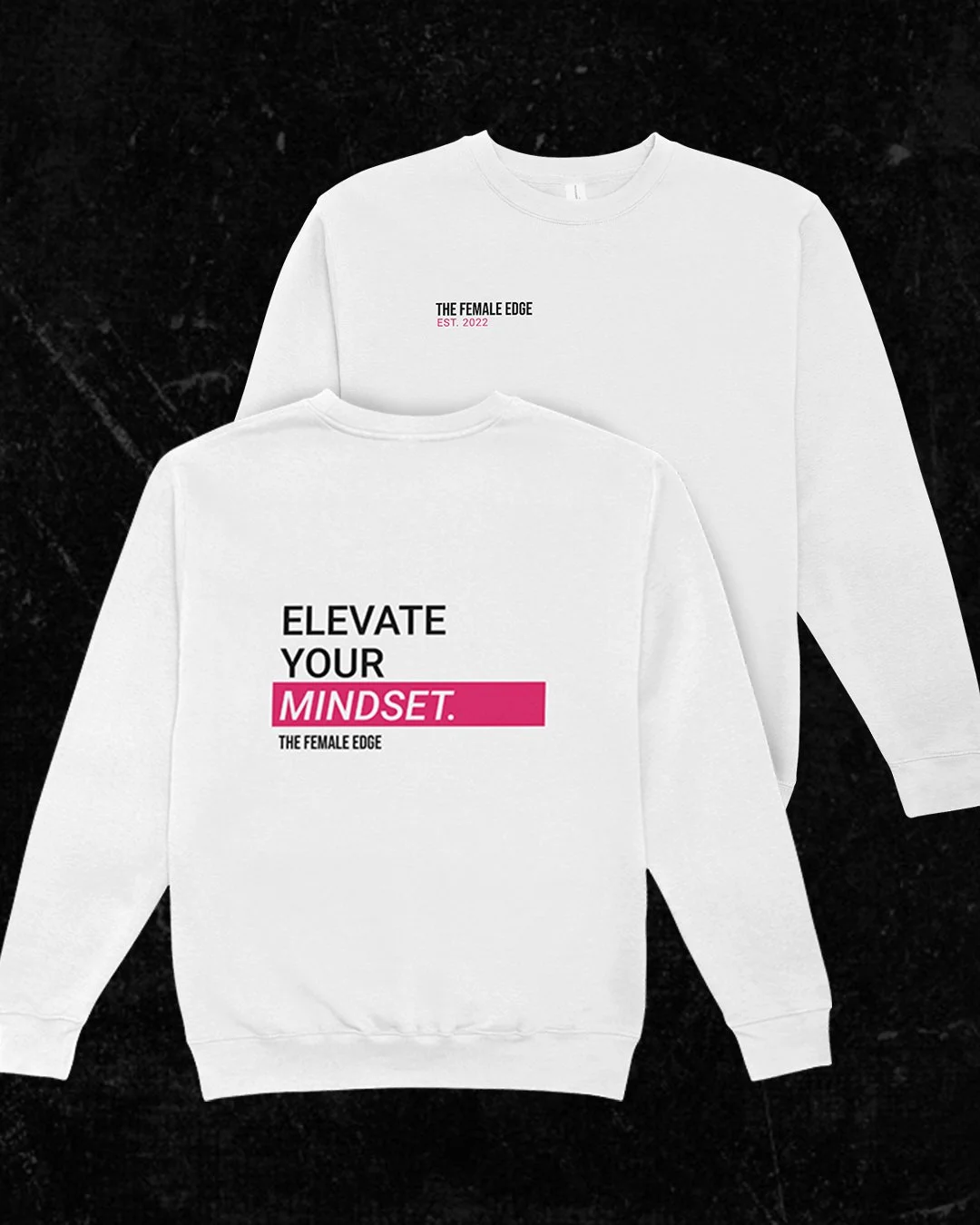
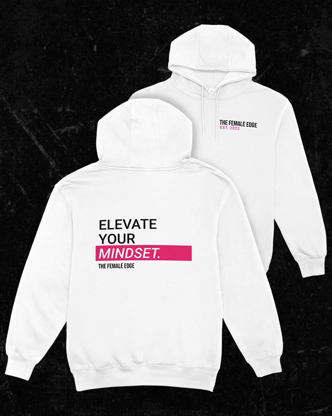
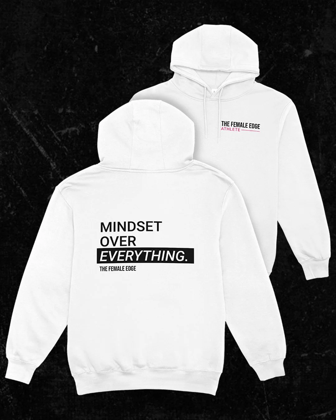
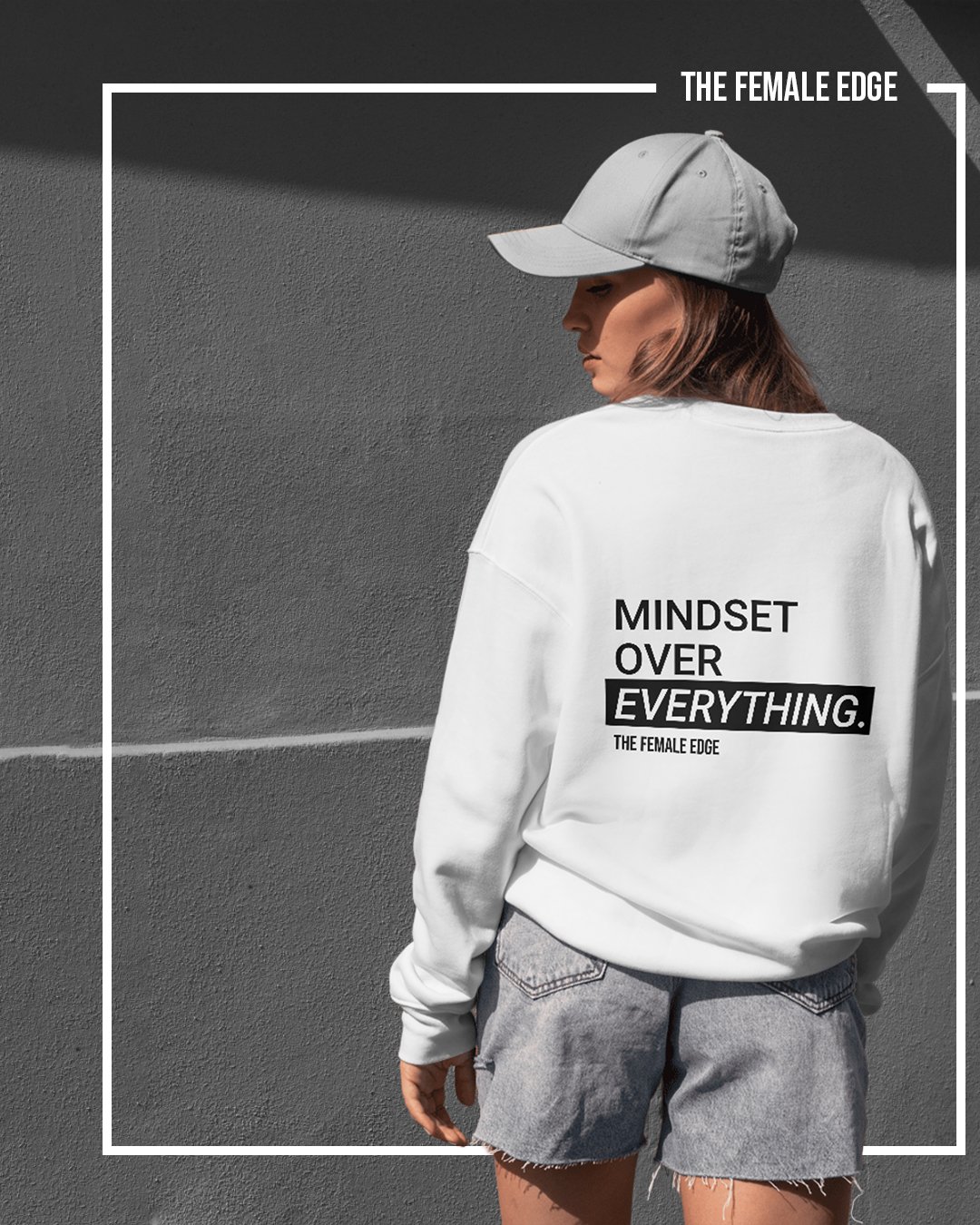
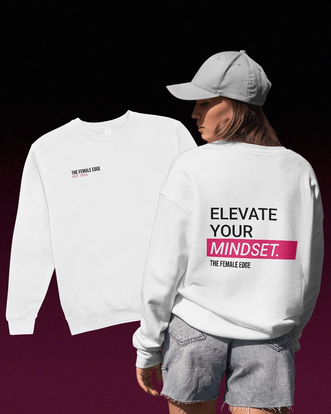
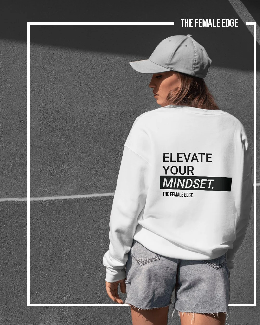
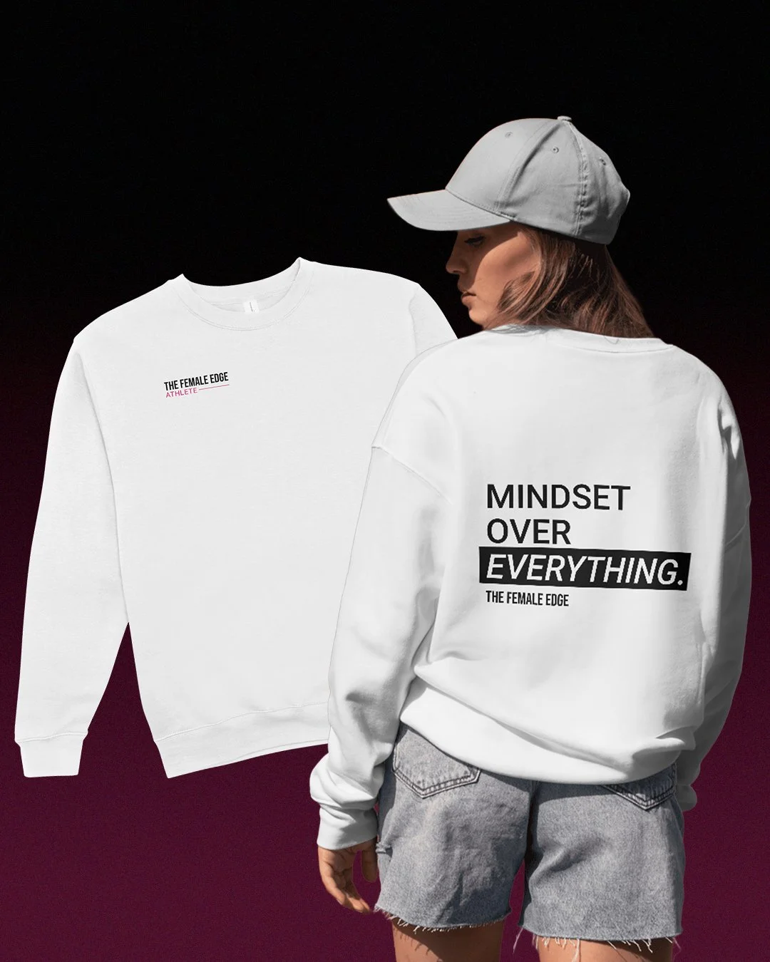
The Female Edge team wanted branded merchandise that reflected their mindset-driven identity. I designed two clean, modern sweatshirt concepts featuring bold messaging and established brand elements, intended as gifts for new athletes and new signees.
BACK: “MINDSET OVER EVERYTHING.” & “ELEVATE YOUR MINDSET.”
FRONT: “The Female Edge Athlete” & “The Female Edge Est. 2022”
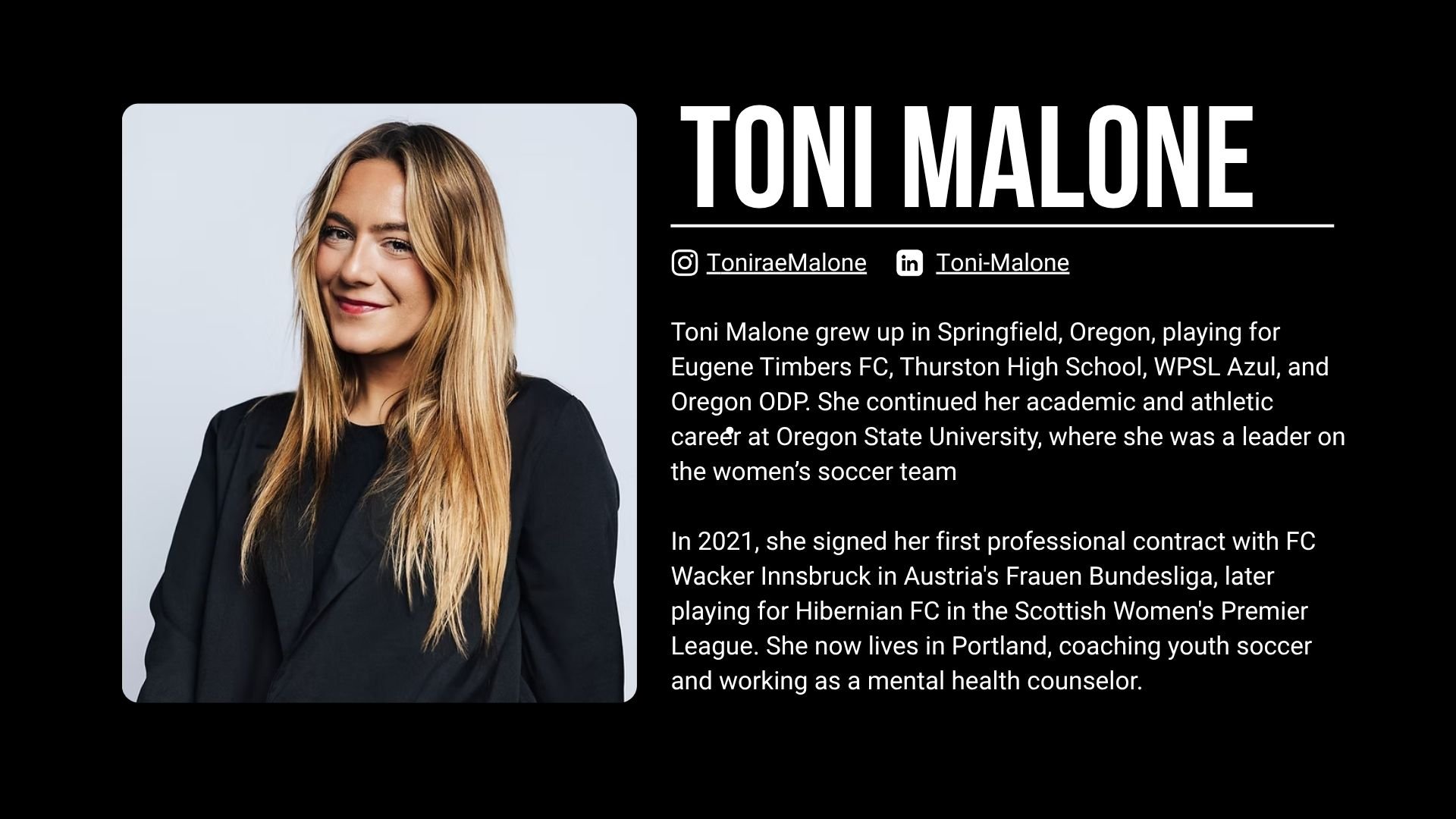
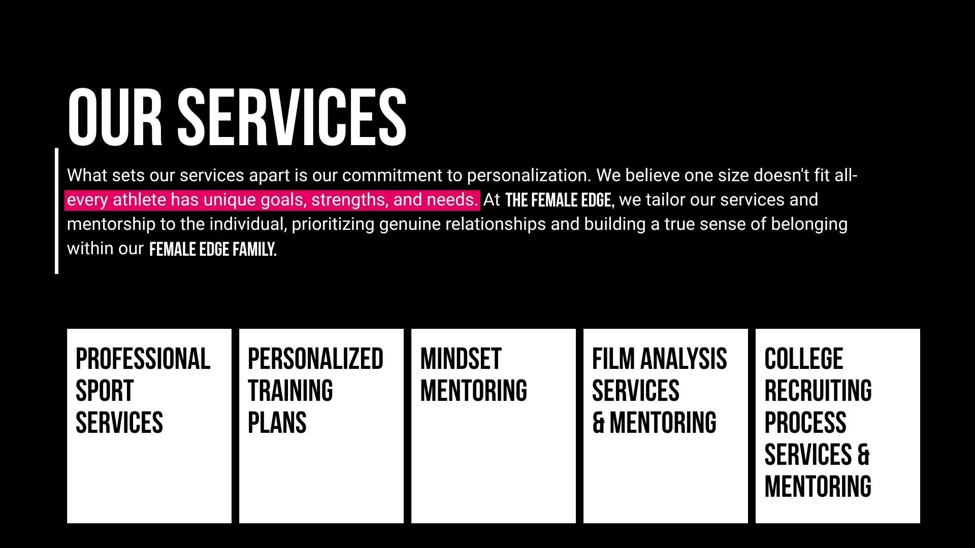
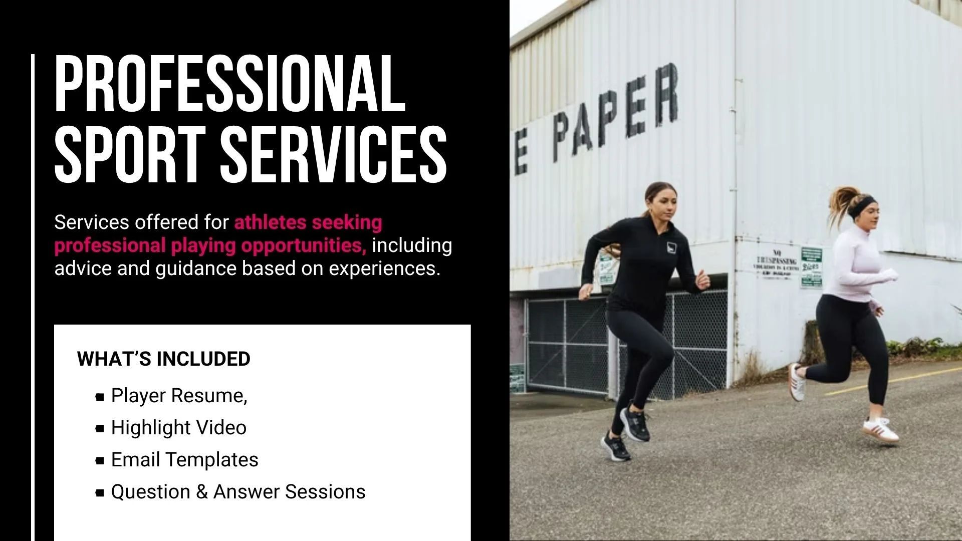
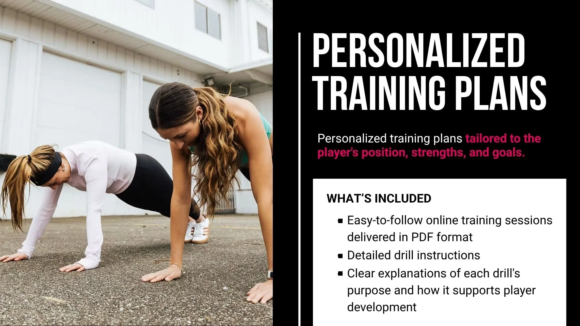
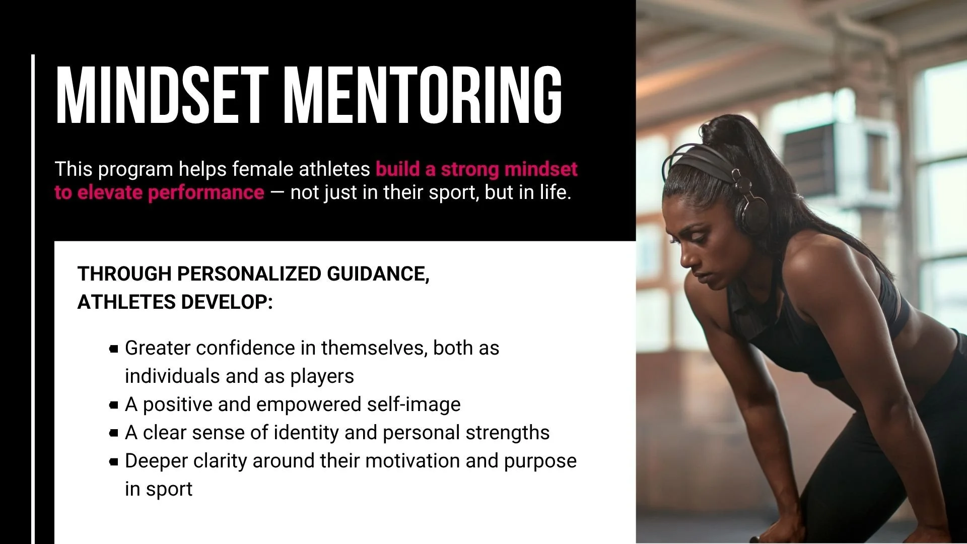
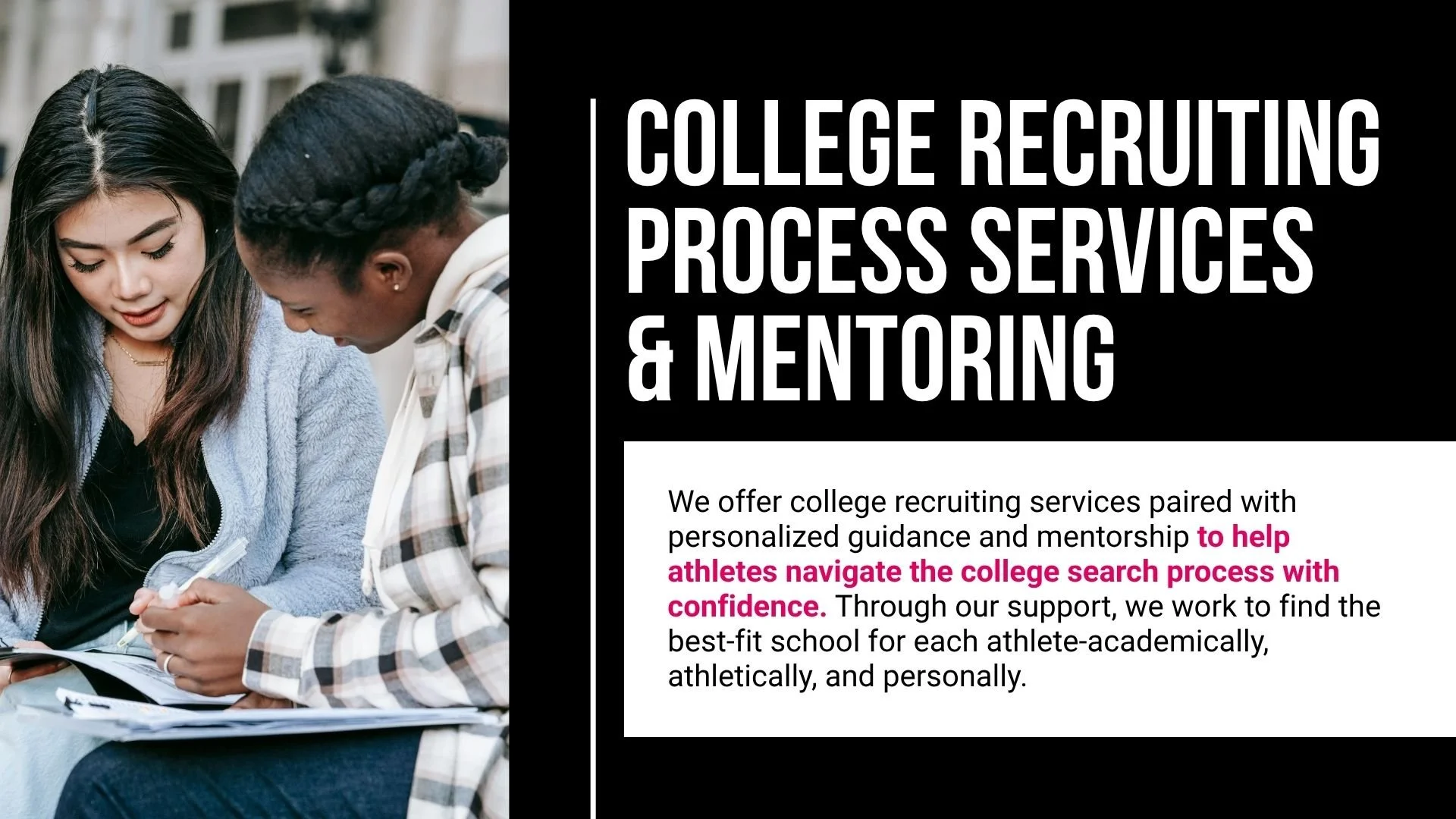
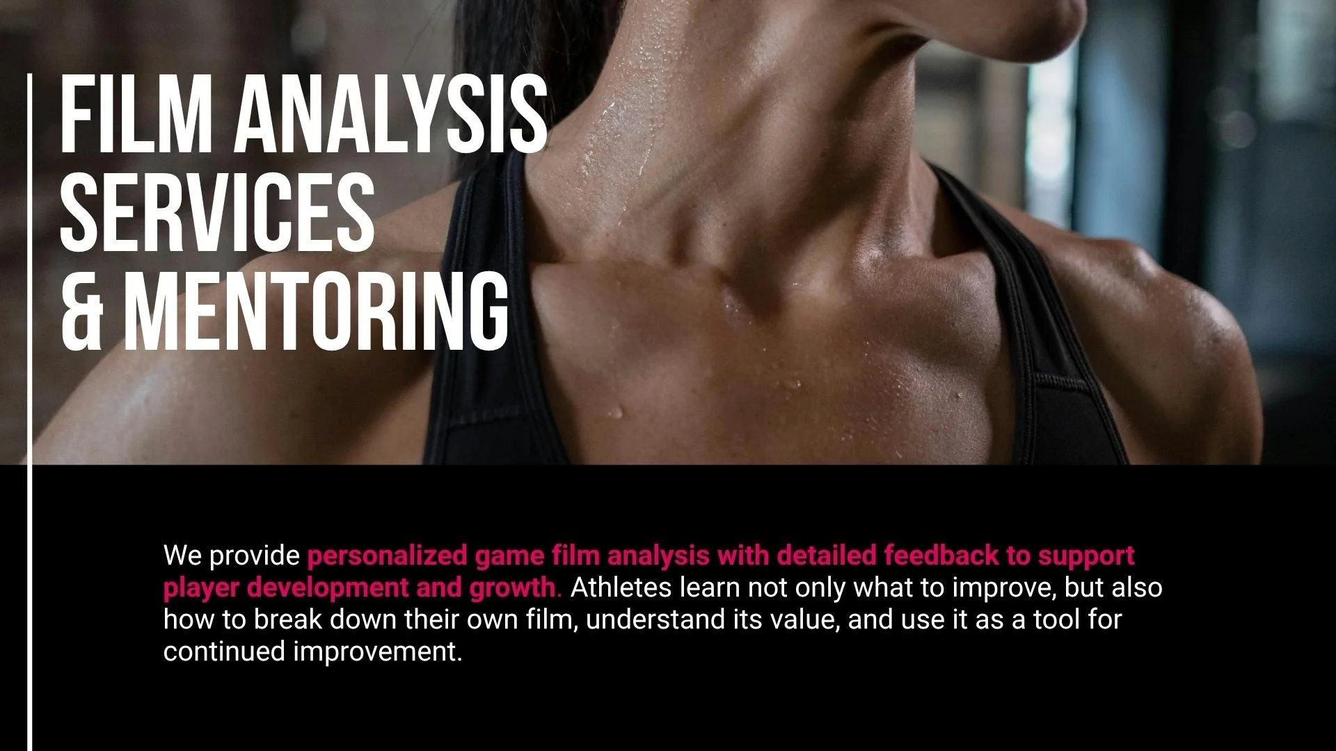
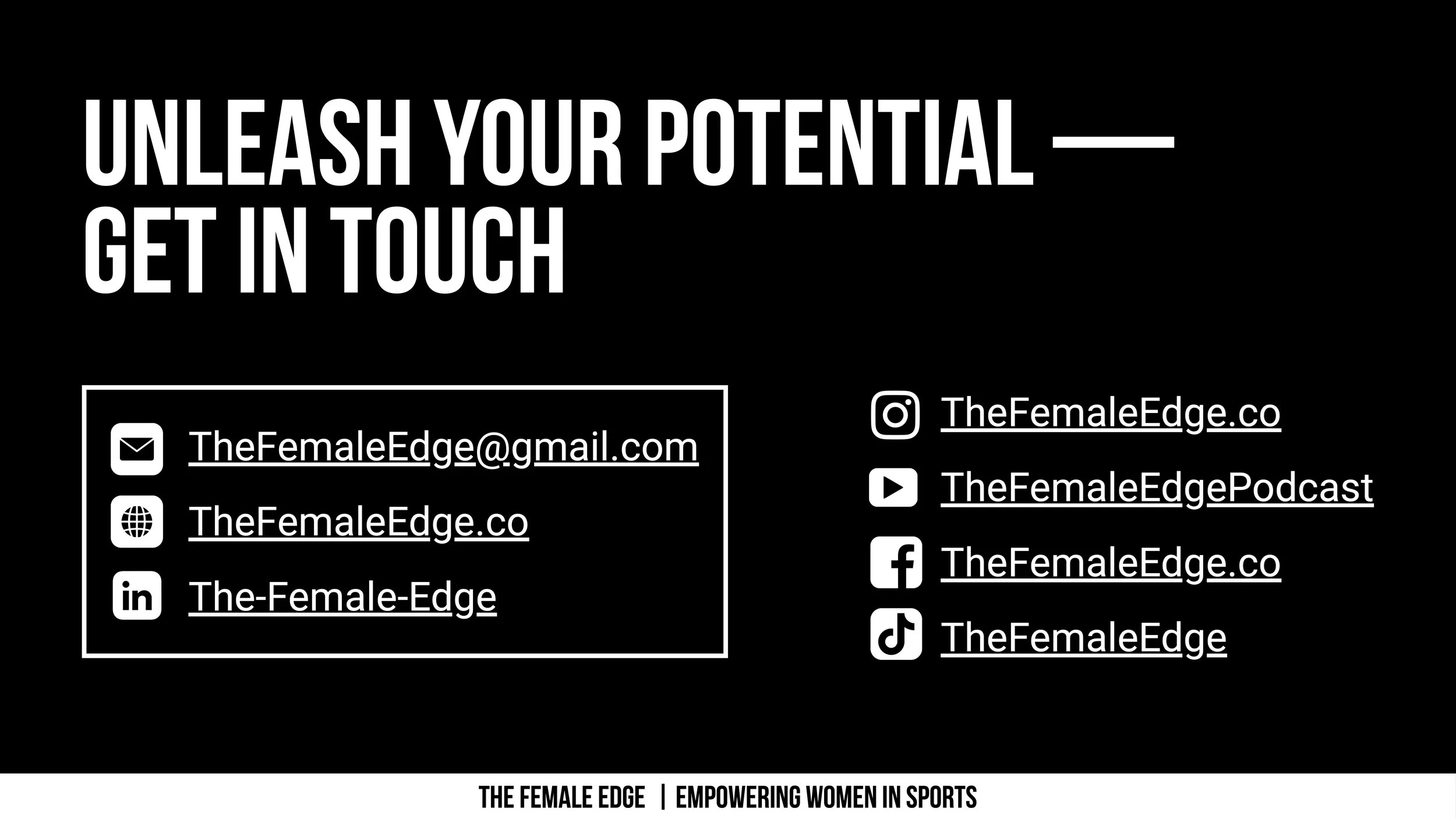
BRANDED PRESENTATION
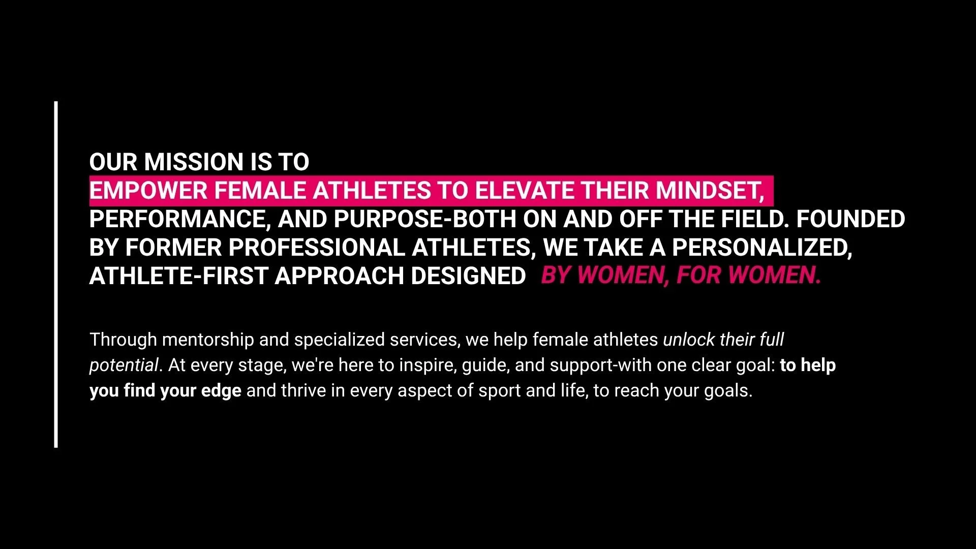
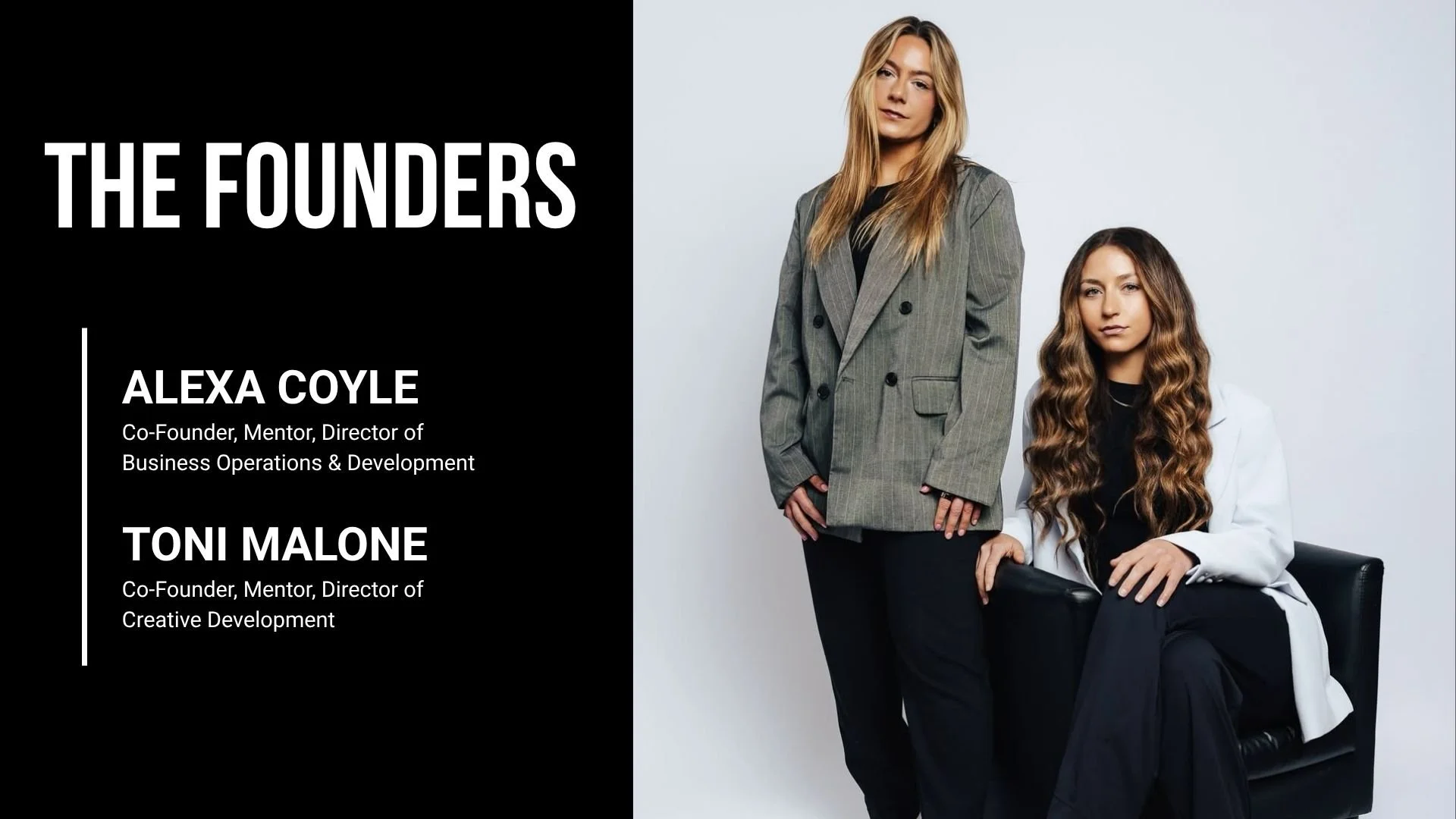
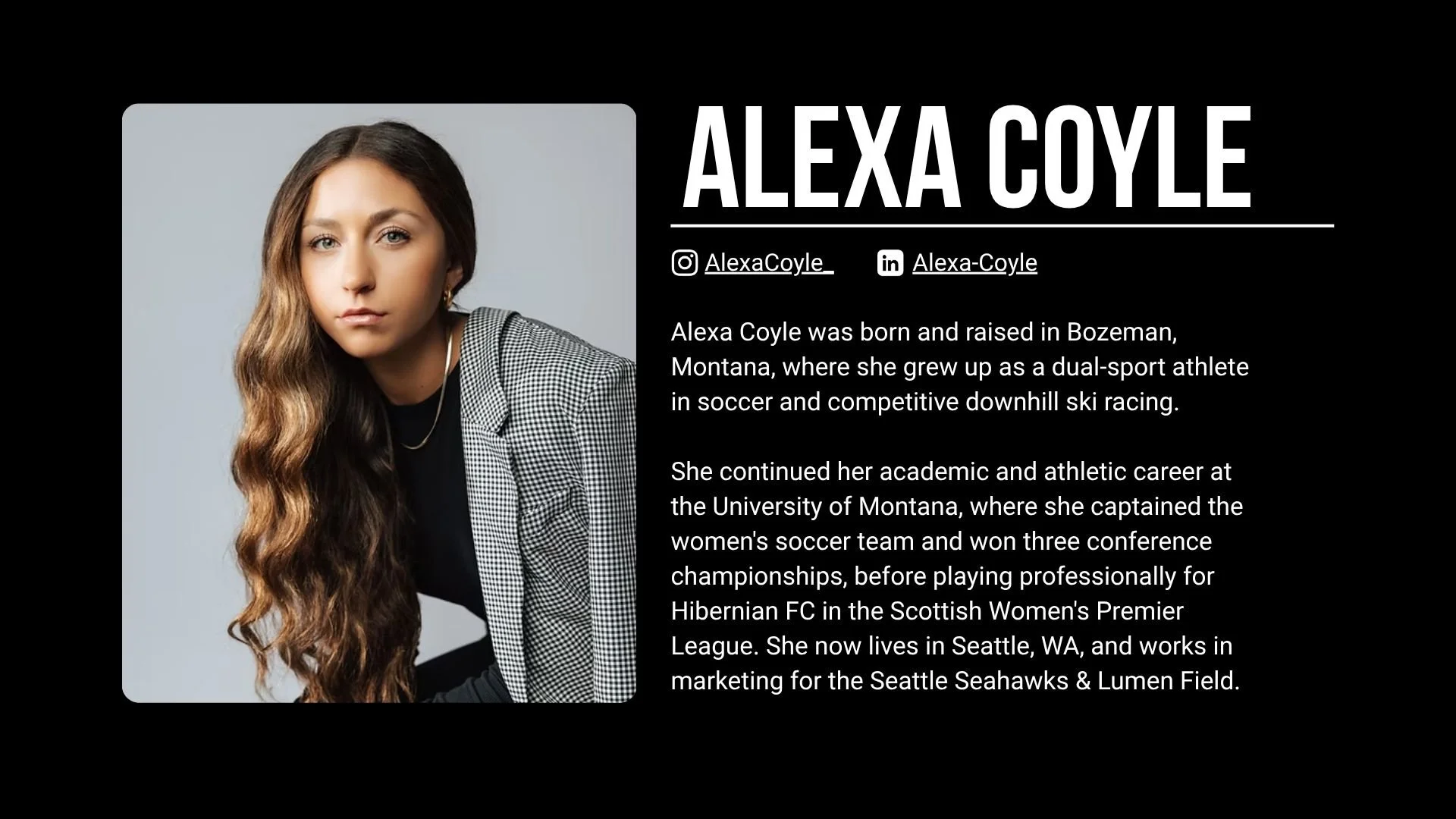
I designed a polished presentation deck to help The Female Edge introduce its mission, showcase its offerings, and make a compelling case to potential partners. The deck transformed the brand into a clear, professional story that could be used to build partnerships and open new opportunities.
THE OUTCOME
ONE COHESIVE SYSTEM. MULTIPLE BRAND TOUCHPOINTS.
The final system gave The Female Edge a stronger and more flexible visual presence across social media, motion, merchandise, and presentations. By building on the existing identity rather than replacing it, the brand gained a more distinctive visual language that could evolve across future touchpoints.
“Working with Alexis was an incredible experience from start to finish. She was consistently communicative, highly detail-oriented, and truly thoughtful in her approach to design. You can tell she puts genuine time and care into her work, and it shows in the final product. She made the entire process seamless, collaborative, and enjoyable, I would absolutely recommend working with her.”
CLIENT TESTIMONIAL: