
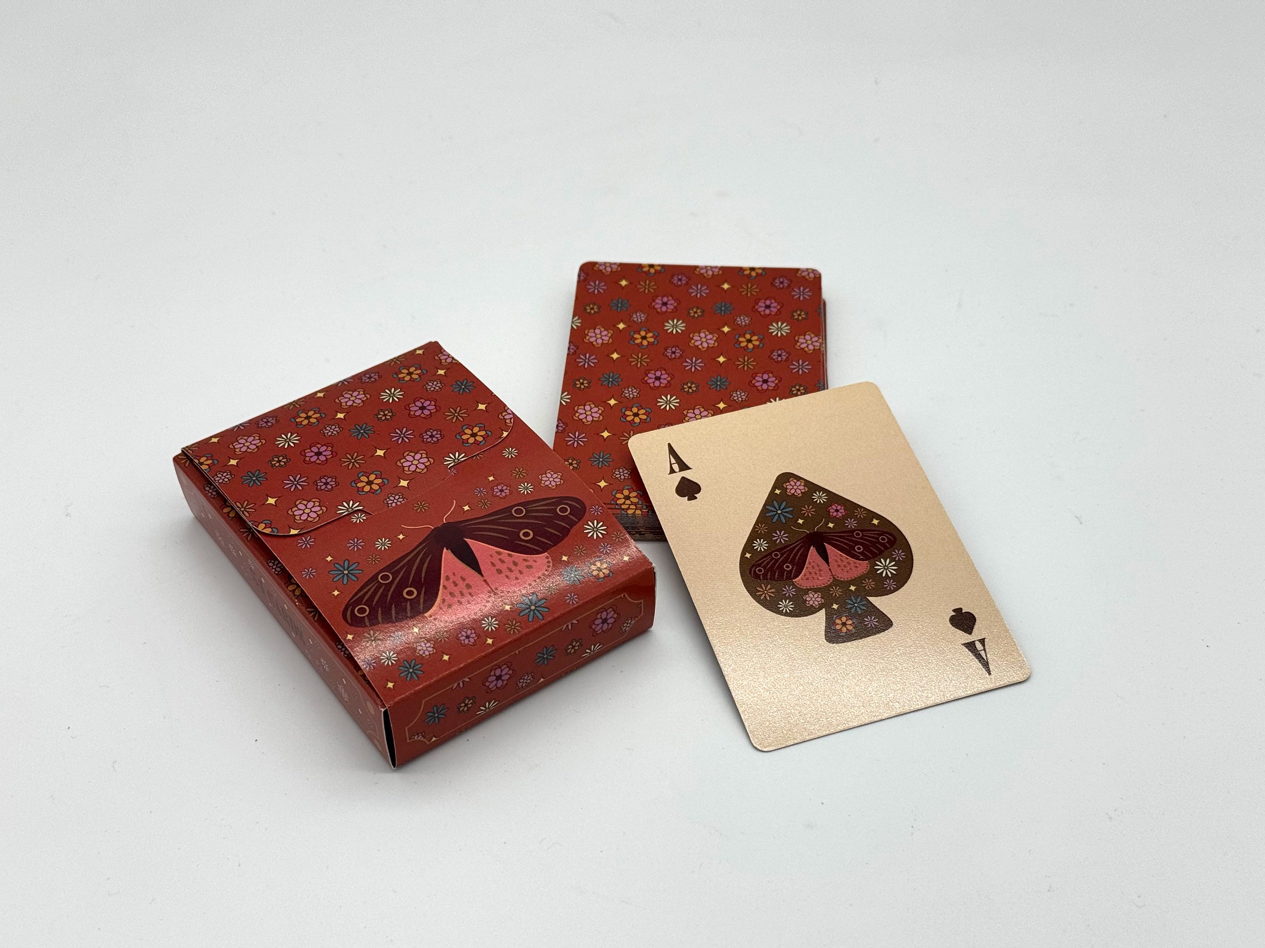
Design a visually cohesive deck of 54 playing cards, including 40 number cards, 12 face cards, 2 jokers, a card back design, and custom inside and outside box designs.
GOAL: Create a distinctive 70s-inspired card system that balances consistency and individuality through bold color, floral pattern, and illustration.

DECK OF
PLAYING CARDS
ILLUSTRATION · PRINT DESIGN · PACKAGING | PERSONAL PROJECT
THE BRIEF
CREATIVE DIRECTION
COLOR, PATTERN, AND CONSISTENCY.
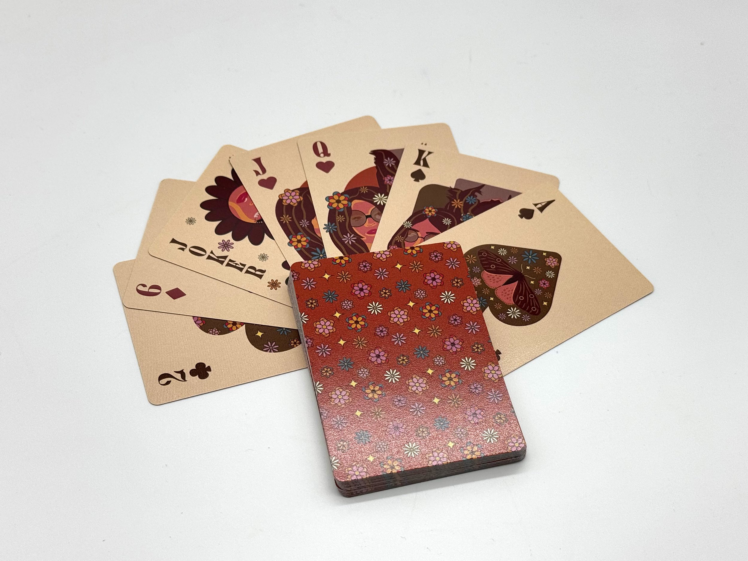
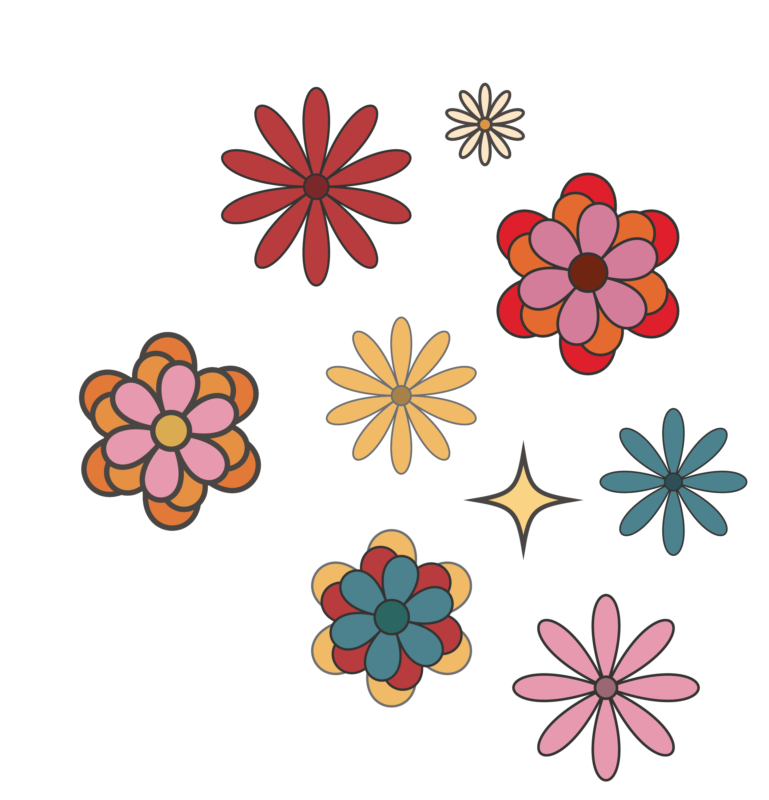
The deck takes inspiration from the vibrant aesthetics of the 70s, using color, floral pattern, and illustration to create a cohesive visual language. A bold flower pattern became the foundation of the system, supported by a palette of browns, pinks, yellows, and blues. Burnt red and brown were used for the suits, maintaining a connection to traditional playing cards while giving the deck its own identity.


NUMBER CARDS & FACE CARDS
BUILDING CONSISTENCY ACROSS THE DECK.
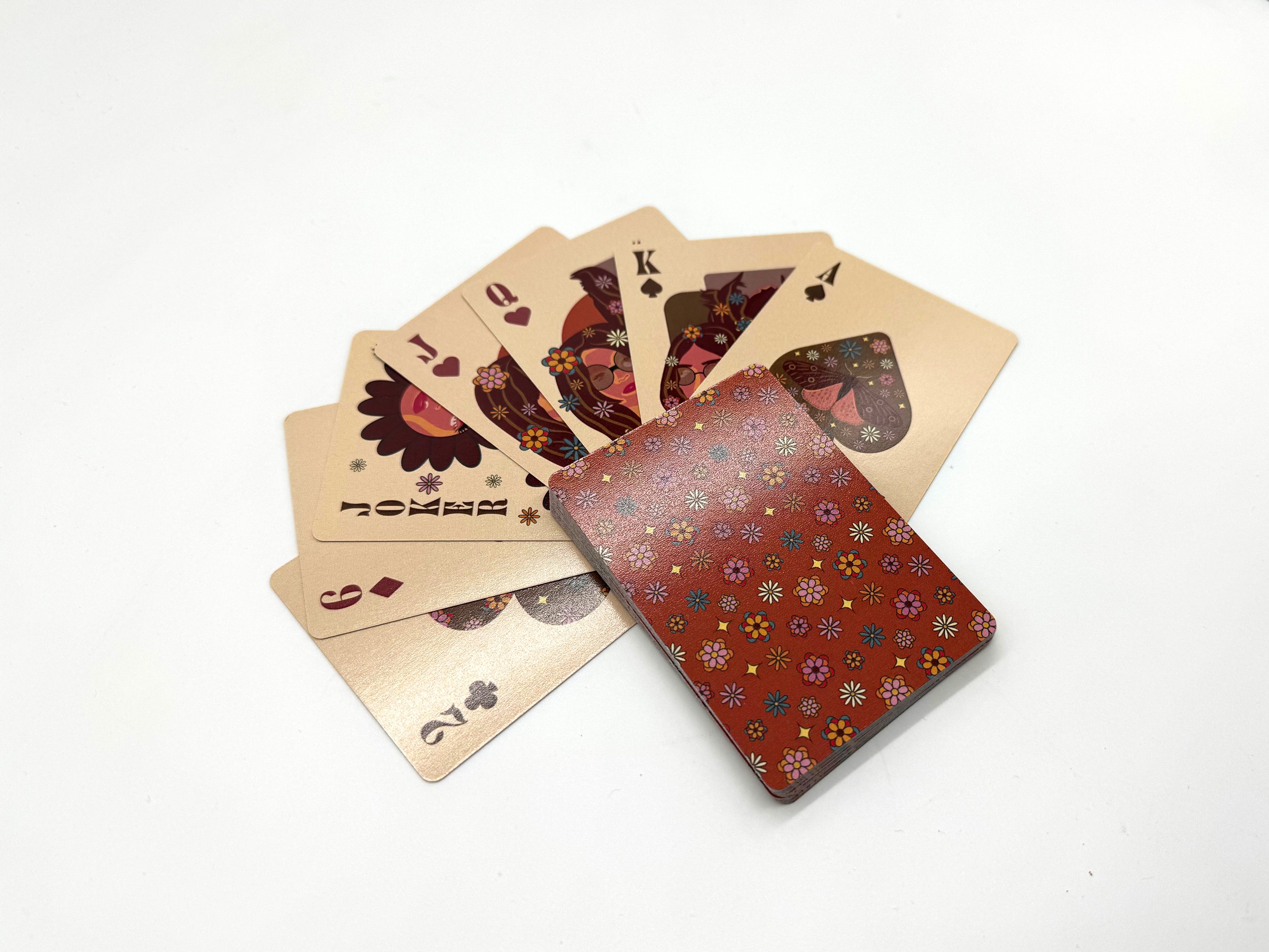
The number cards establish the visual foundation of the deck. I used a large, bold suit in the center of each card as a space for the floral pattern to interact with the traditional playing card structure. The suits use burnt red and brown, connecting back to familiar playing card conventions while fitting within the 70s-inspired color palette.
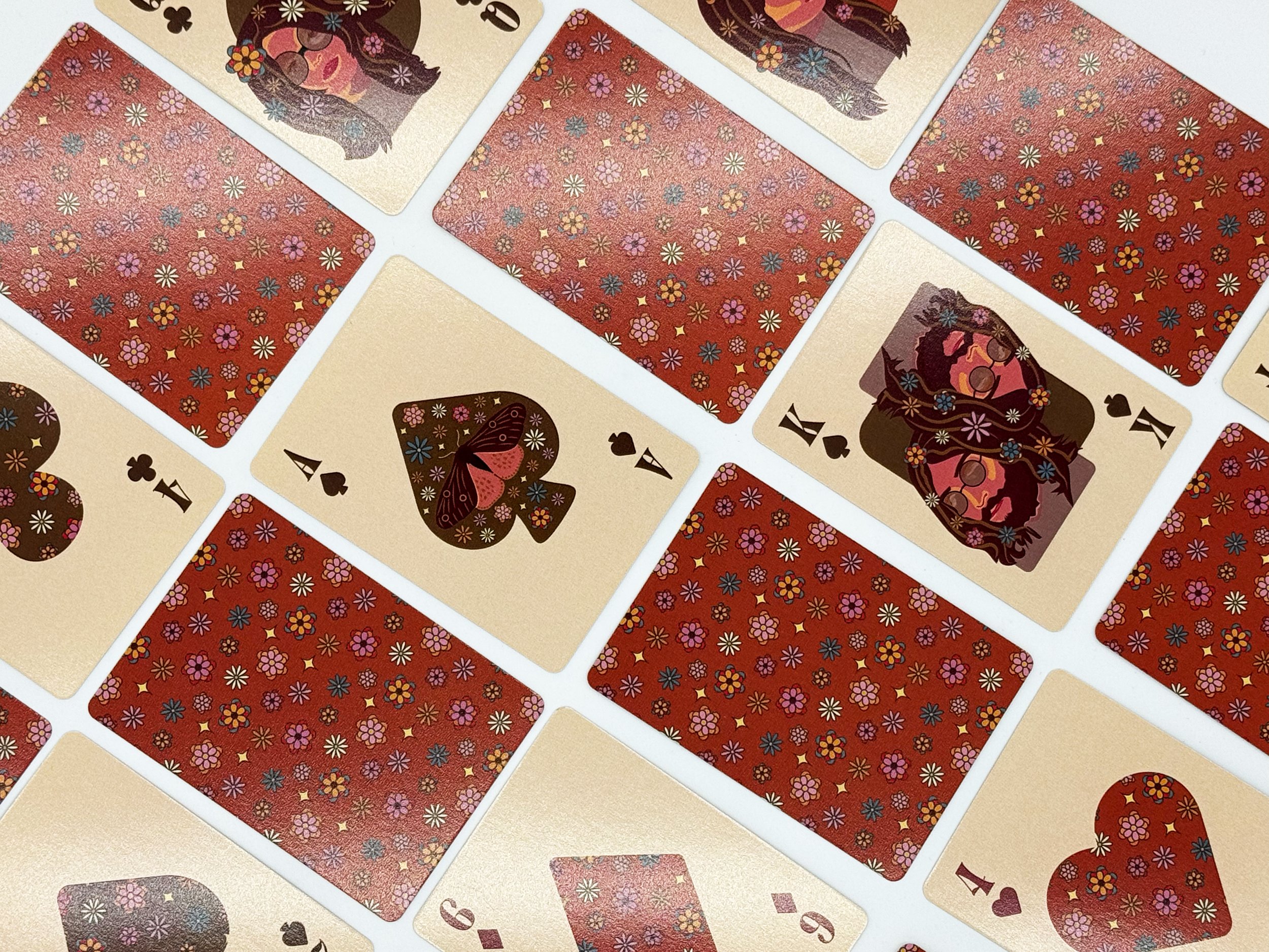
To create consistency across all 54 cards, I incorporated flowers from the original pattern into every design. This gave the deck a recurring visual element that tied the different card types together, even as the layouts and illustrations changed.
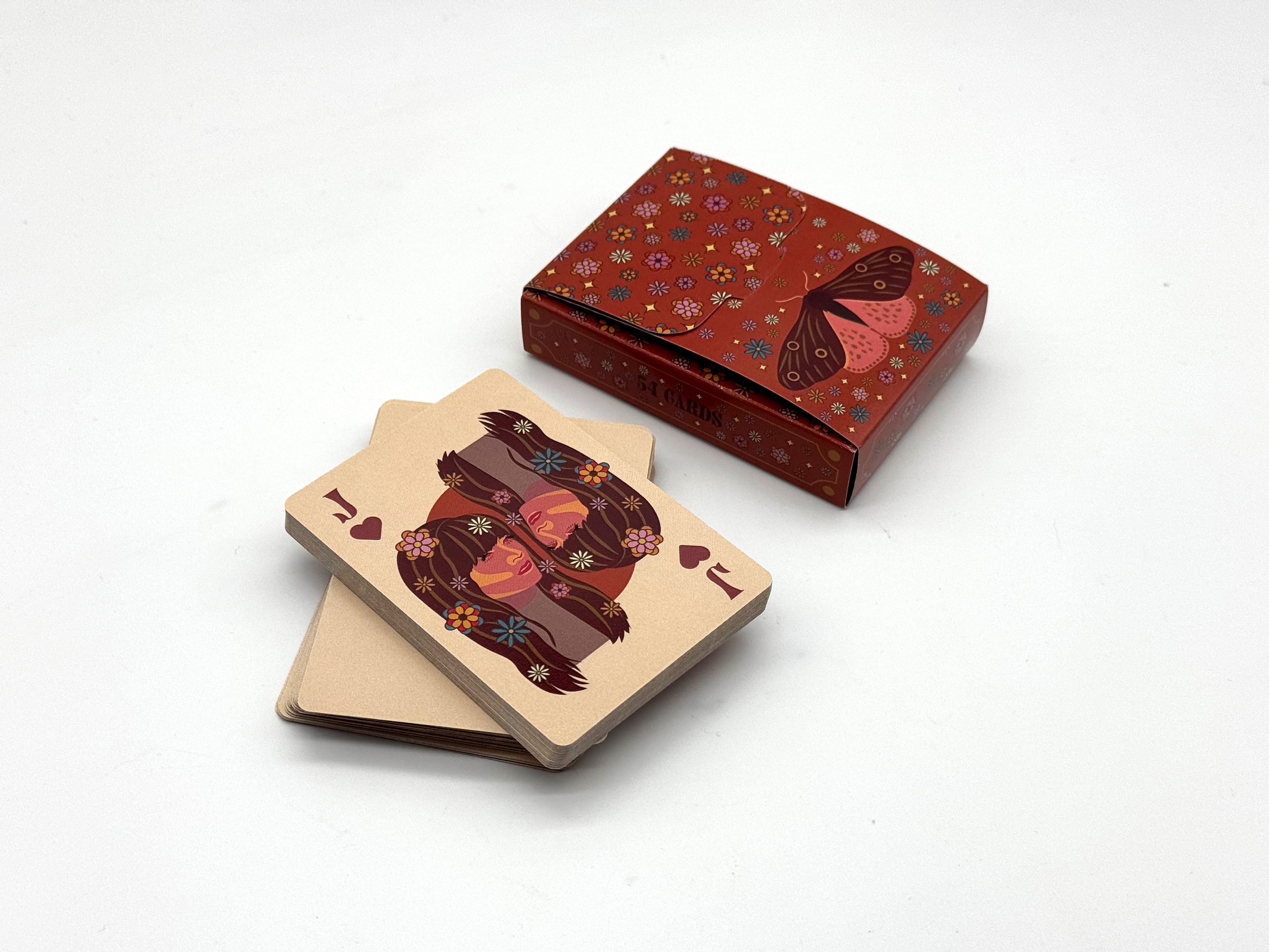
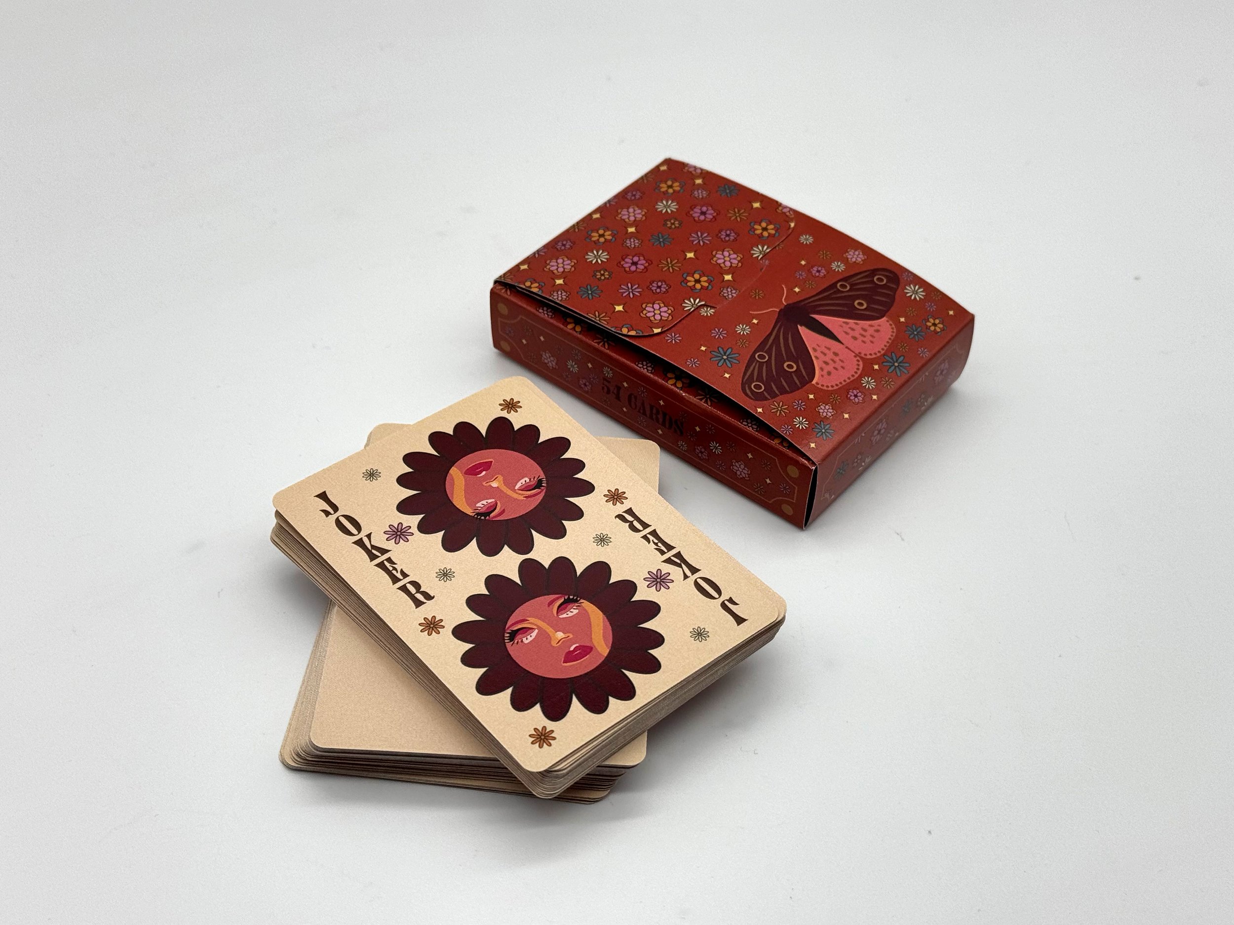
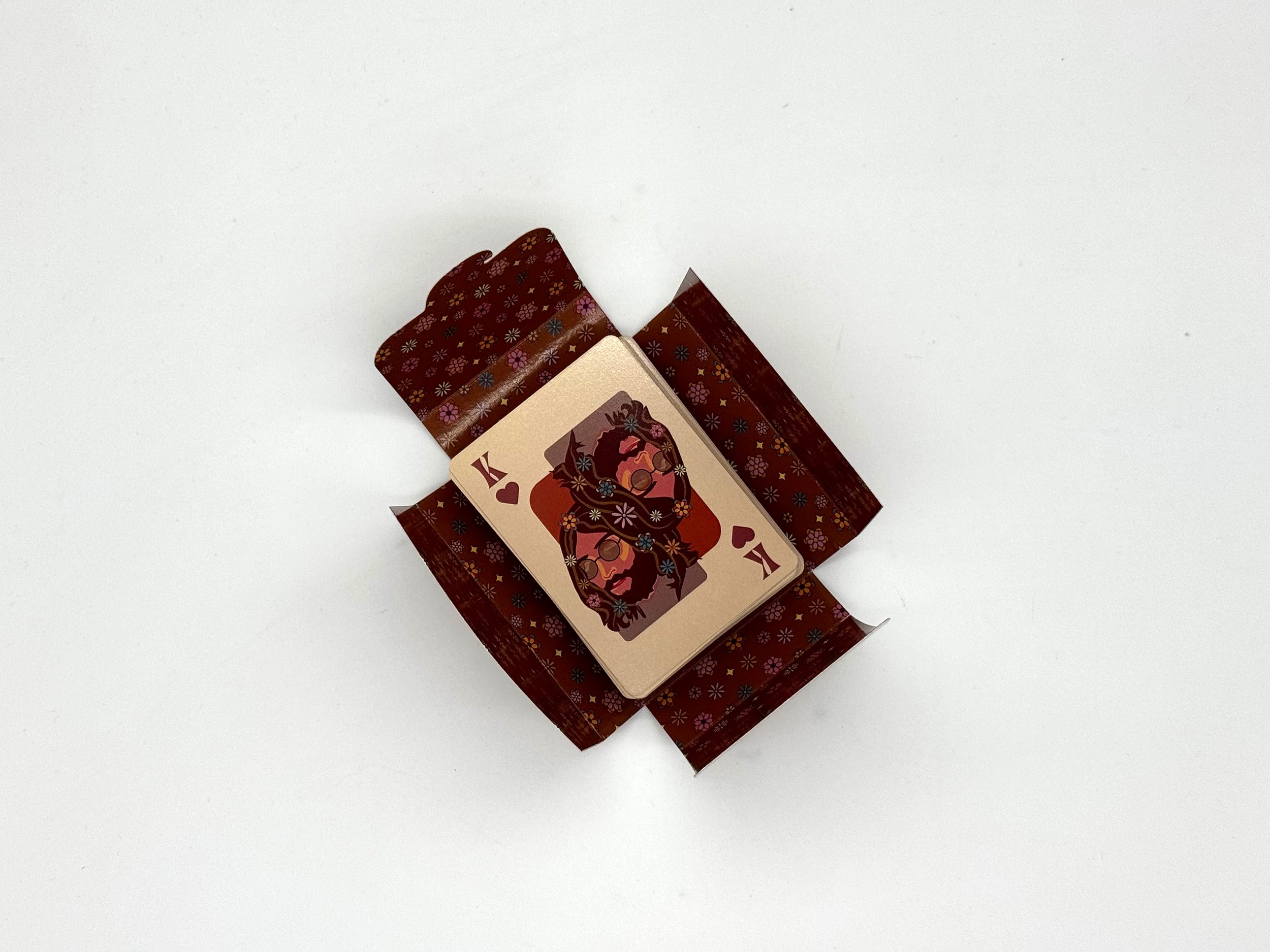
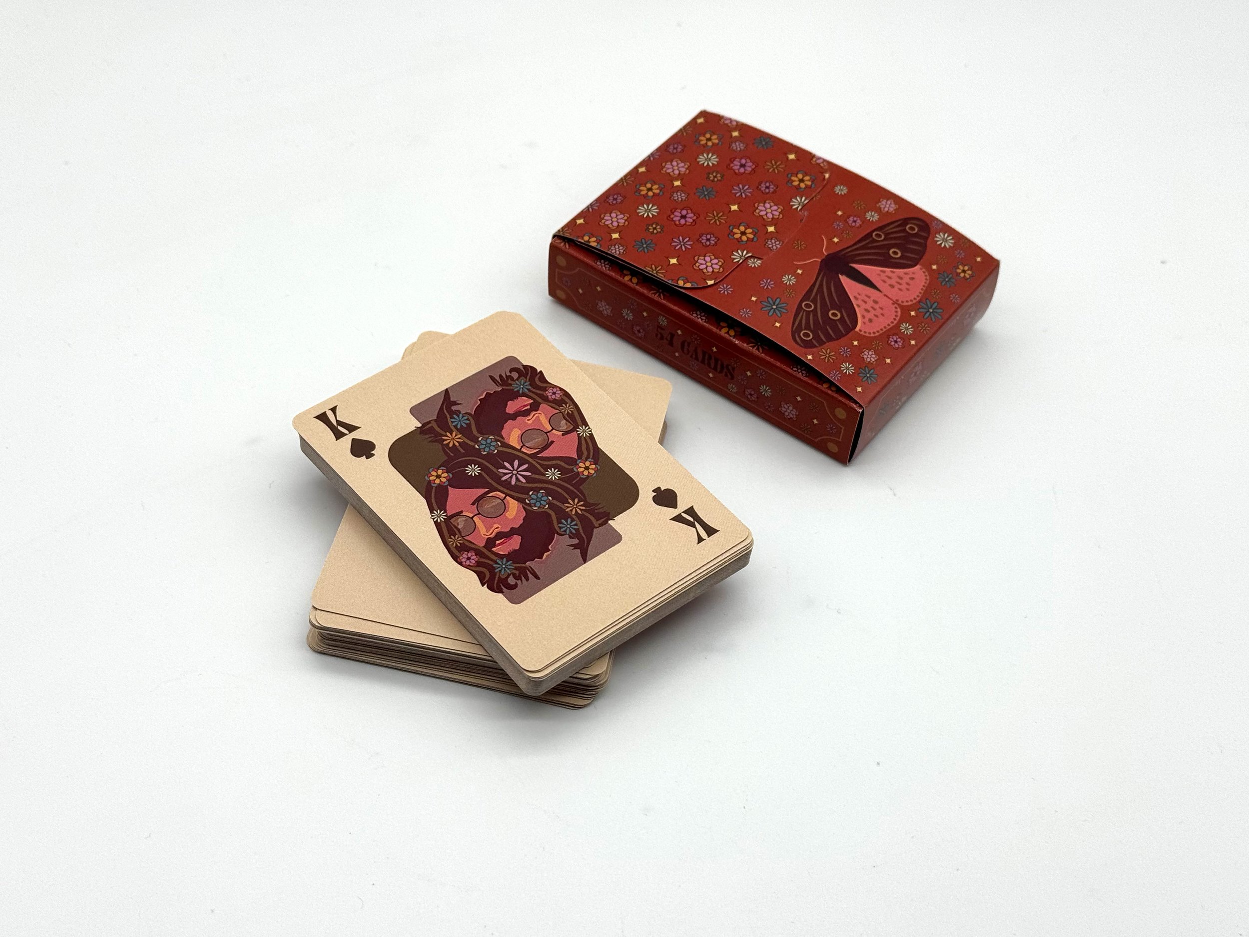
The face cards allowed the floral theme to become more expressive. Flowers were incorporated into the characters’ hair, adding personality while maintaining the same visual language established throughout the number cards. The Joker pushed the illustration further, using flowers to frame the composition, while the Ace of Spades became a focal point with a moth illustration surrounded by the same floral elements.
Together, the number cards, face cards, and special cards create a system that feels varied without becoming disconnected, with color and recurring floral details providing a consistent thread throughout the deck.
DESIGNING THE BOX
EXTENDING THE SYSTEM BEYOND THE CARDS.
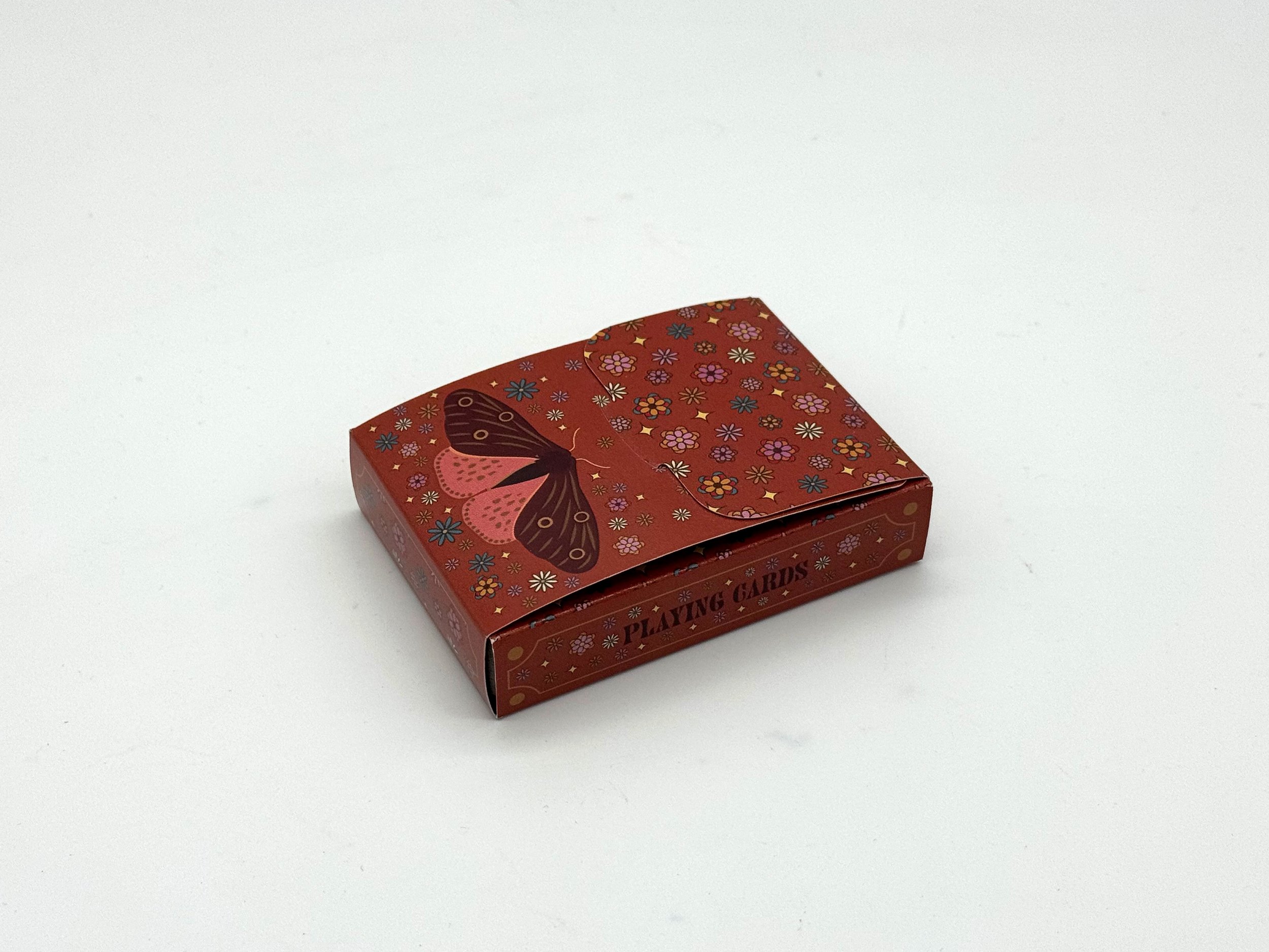
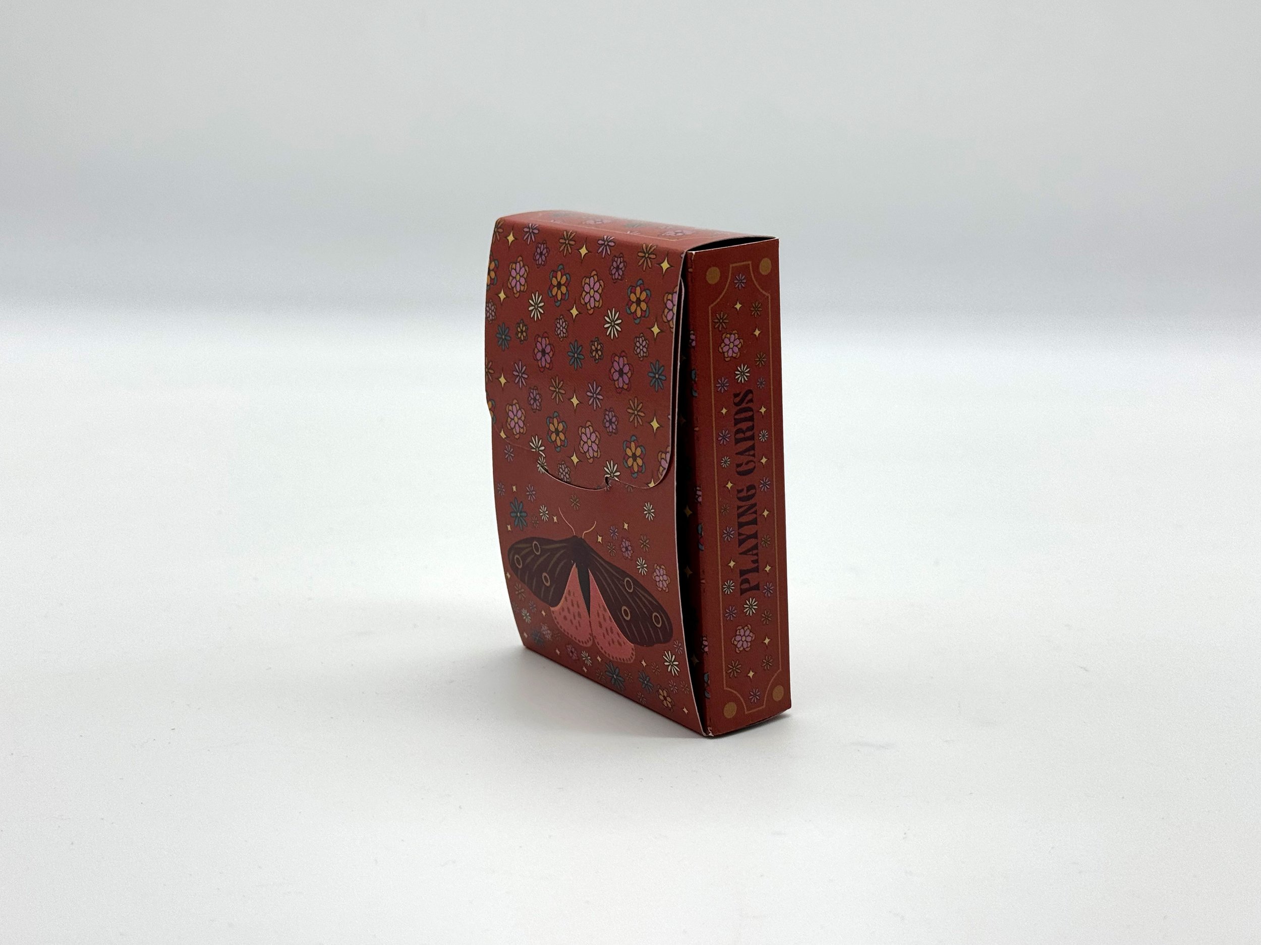
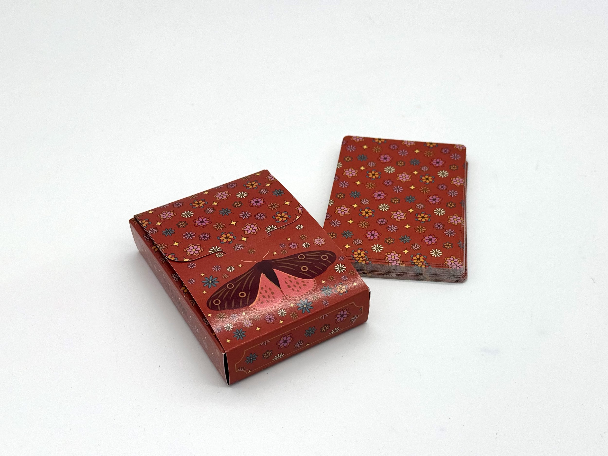
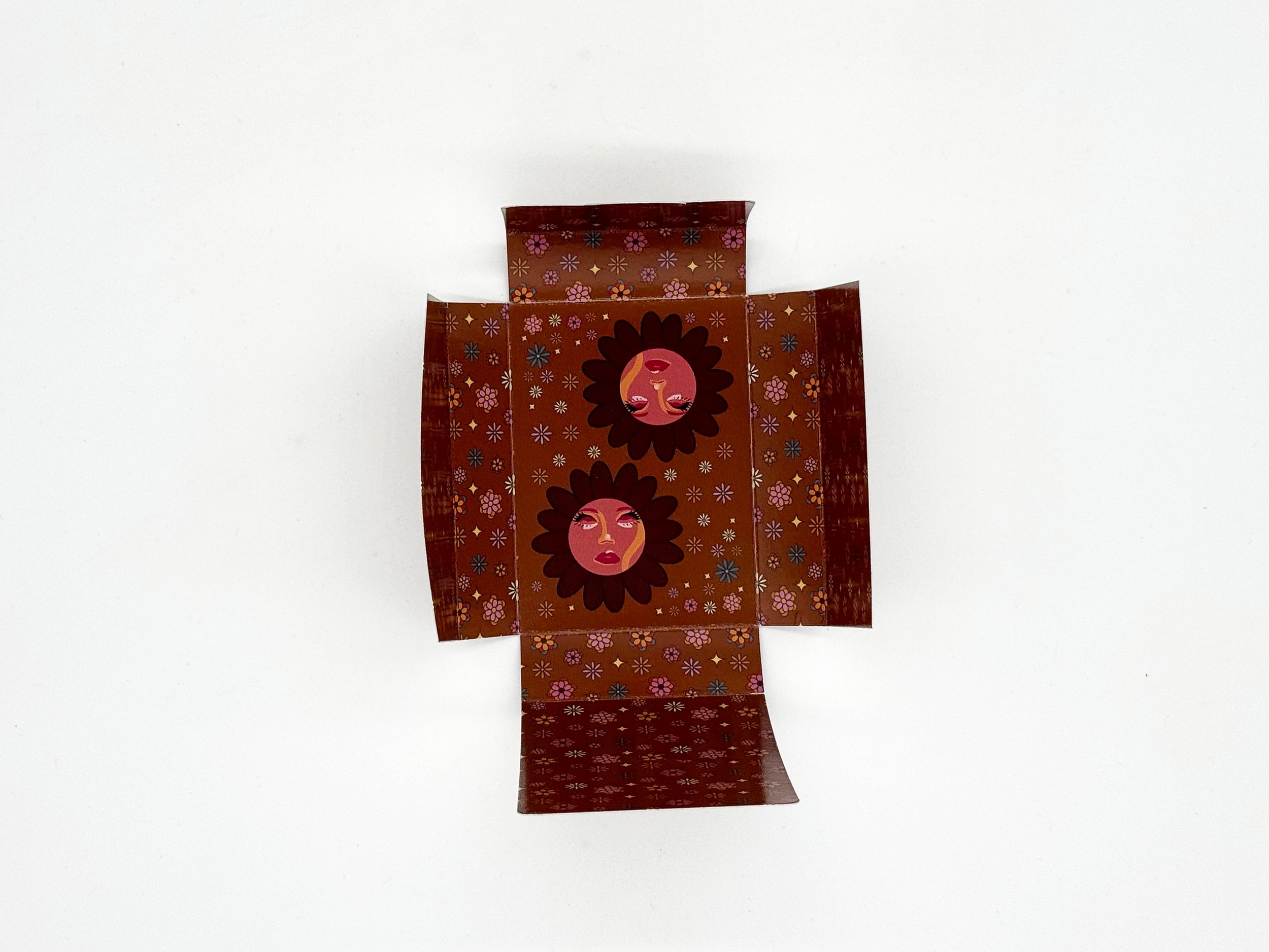
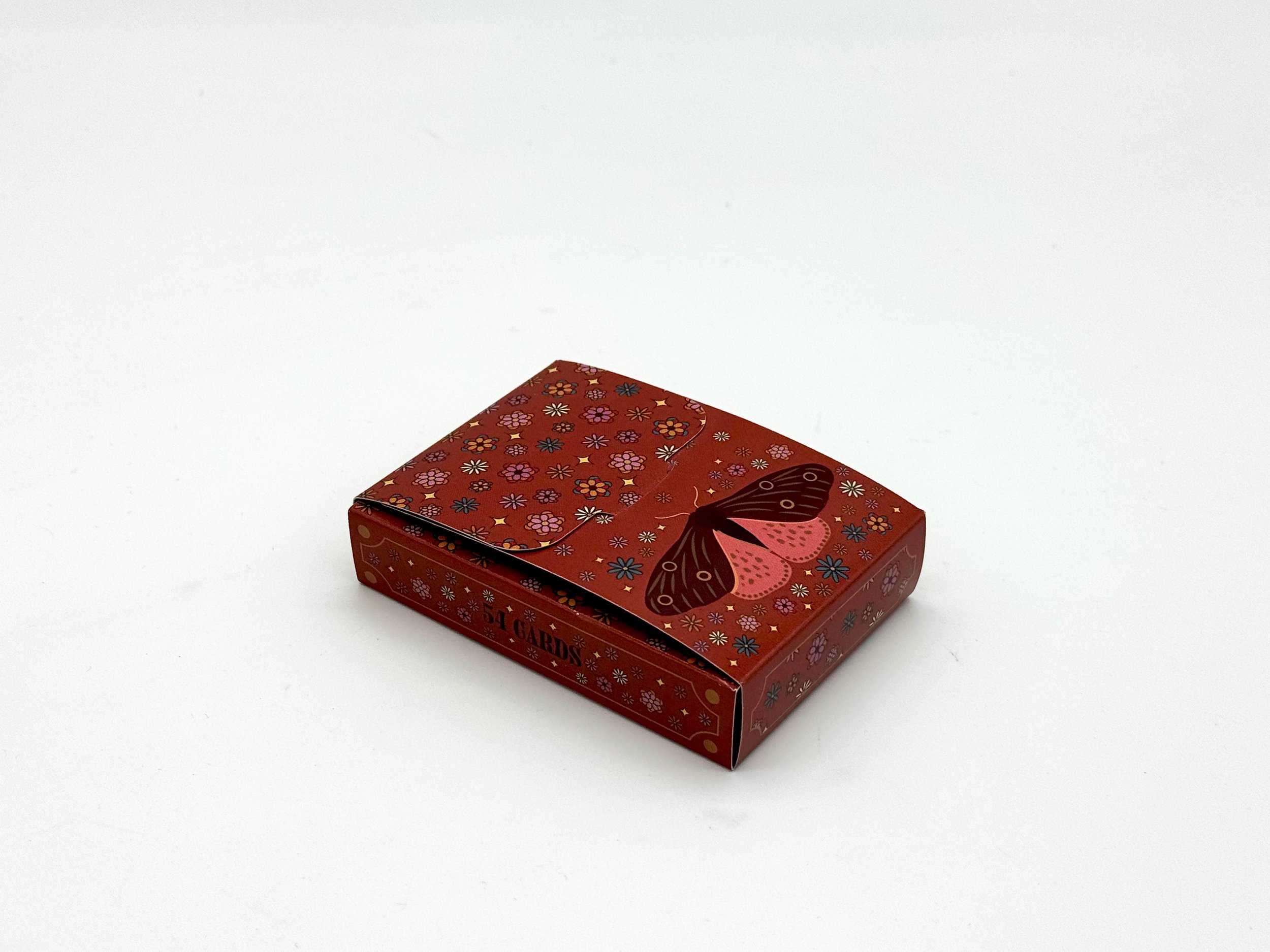
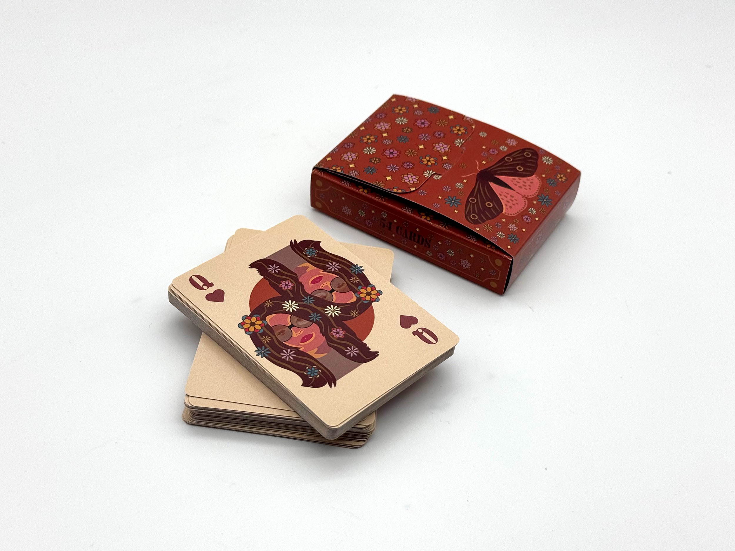
The box was designed to feel cohesive with the deck, carrying the same colors and floral elements into the packaging. The exterior matches the card backs, while the brown interior connects back to the brown cards.
The moth takes center stage on the box, while the top flap features a solid flower pattern that creates a gradient effect when opened. Inside, the Joker illustration and additional flowers add an unexpected detail to the unboxing experience.
THE COMPLETE DECK
ONE SYSTEM ACROSS 54 CARDS.
The final deck brings the color, floral pattern, illustration, and packaging together into a unified visual experience. Each element was designed to feel distinctive on its own while contributing to a cohesive set.