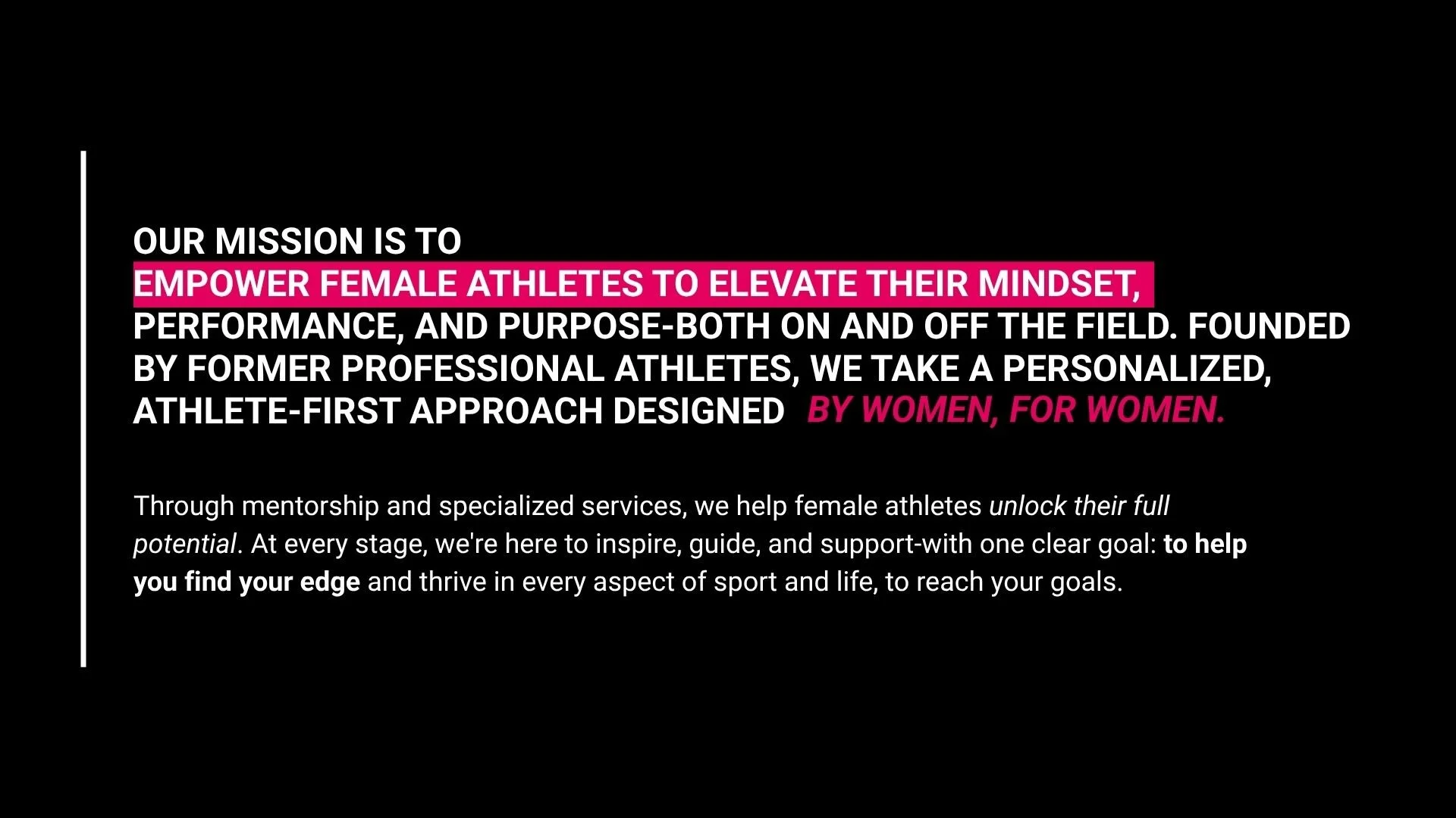
Client Work for The Female Edge. The project involved expanding the brand by designing Instagram templates, merchandise, a branded slide deck, and motion graphic videos. The client’s goal was to strengthen their social media presence and create evergreen brand assets for long-term use. The Female Edge is a brand dedicated to helping female athletes unlock their full potential through mentorship and specialized services. With an established logo, font, and base color palette already in place, my goal was to strengthen their visual presence — creating a cohesive, elevated social media system that reflected their mission while remaining flexible and easy for the client to use independently.
THE FEMALE EDGE
BRAND MATERIALS
THE PROJECT
Phase 1: Stylescapes
To kick off the project, I started with stylescapes to set the tone and visual direction for all designs moving forward. The client wanted to explore new color combinations and expand their brand aesthetic beyond the existing palette. I presented three stylescape directions — mild, medium, and spicy — each exploring a different interpretation of the word “EDGE”:
Mild — clean, minimal, and feminine, leaning into the box motif from their logo.
Medium — sharper, with angular shapes, contrast, and attitude to reflect “EDGE” more literally.
Spicy — bold and gritty, using strong textures, deep pinks, black, and a moody palette.
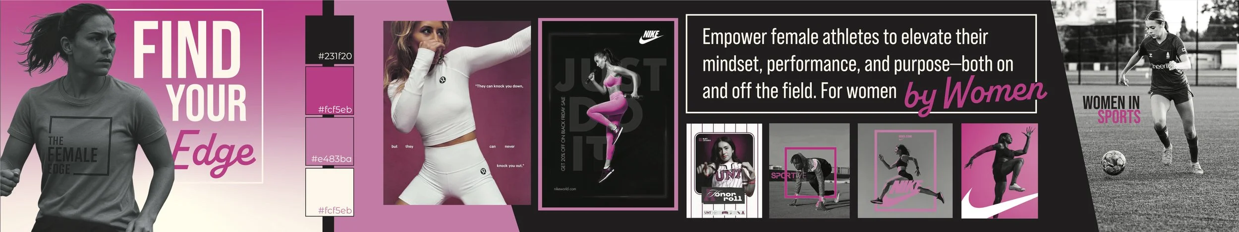
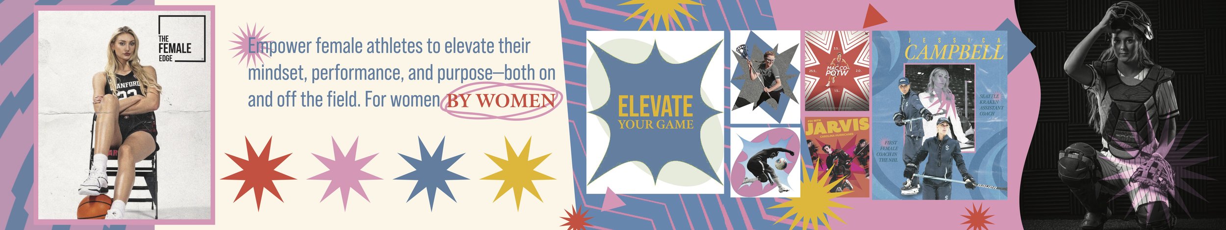
The client was most drawn to the spicy direction but requested a few refinements: combining the boldness and color palette of the third option, the clean structure and box motif from the first, and adding pops of orange while toning down heavy textures.
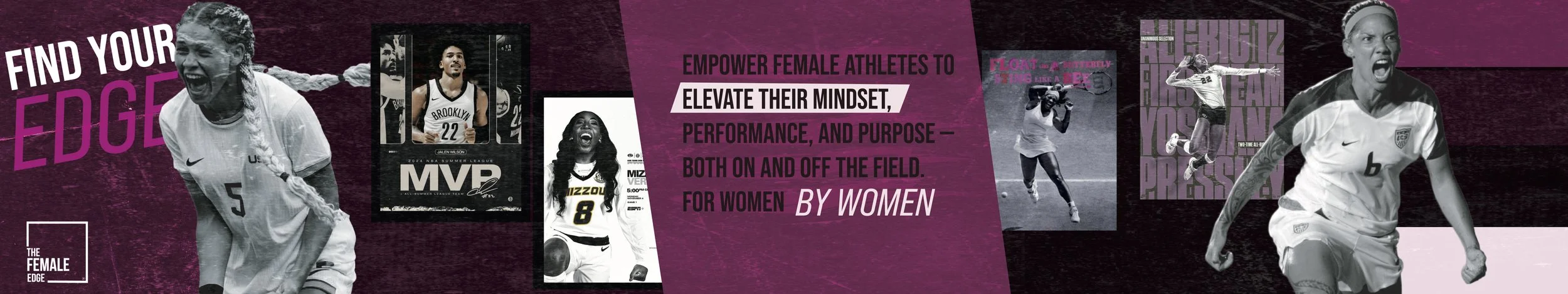
final stylescape
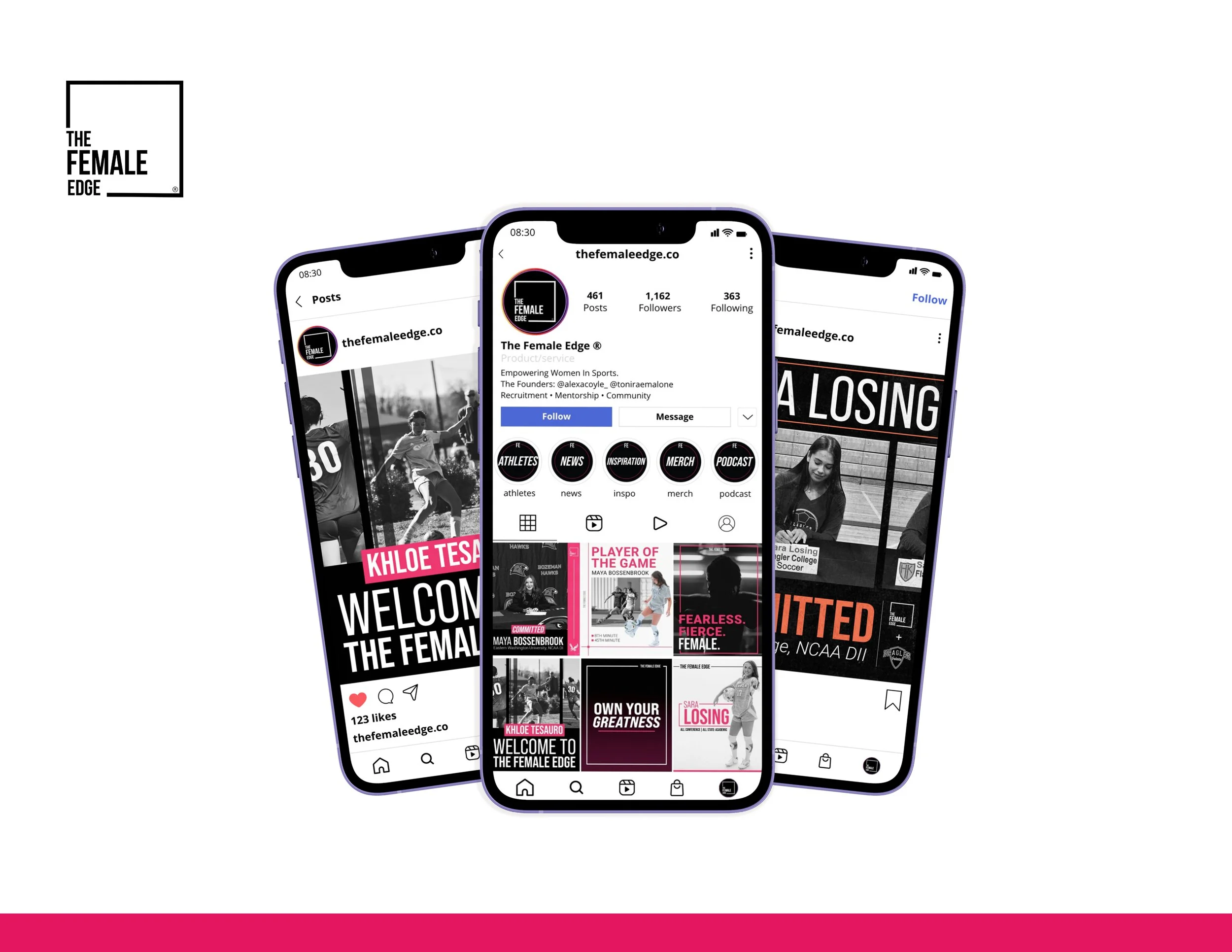
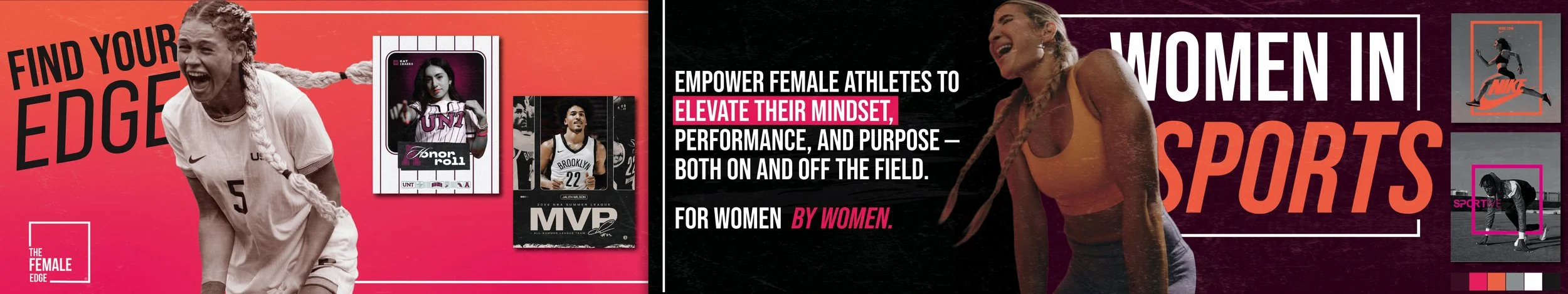
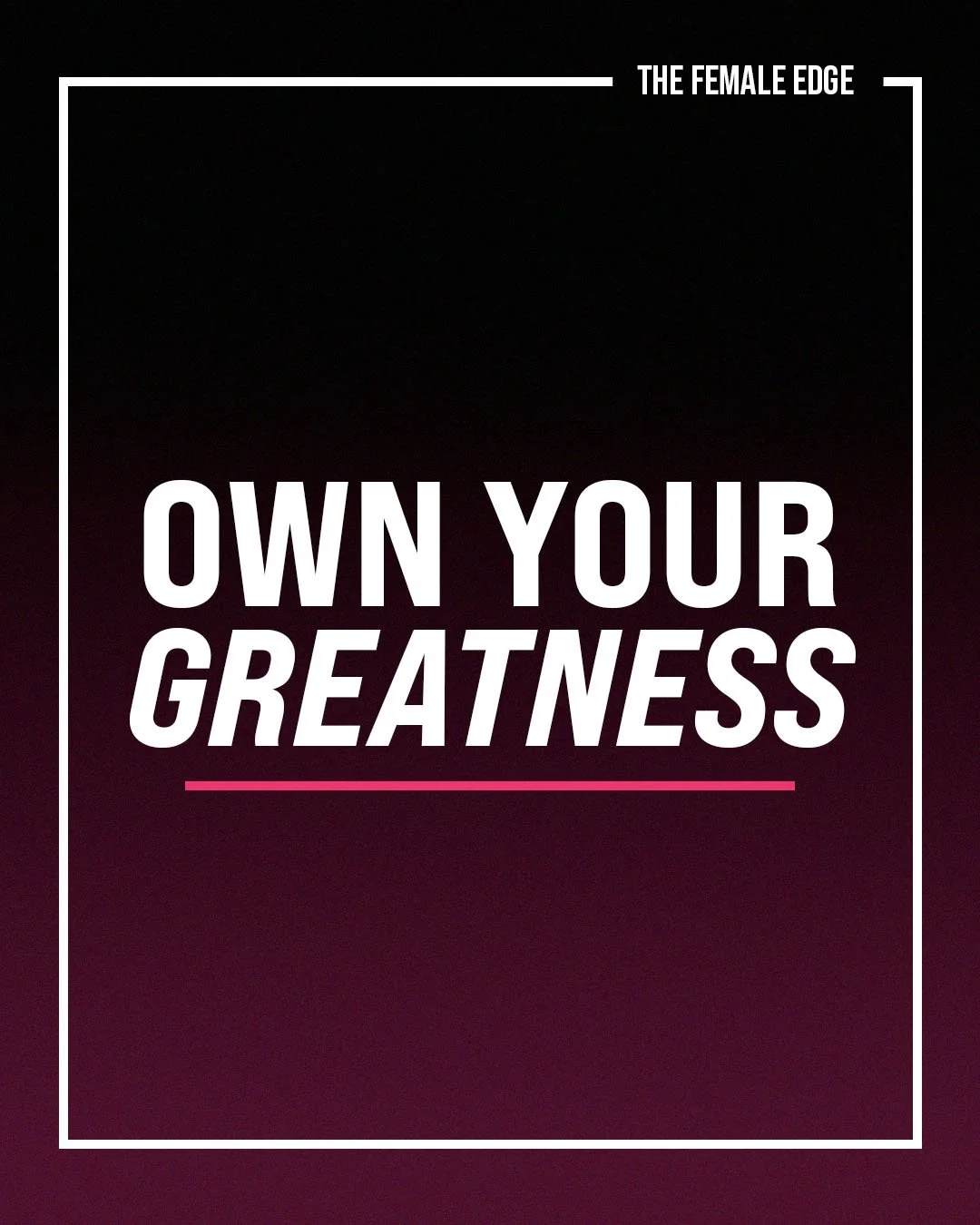
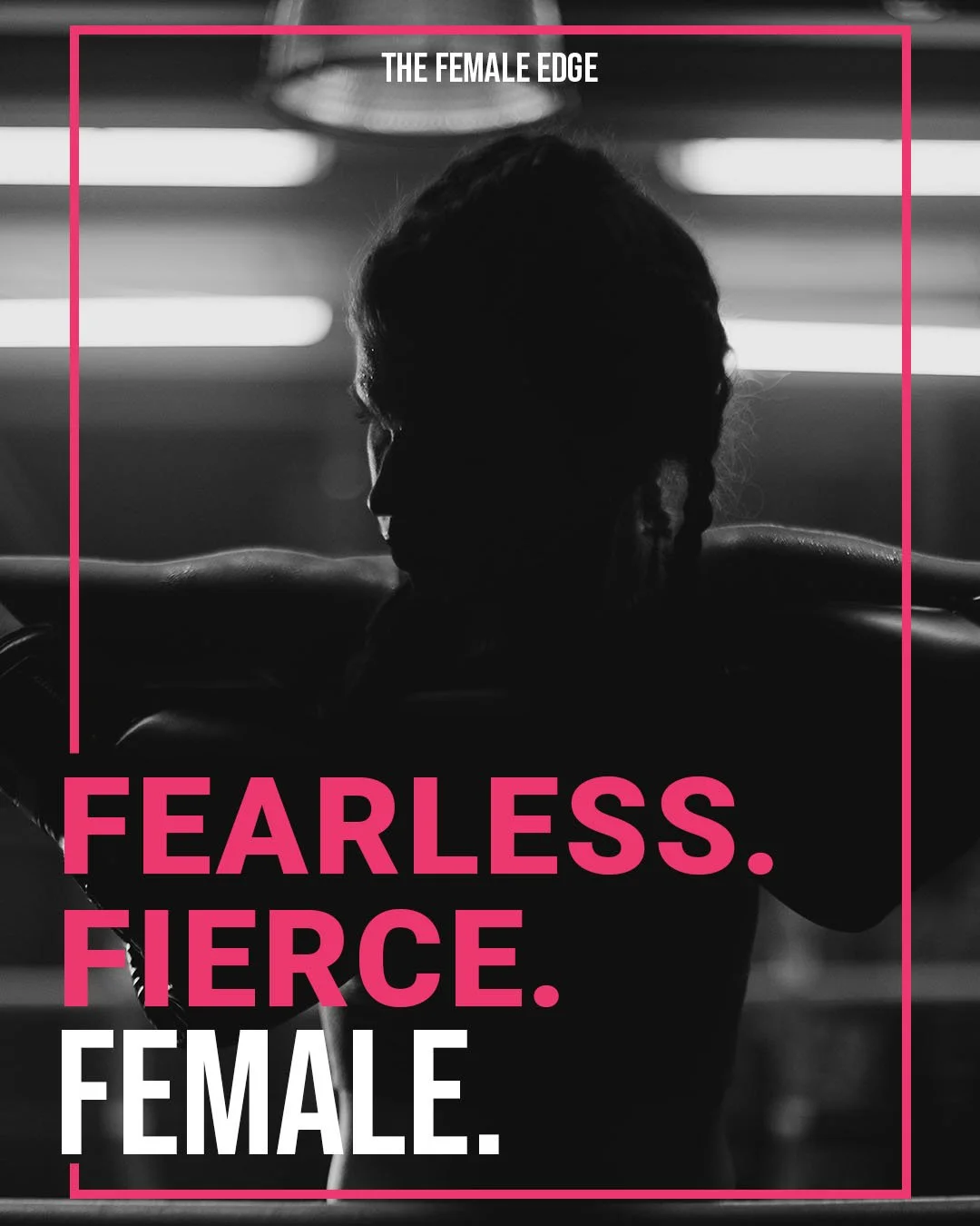
Phase 2: Social Media Templates
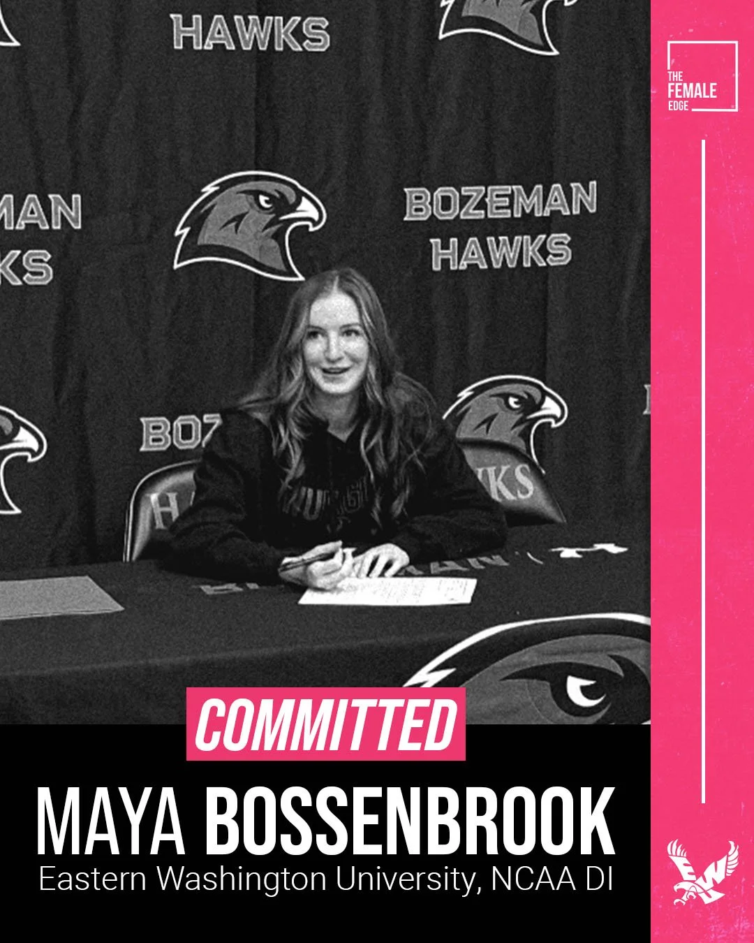
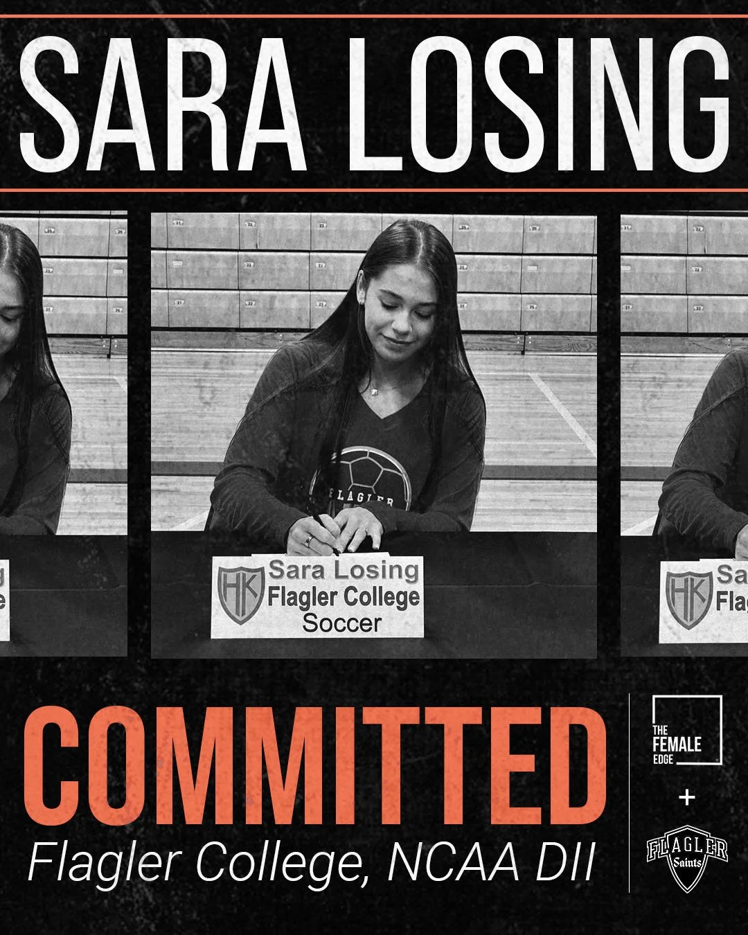
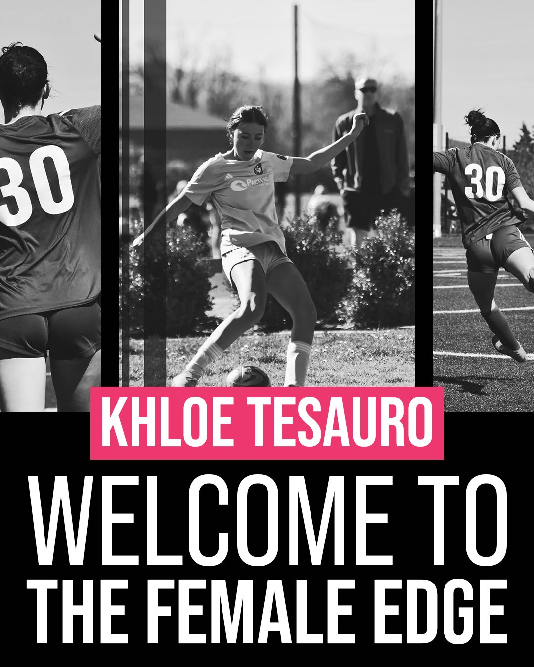
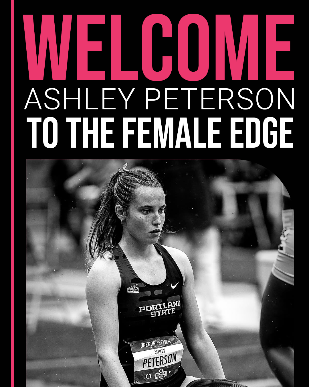
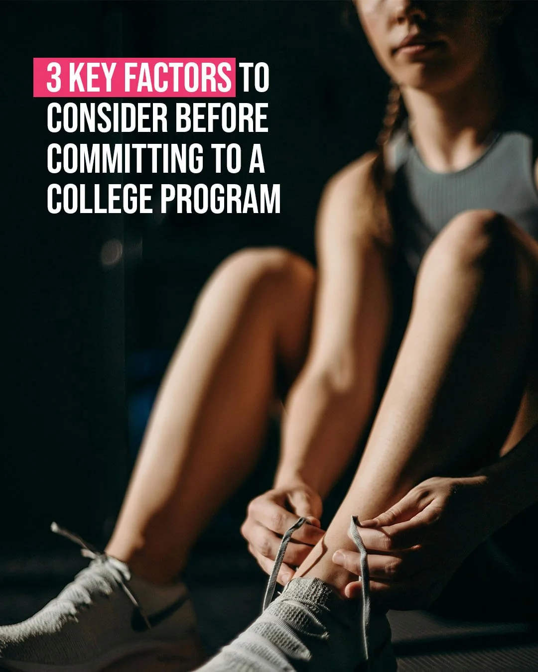
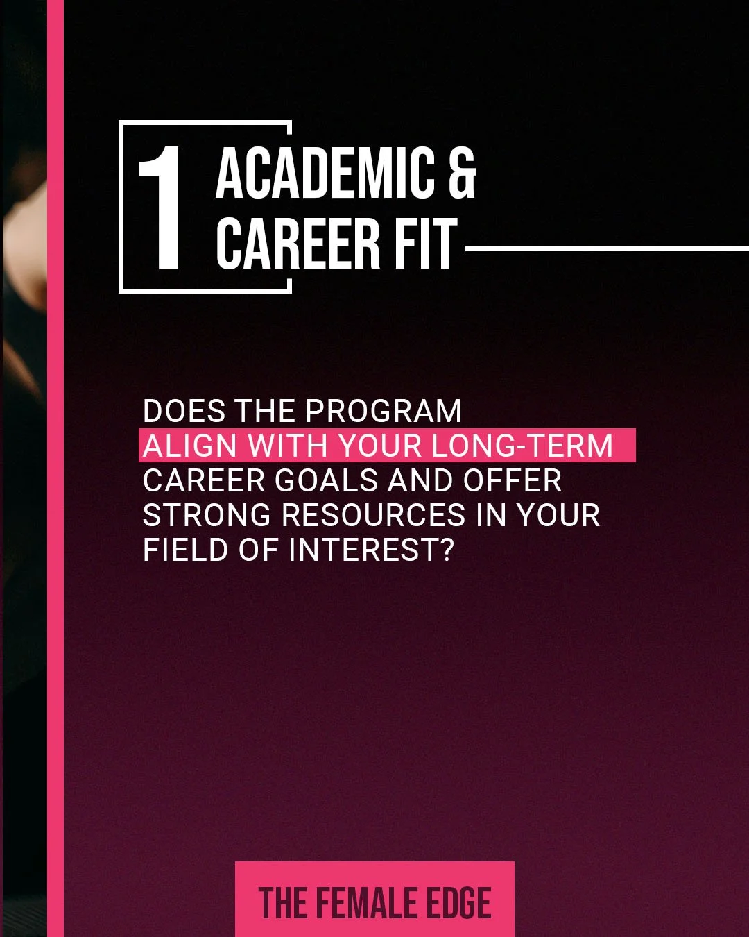
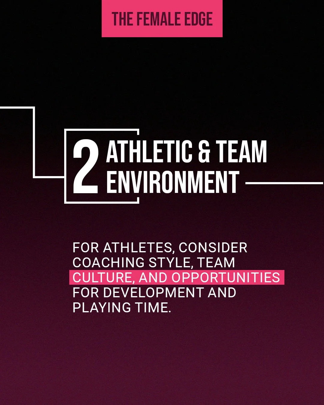
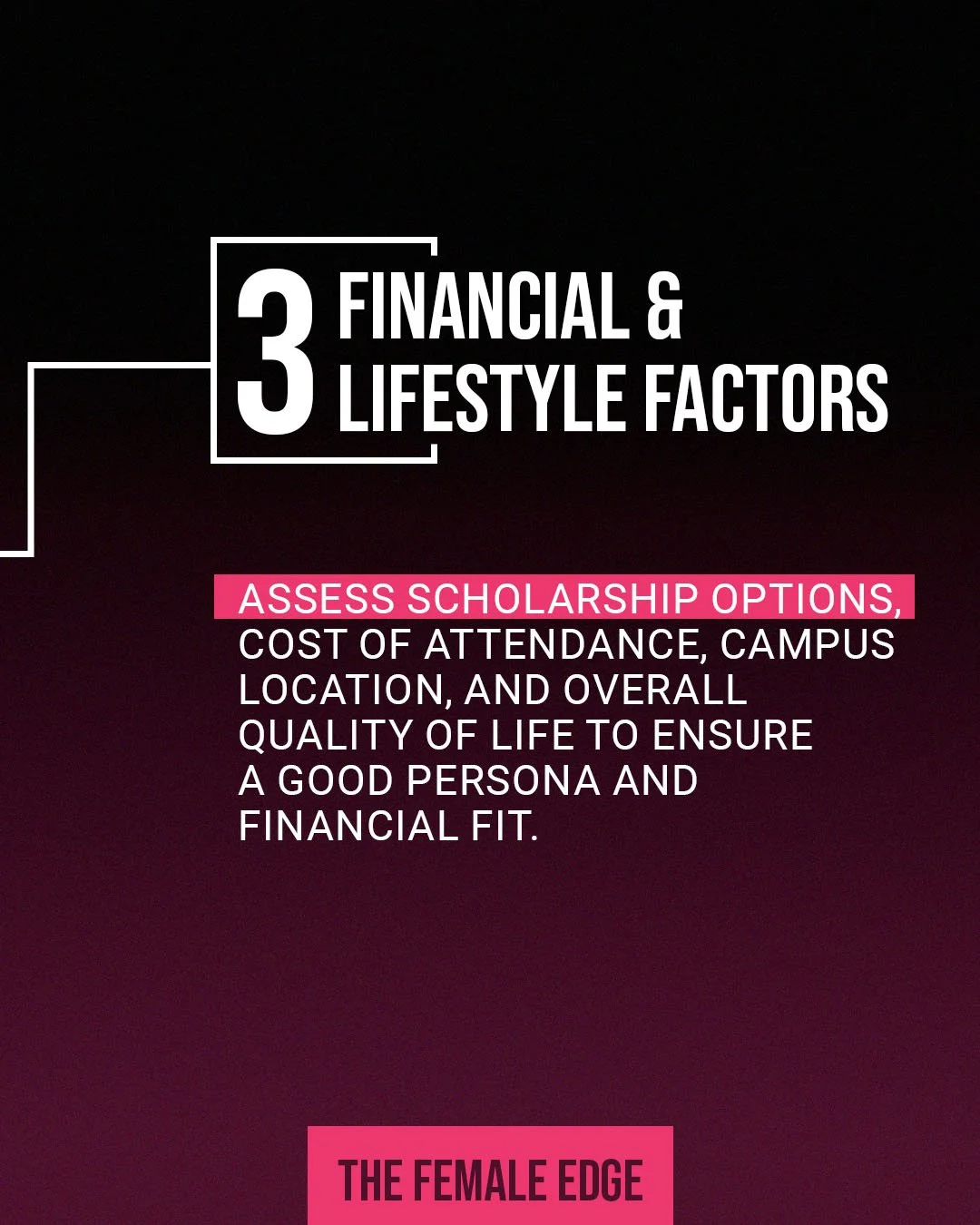
Once the stylescape was approved, I moved into designing social media post templates in Photoshop. The focus was on maintaining the signature box element and developing distinct looks for each content category while keeping templates simple and editable. Each template was designed for easy client use in Canva while ensuring a cohesive and elevated brand presence on Instagram. The final deliverables included templates for: Committed Athletes, New Athletes, Athlete Achievements, Inspirational Content, Athlete Highlight Reels
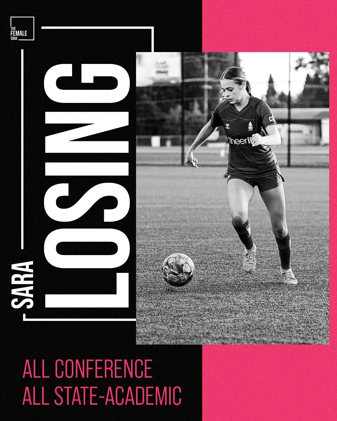
Each category included a minimum of two template options to maintain variety and consistency.
The client shared that the templates “beautifully captured the brand.”
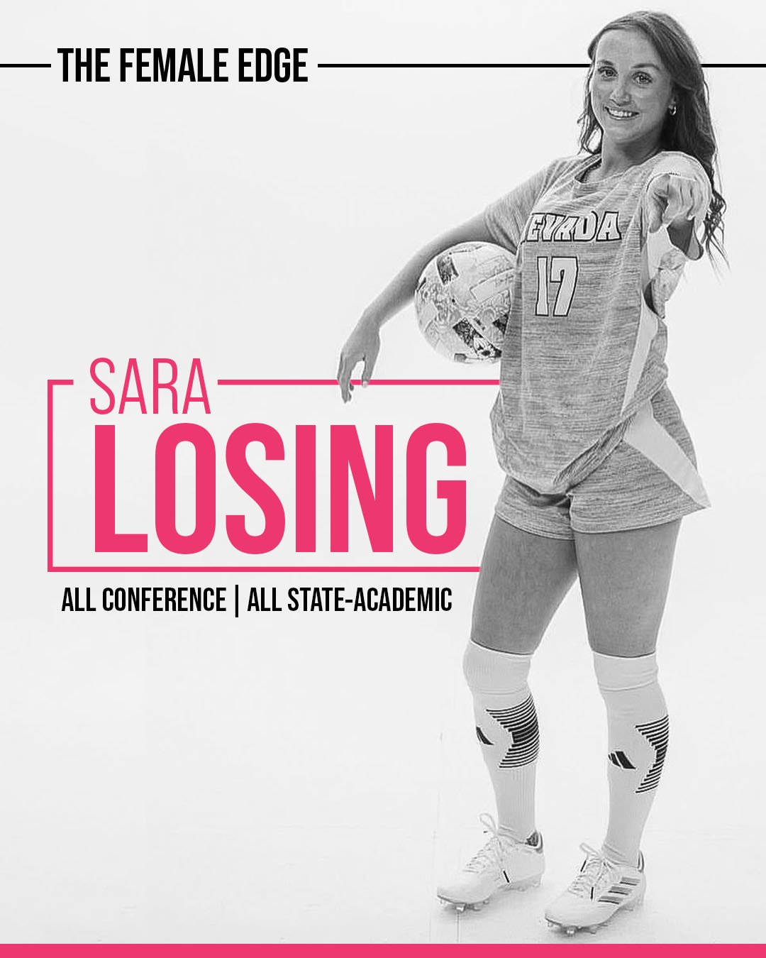
Committed Athletes
—
Committed Athletes —
New Athletes
—
New Athletes —
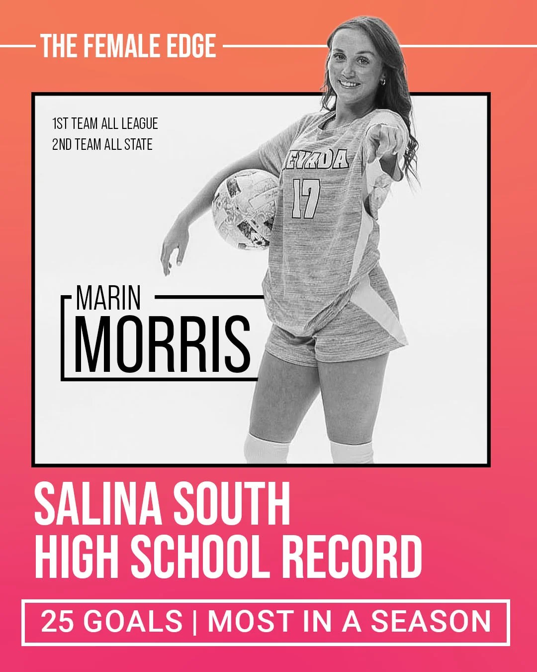
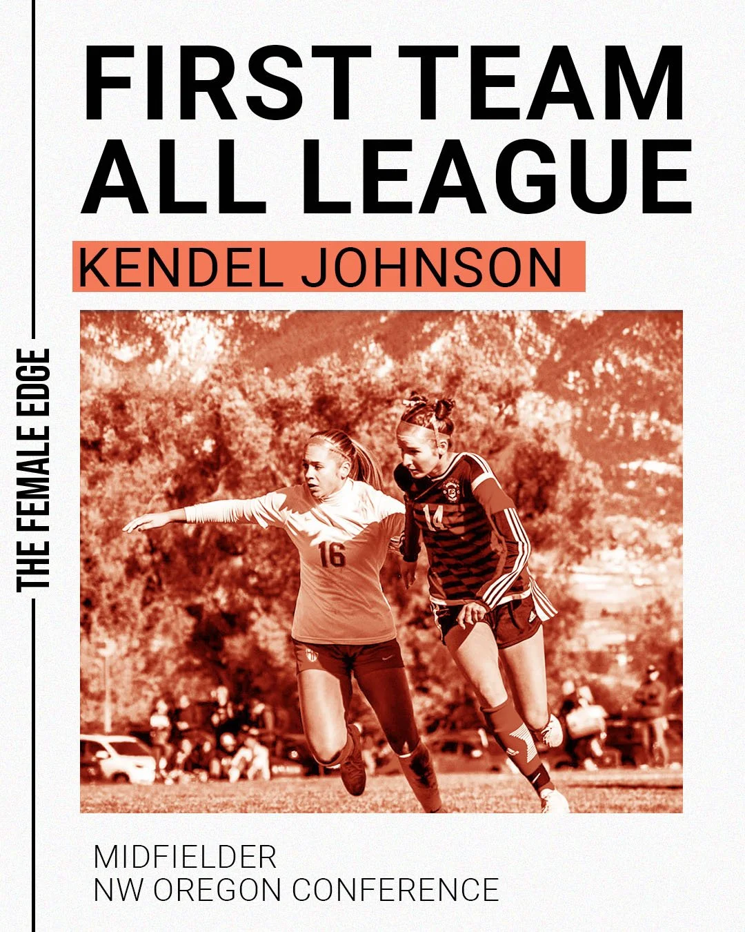
Athlete Achievements
—
Athlete Achievements —
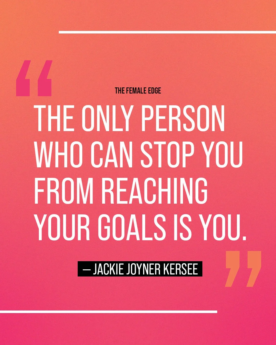
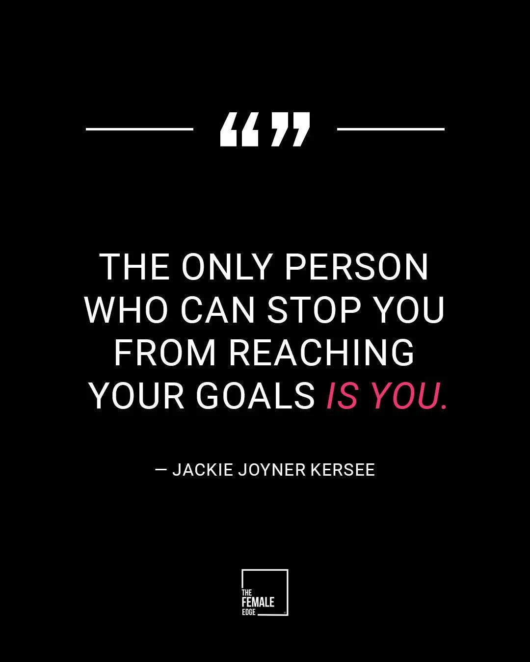
Inspirational Content
—
Inspirational Content —
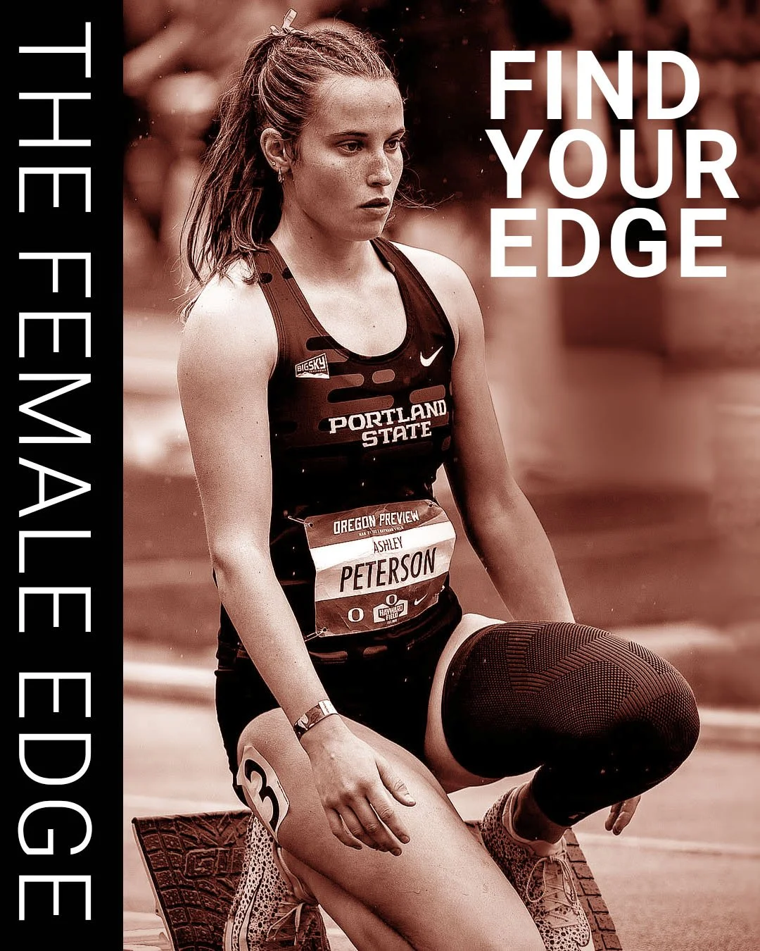
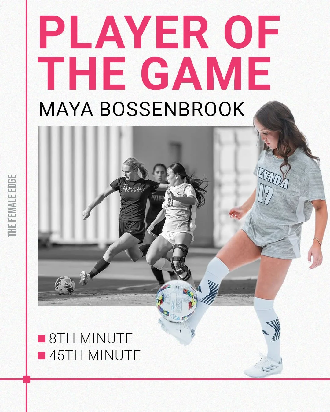
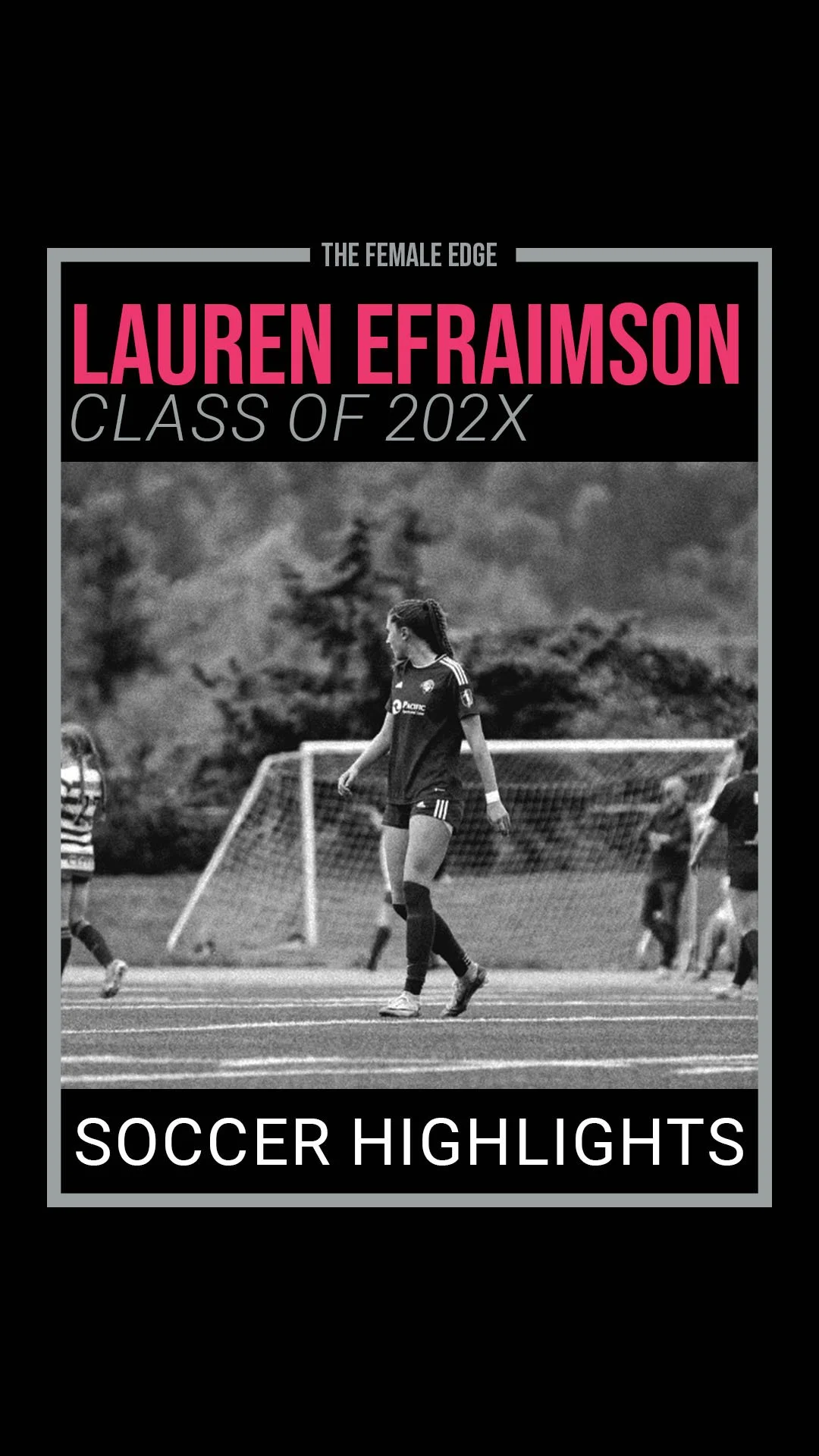
Athlete Highlight Reels
—
Athlete Highlight Reels —
Phase 3: Motion Graphics
Next, I created a series of motion graphics featuring the brand’s taglines and logo for use in Instagram Reels.
These animations incorporated the brand’s main colors — pink, black, and white — and played with lines and box elements for visual rhythm. Each animation was delivered in both light and dark background versions for flexibility across content types.
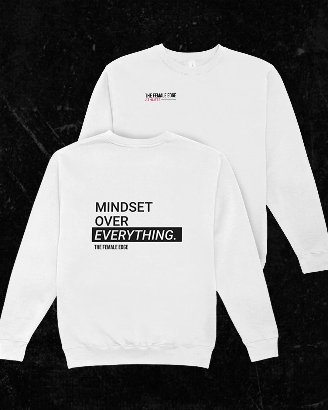
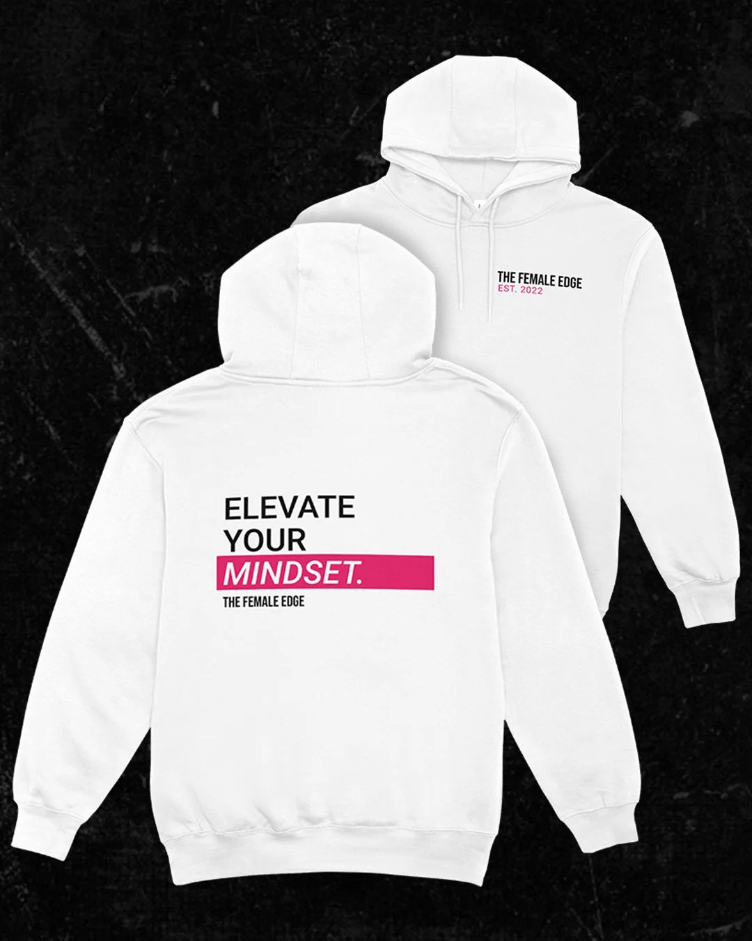
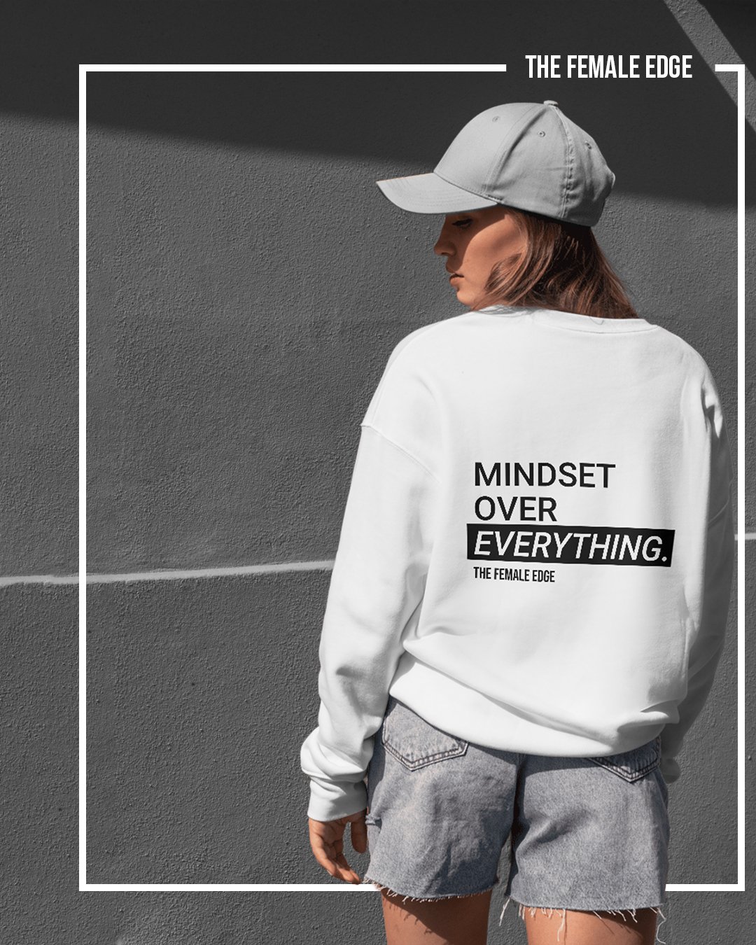
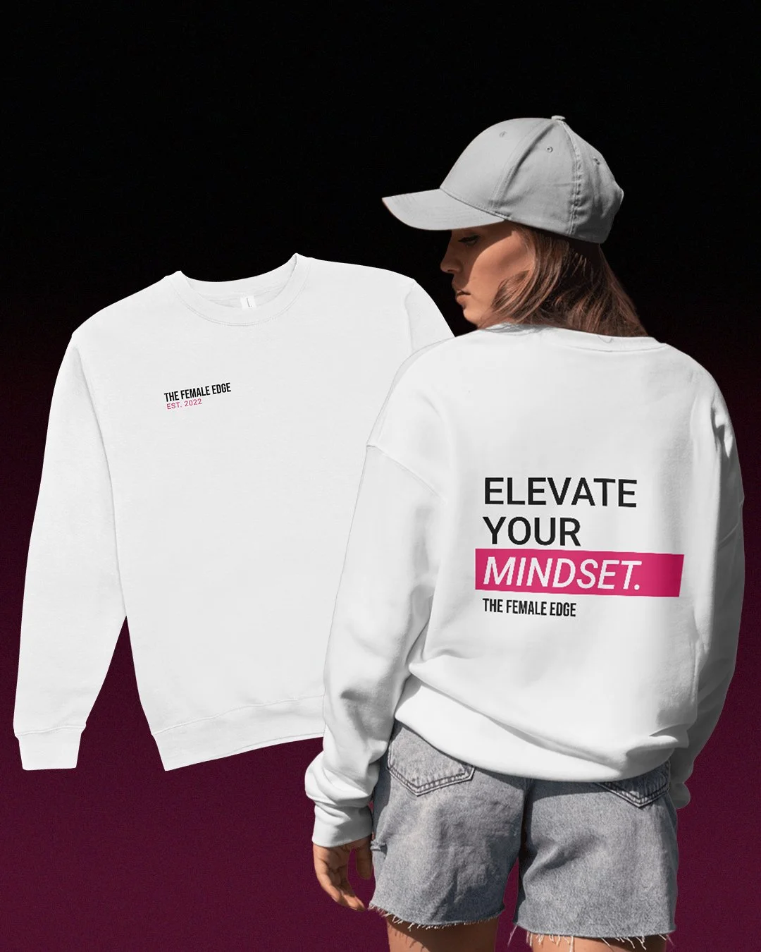
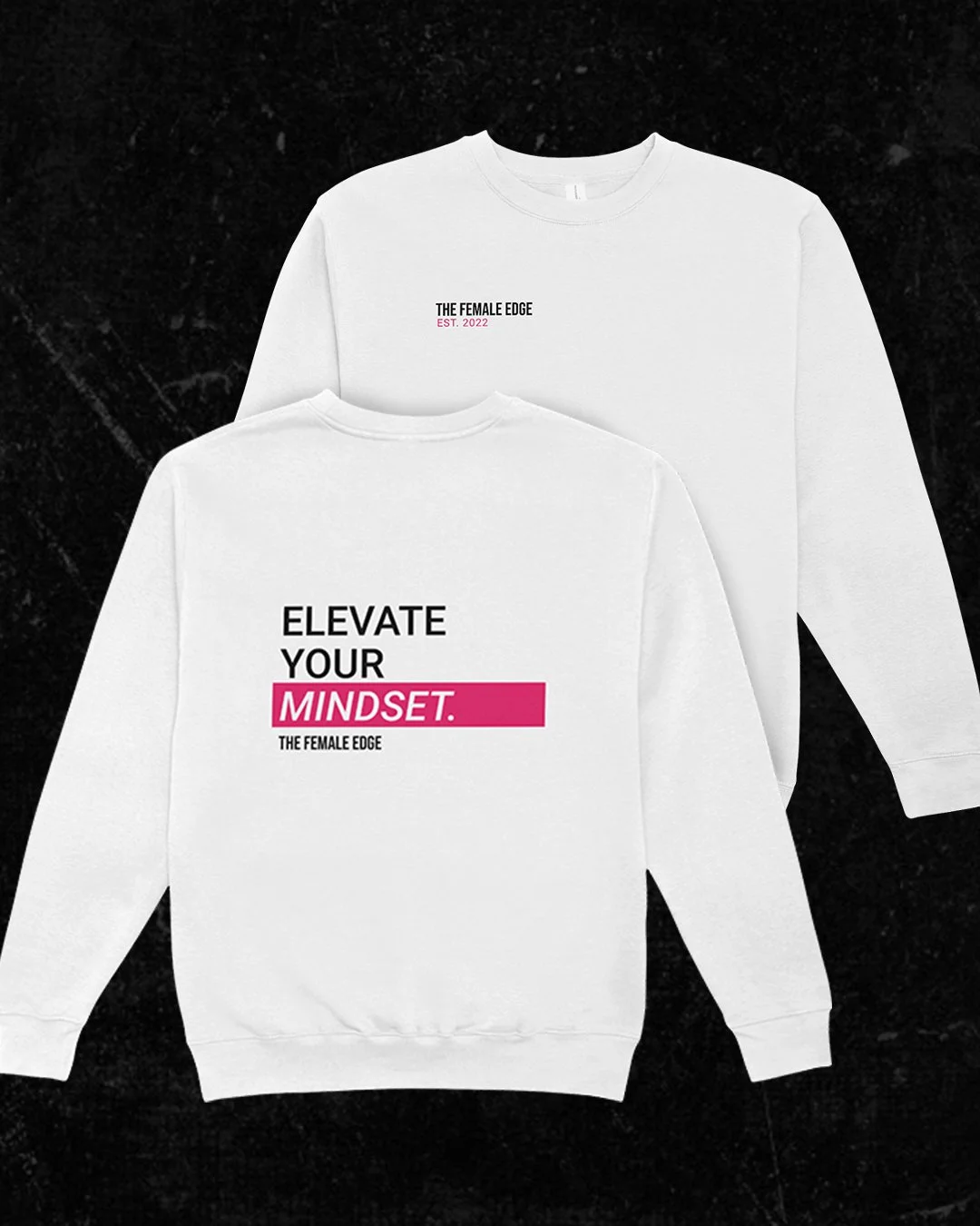
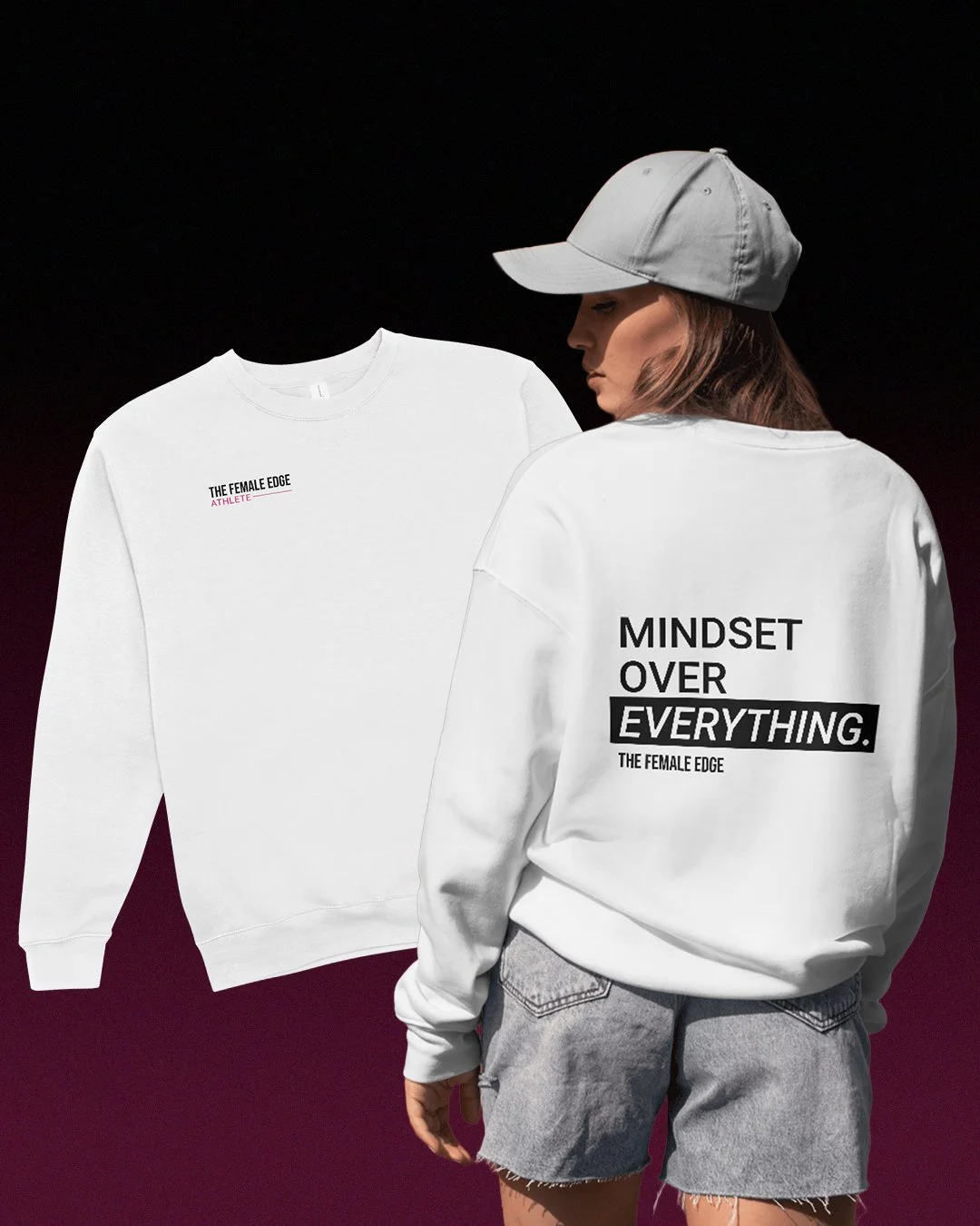
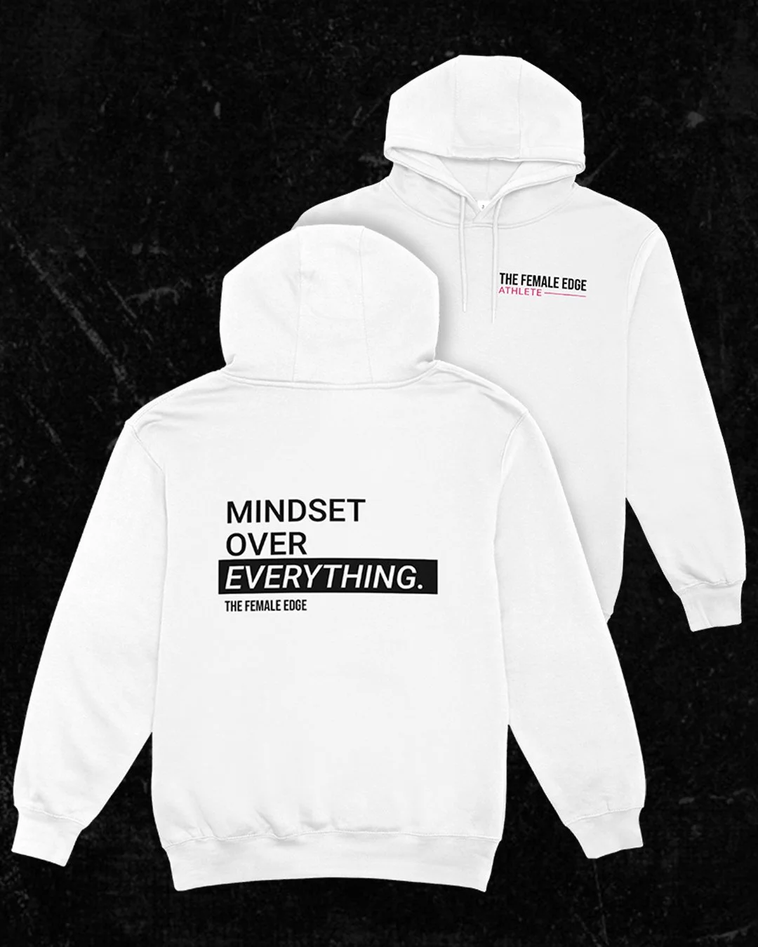
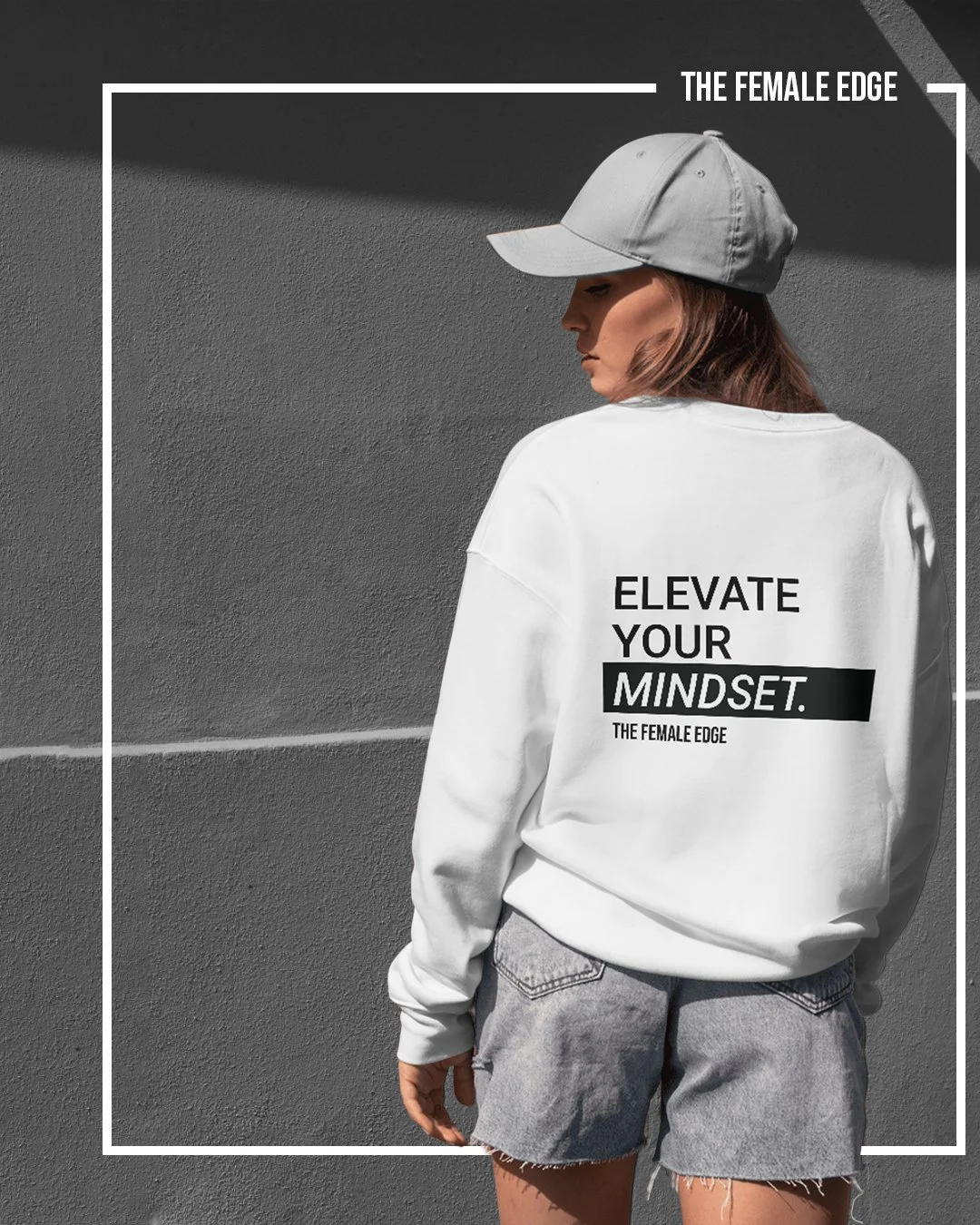
Phase 4: Merchandise Design
The Female Edge team also wanted branded merchandise that reflected their mindset-driven identity.
I designed two sweatshirt concepts — clean, modern, and on-brand:
Back designs: “MINDSET OVER EVERYTHING.” and “ELEVATE YOUR MINDSET.”
Front designs: “The Female Edge Athlete” and “The Female Edge Est. 2022.”
These pieces allowed new athletes to feel connected to the brand, and the client especially loved the idea of gifting the sweatshirts to new signees.
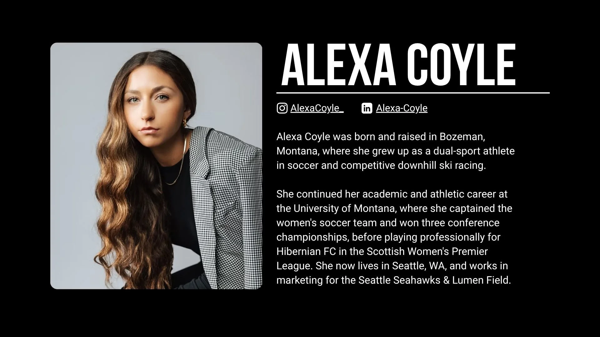
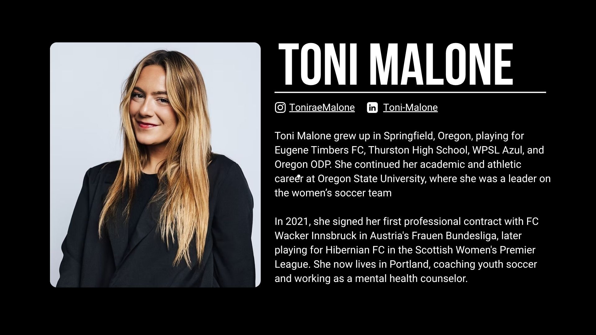
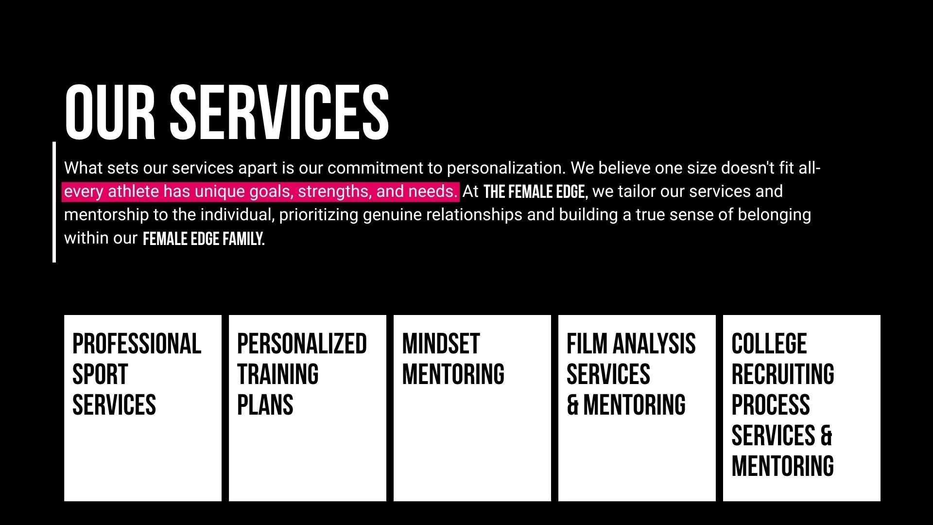
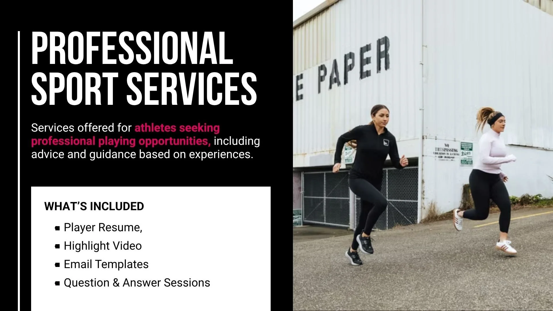
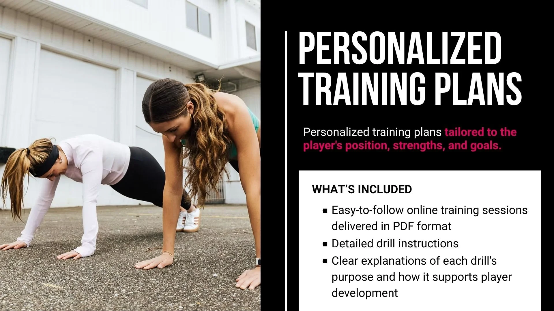
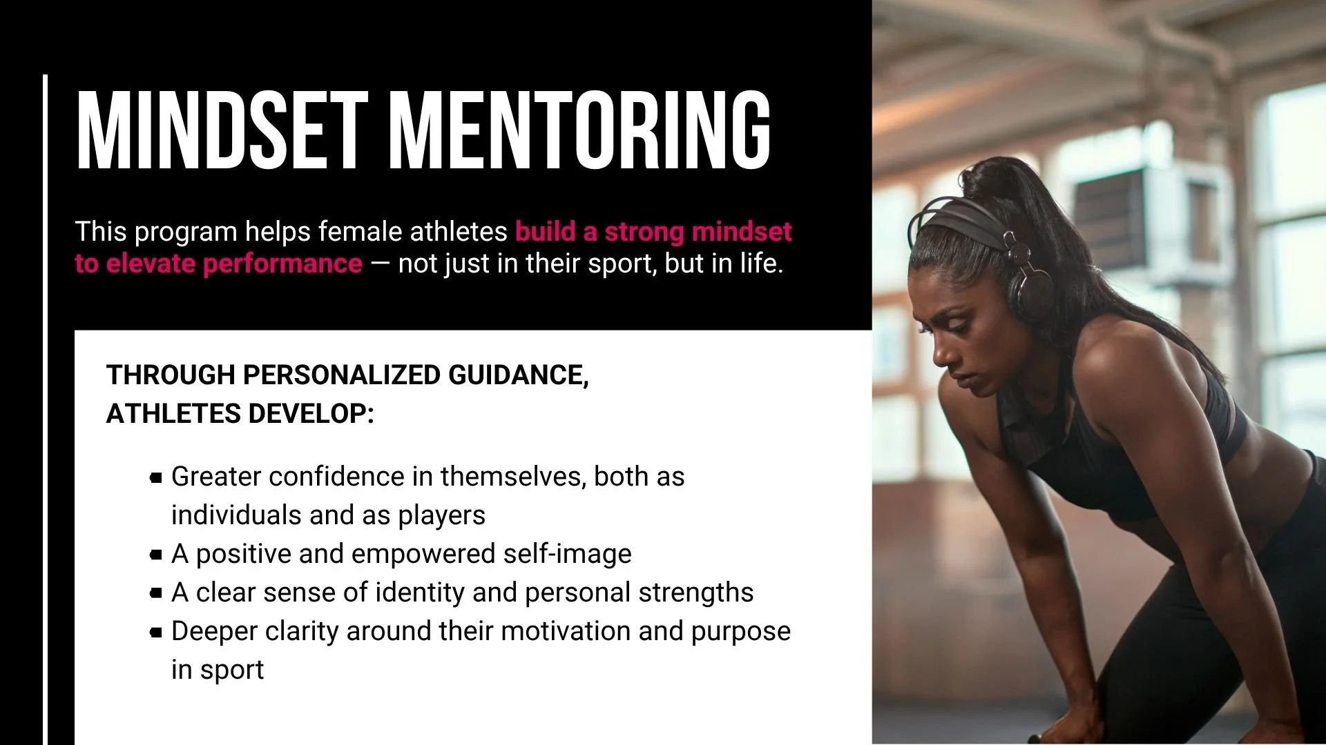
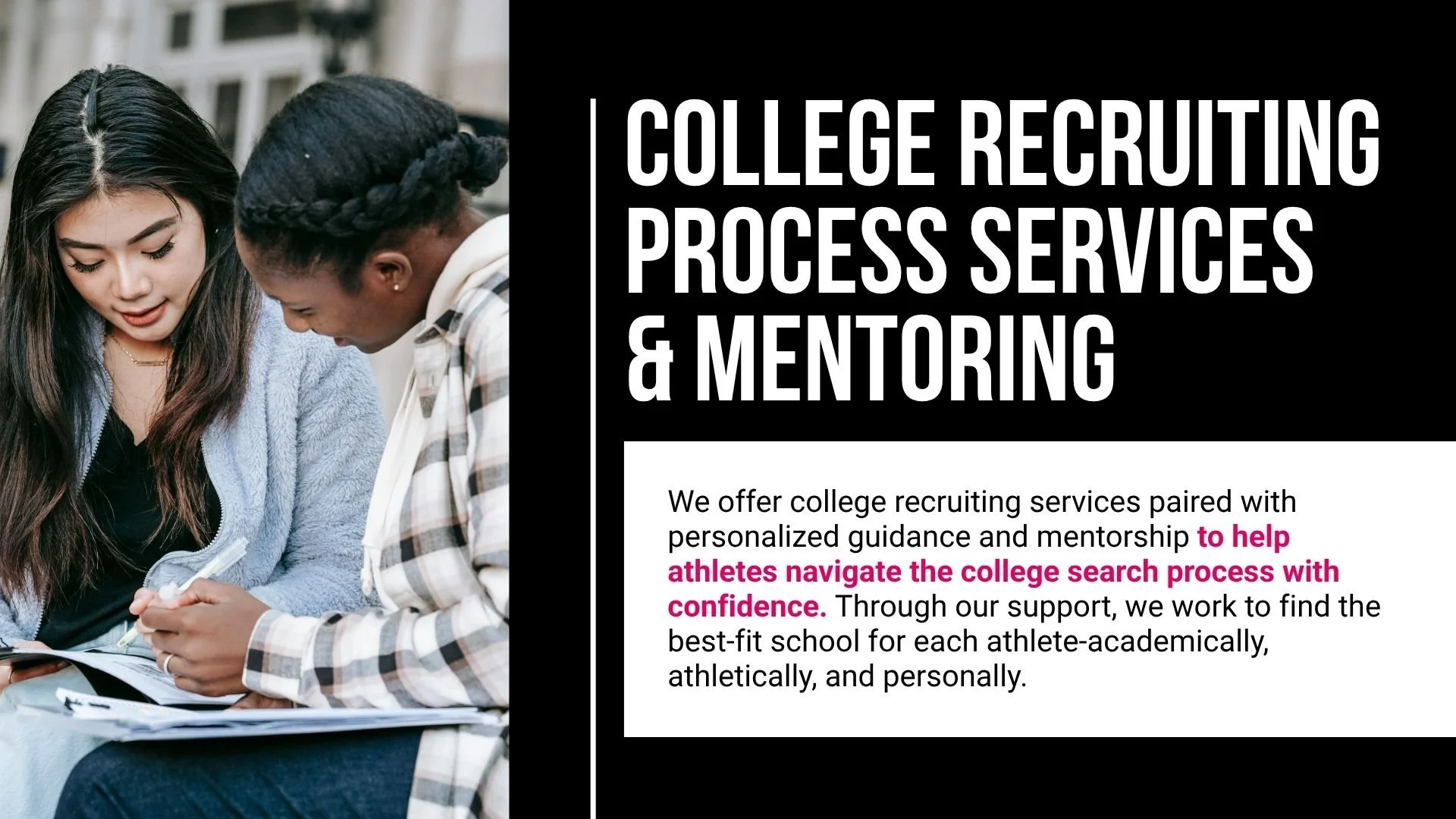
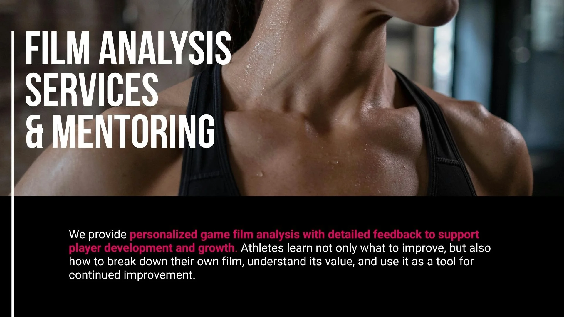
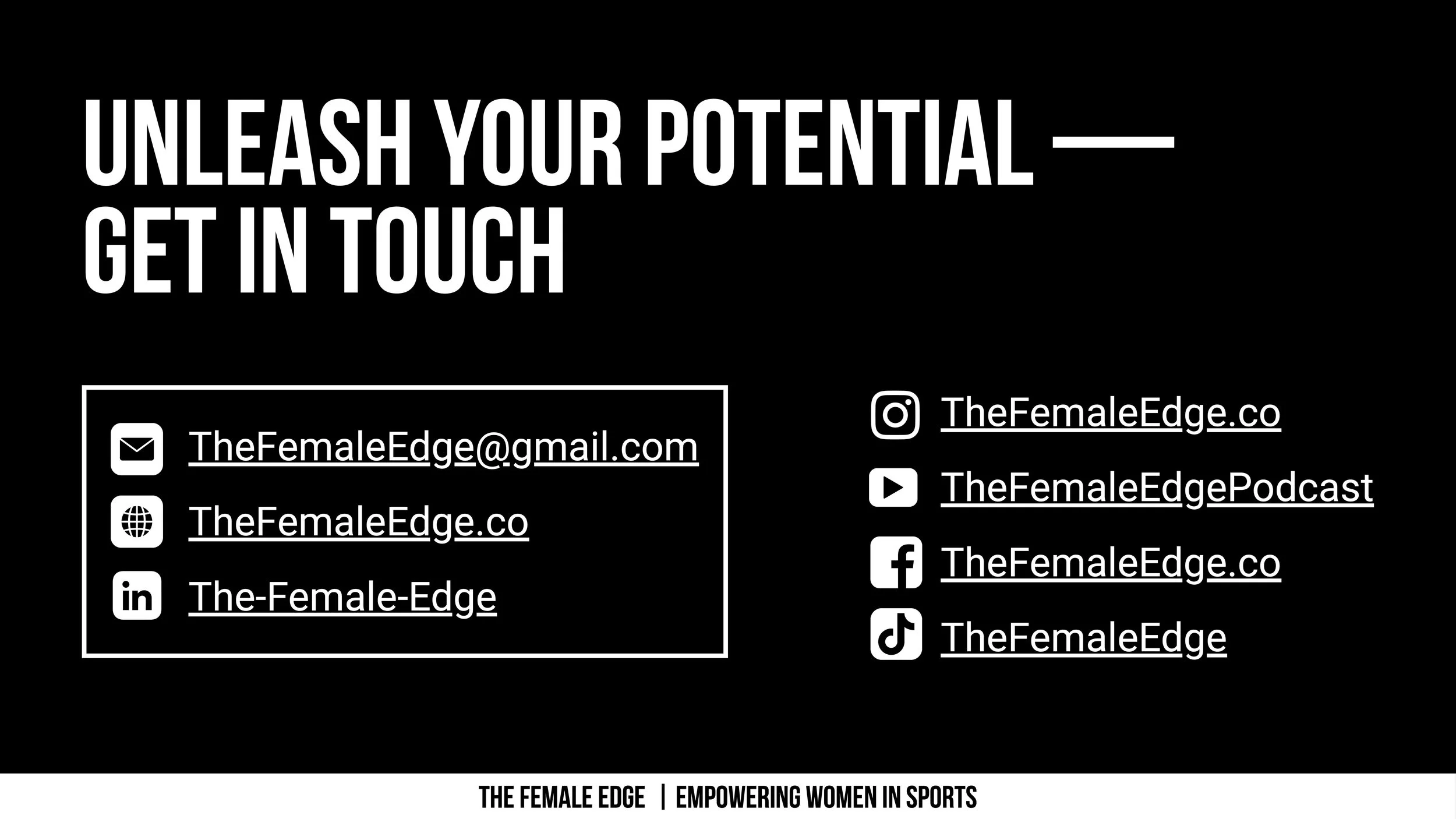
Phase 5: Slide Deck
Finally, I designed a presentation deck the client could send to potential partners. The deck introduced the brand, outlined their services, and reinforced their mission with a polished, professional look consistent with the rest of the system.
The completed projects tied the brand together across every touchpoint — from social media to merch. The result was a bold, unified identity that maintained The Female Edge’s strong personality while offering easy-to-use tools for consistent, elevated content..