ANNUAL REPORT
QUINN CENTER
Design a printed Annual Report for the Quinn Center highlighting its programs, services, and fiscal-year impact. The piece would be distributed at the organization’s annual gala and needed to feel elevated in celebration of its 15th anniversary.
THE PROJECT
CREATIVE DIRECTION
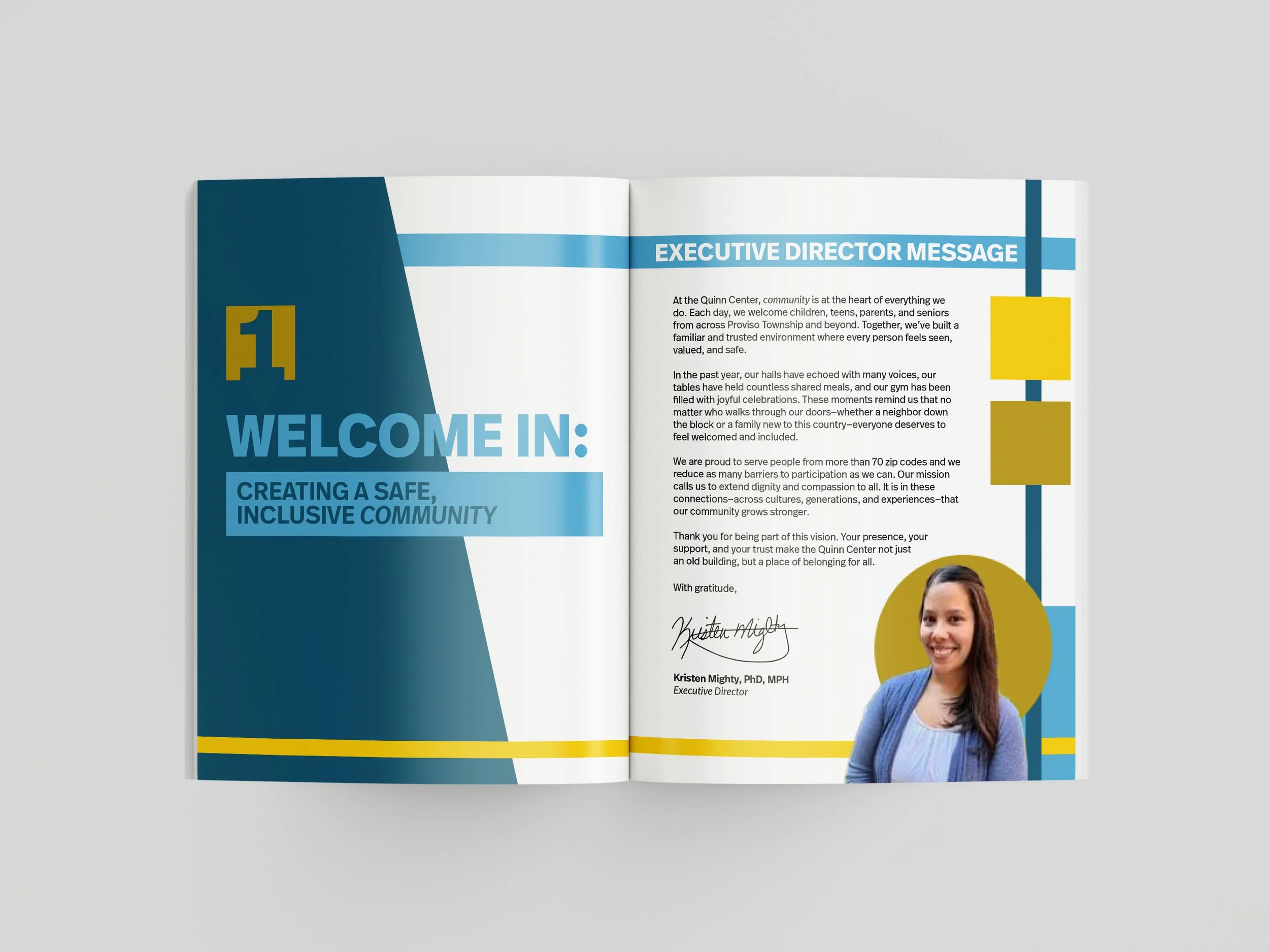
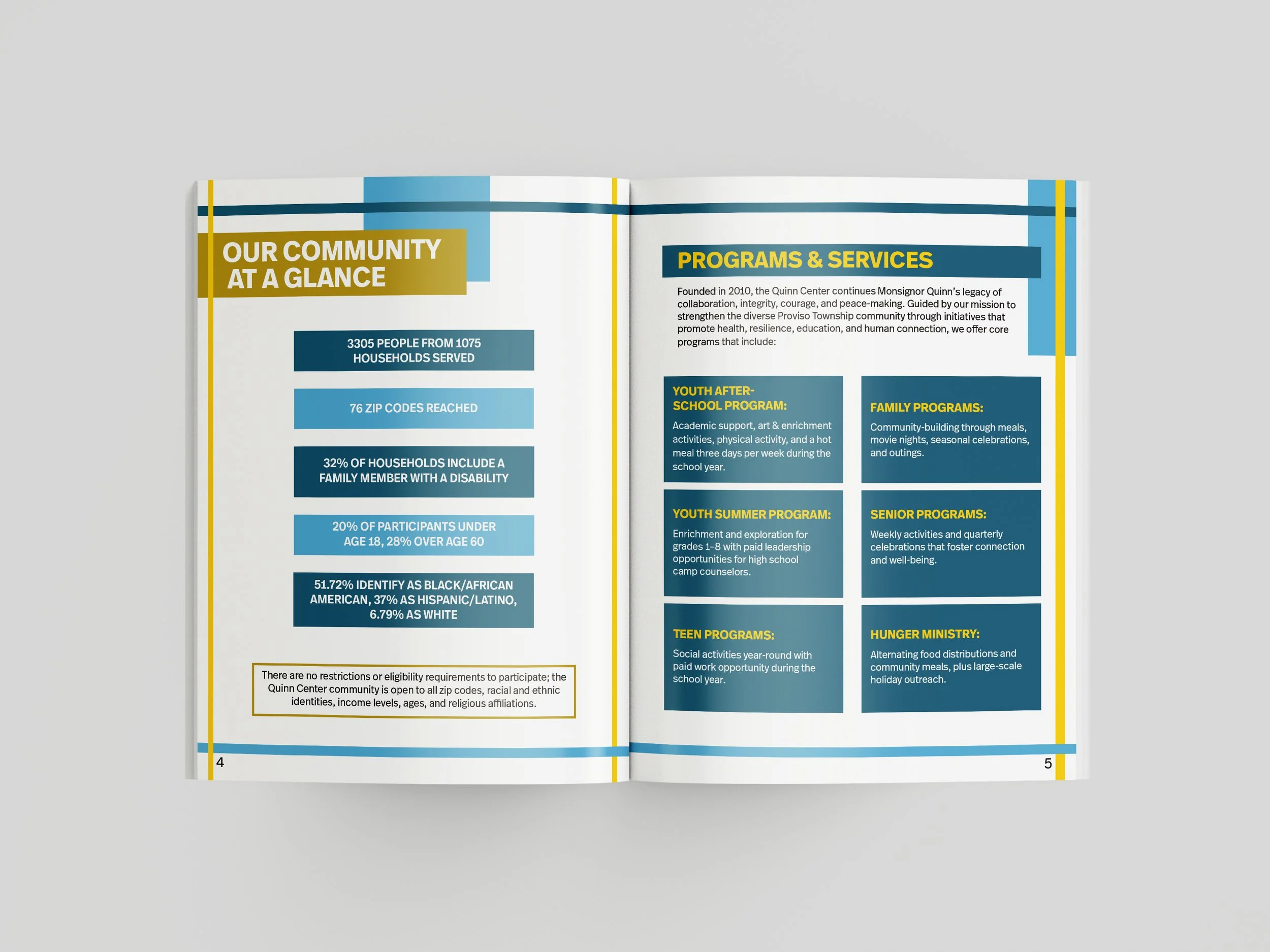
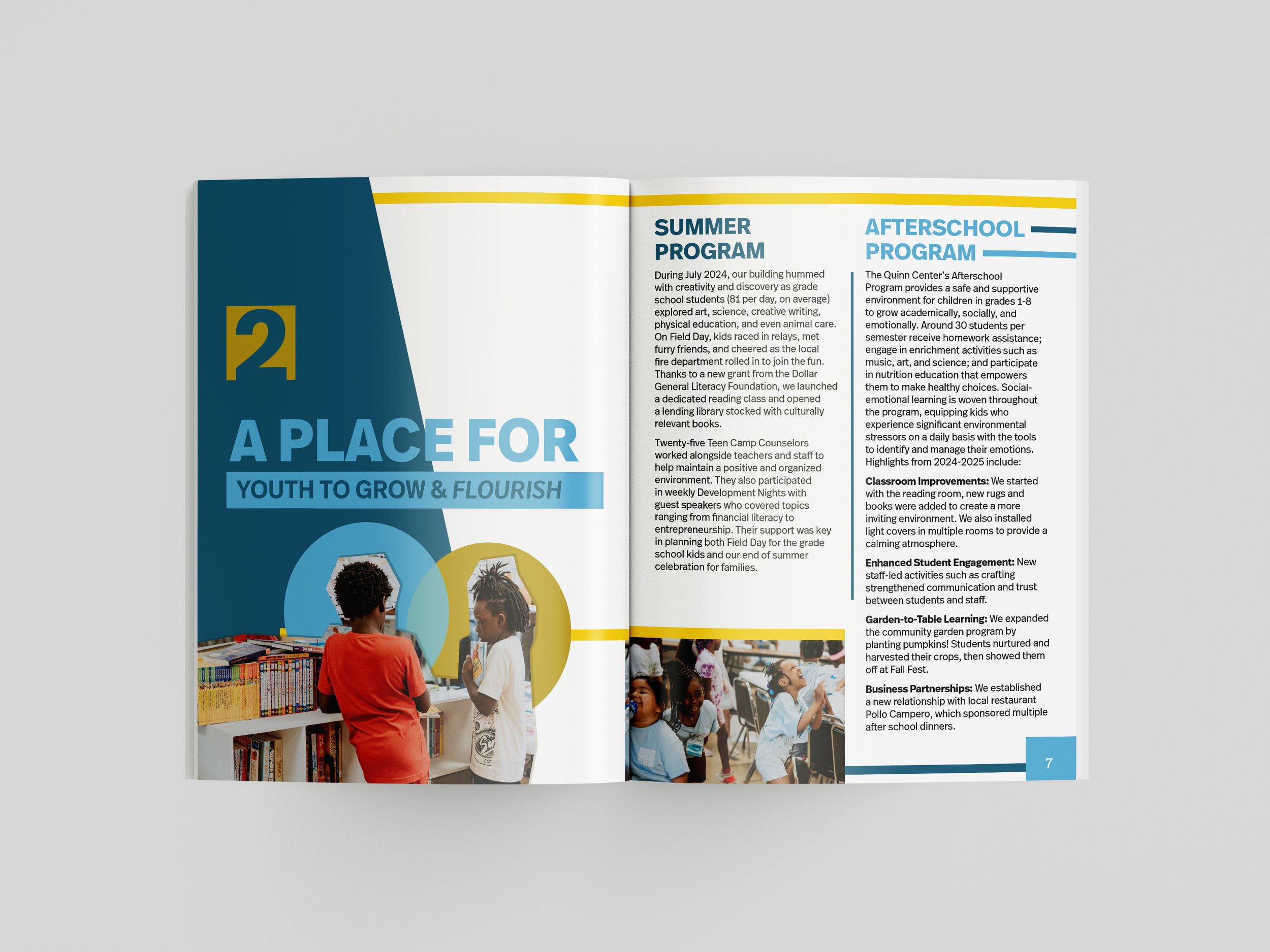
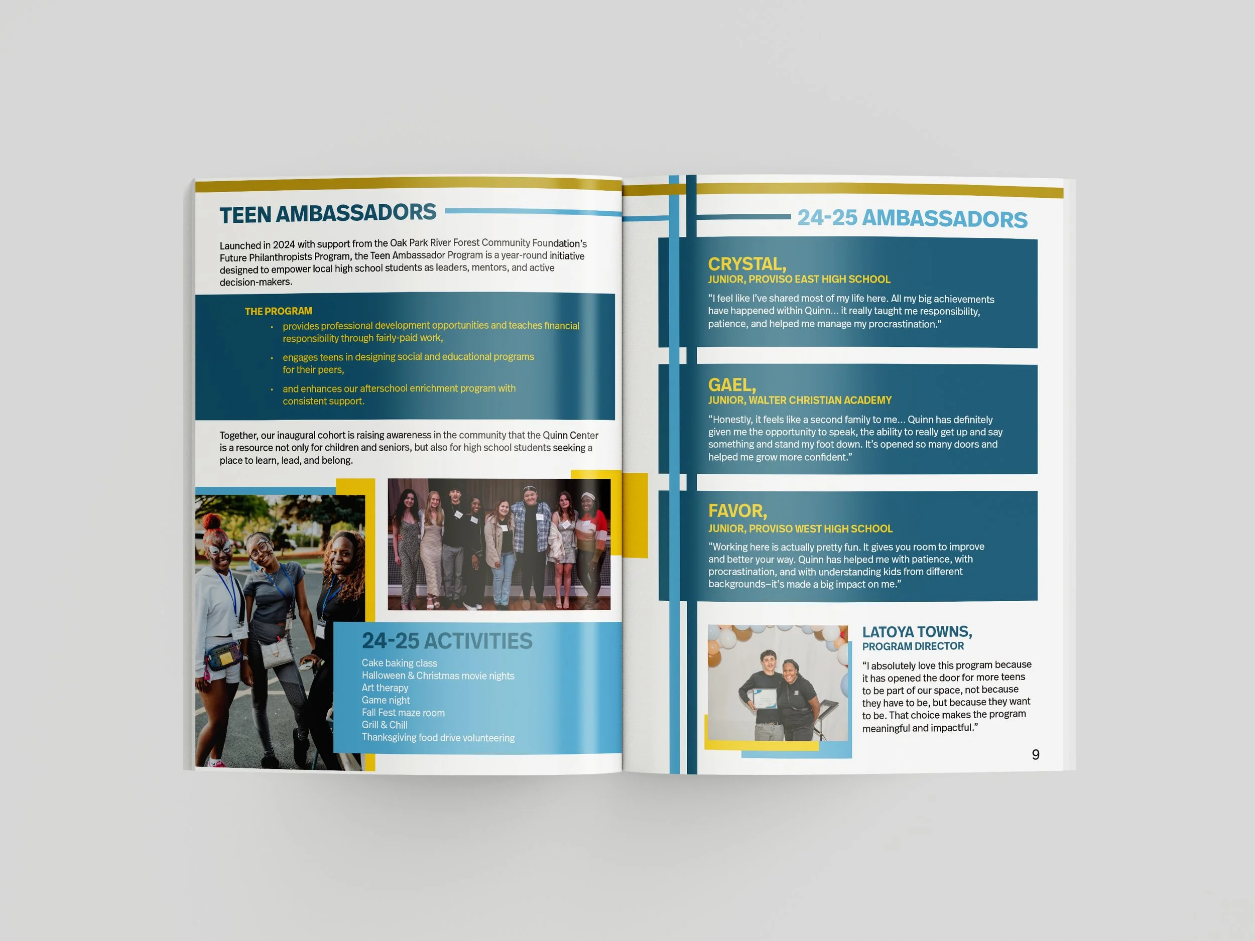
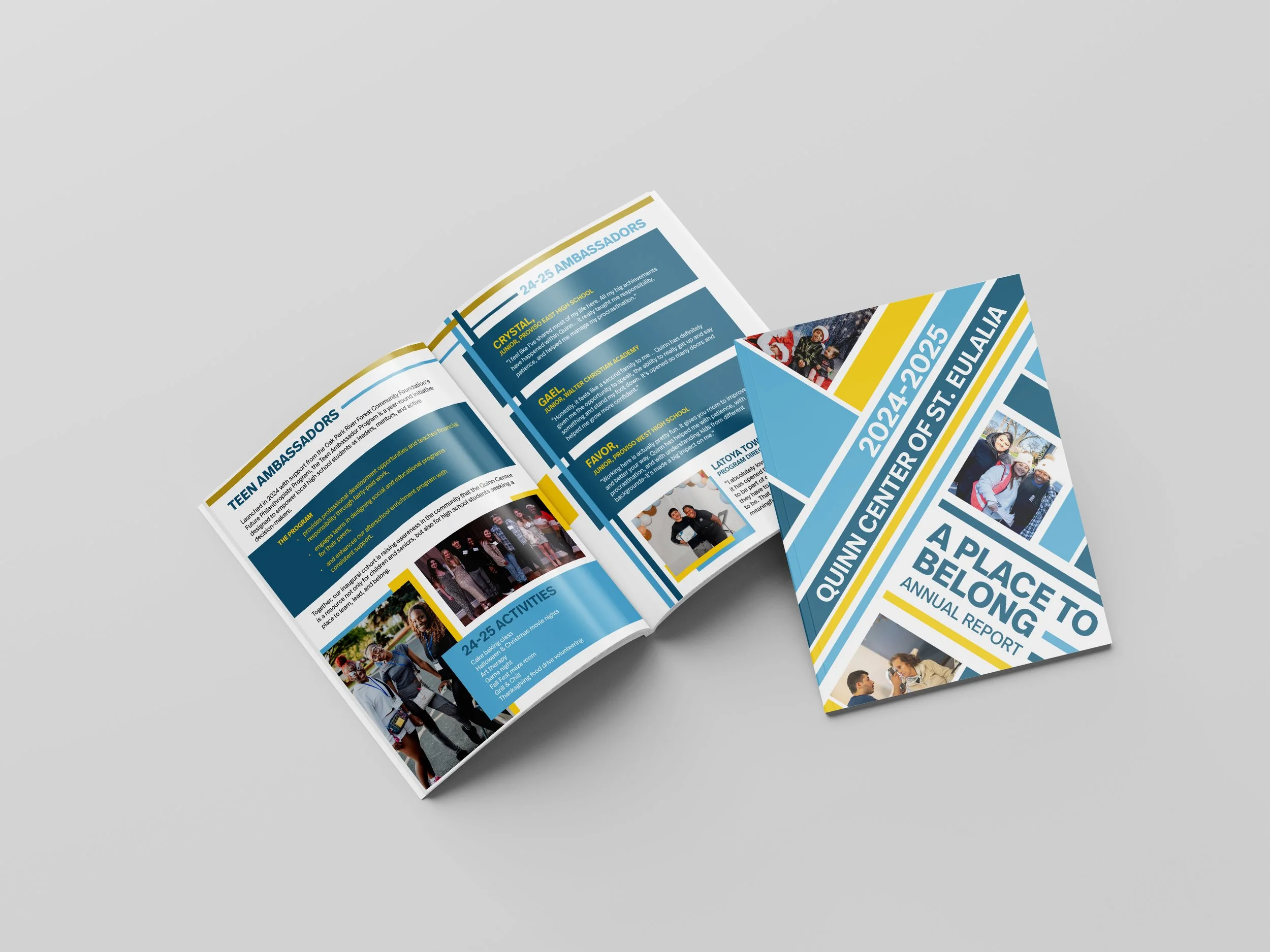
The client requested a branded report inspired by Bauhaus design—bold typography, strong geometric structure, and intentional color—while maintaining generous white space for clarity and accessibility. With a significant portion of the audience being older adults, readability and ease of navigation were essential.
The challenge
Previous reports averaged 12 pages, and the client initially hoped to maintain that length. However, this year, the content was substantially heavier. Balancing dense copy, accessibility considerations, and the desired Bauhaus-inspired aesthetic within a tight page count required strategic layout decisions.
The Solution
To ensure the strongest possible outcome, I presented two first-round concepts:
A refined 12-page version that maximized structure and hierarchy within a tighter format.
An expanded version that allowed for increased white space, improved readability, and more breathing room for imagery and design elements.
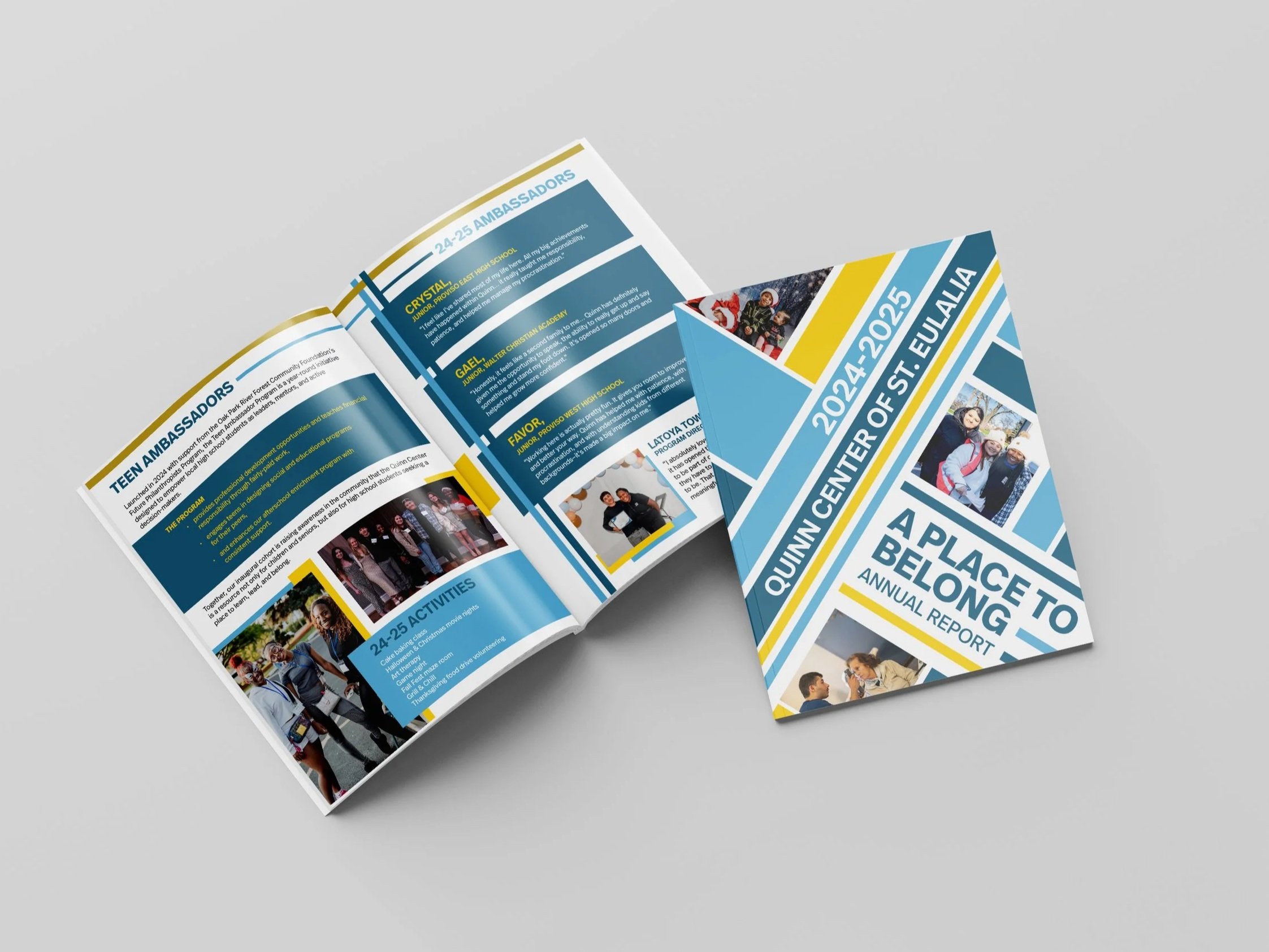
Draft of 12-page version
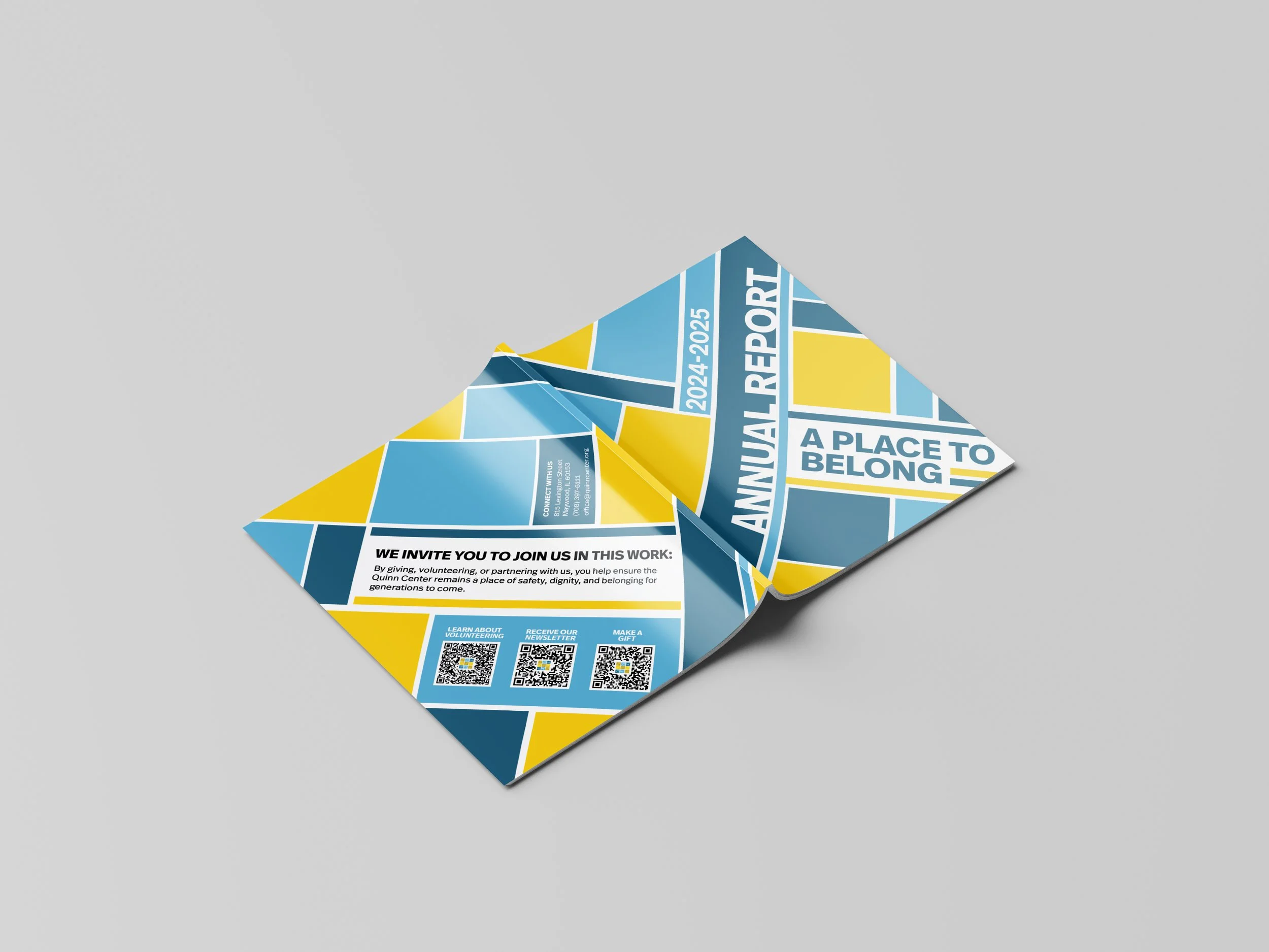
Outcome
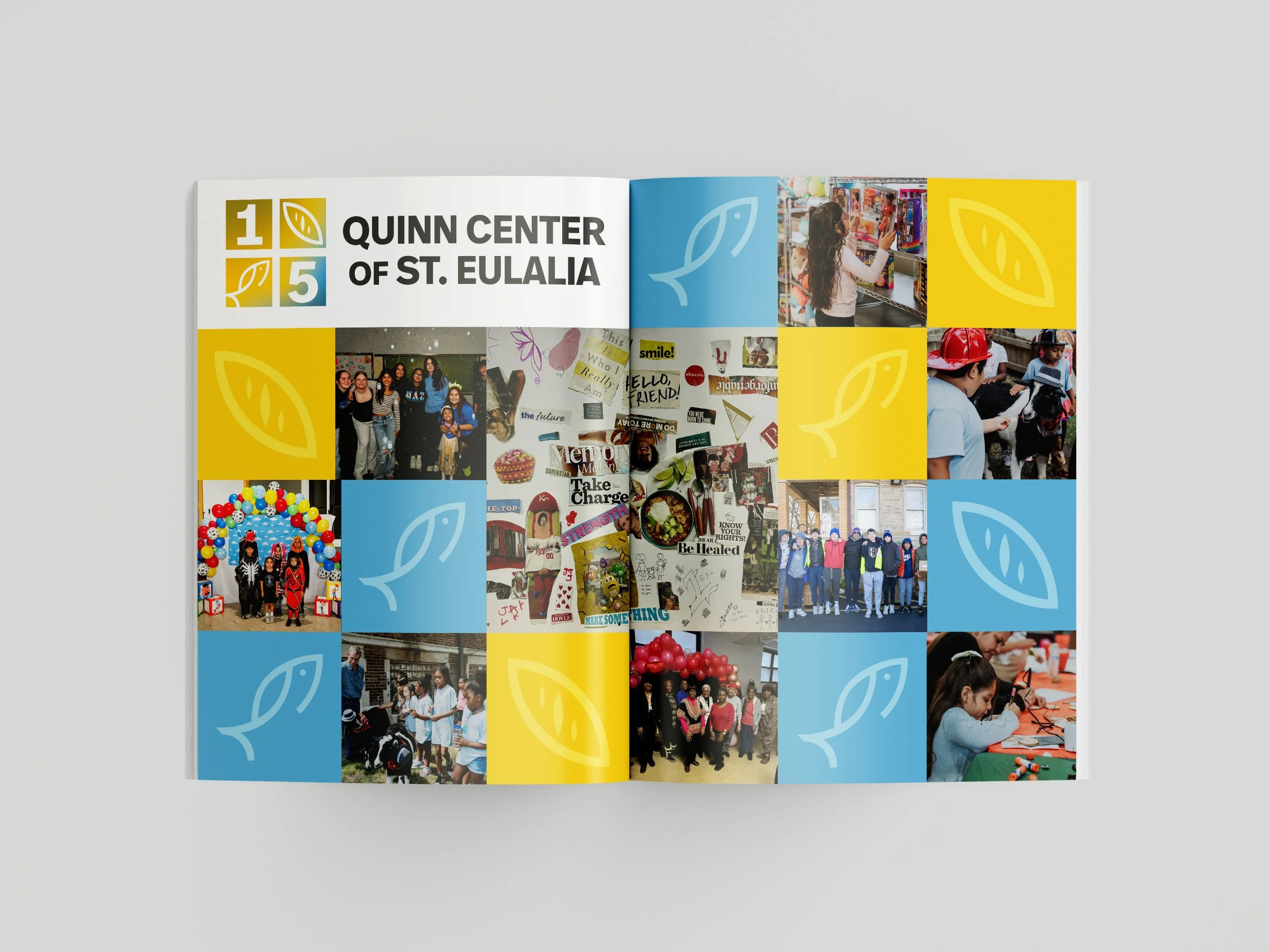
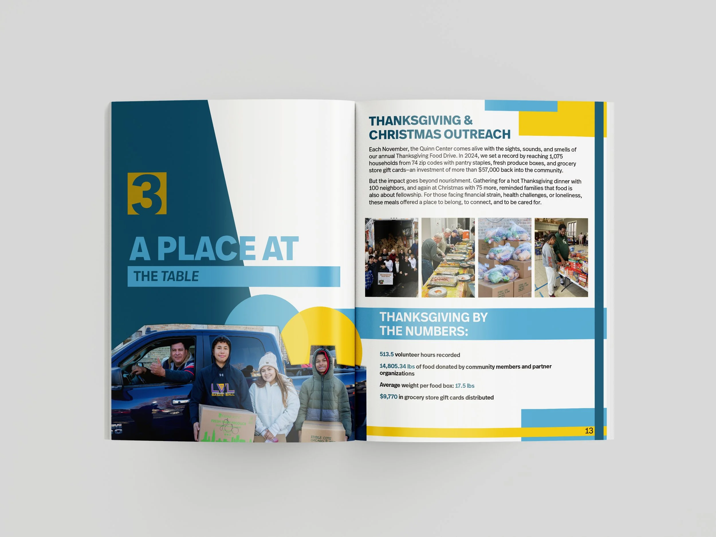
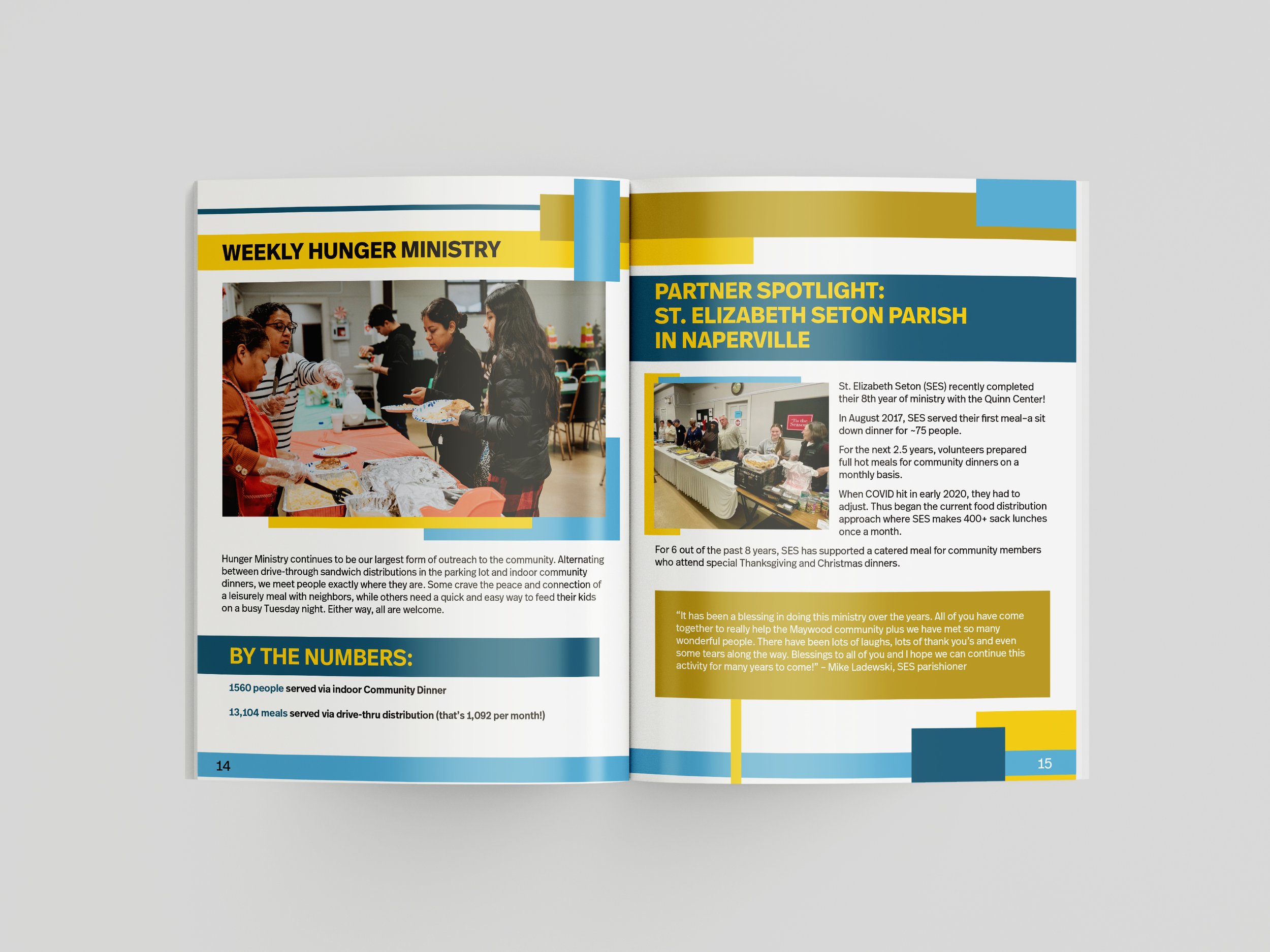
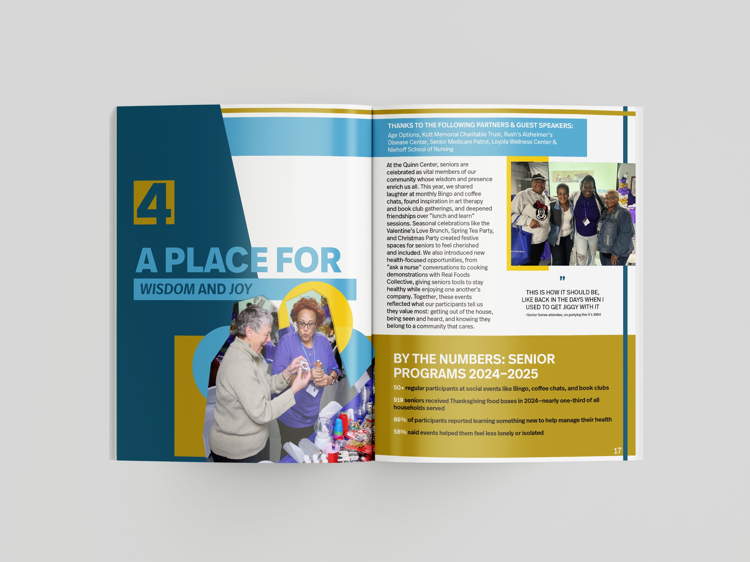
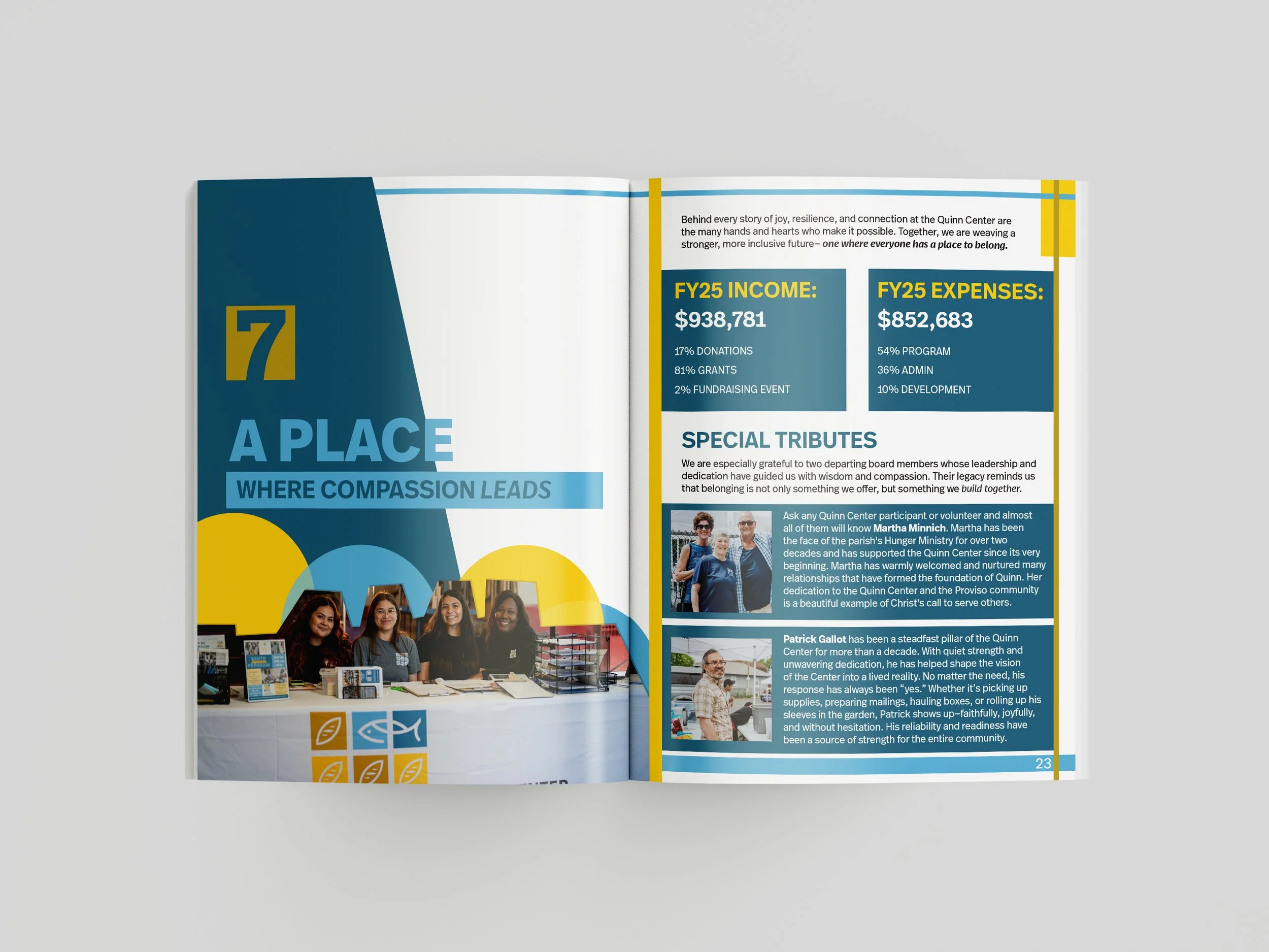
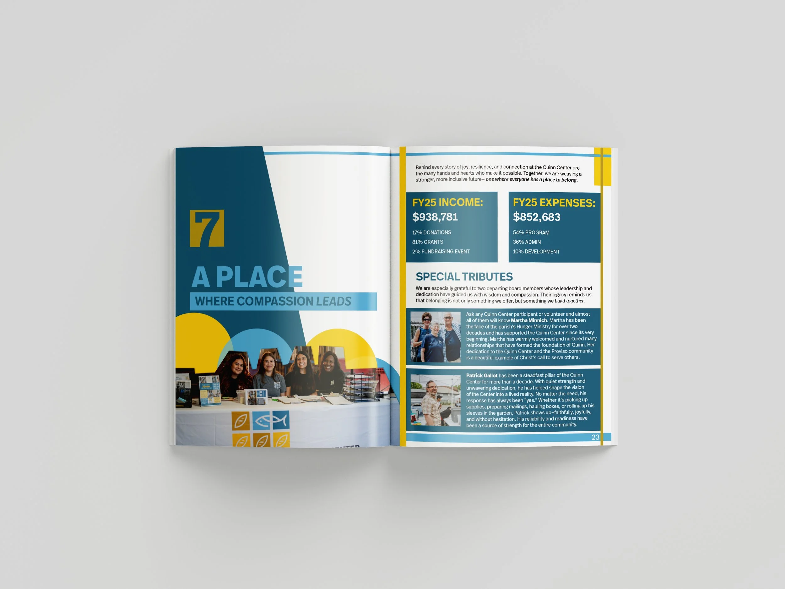
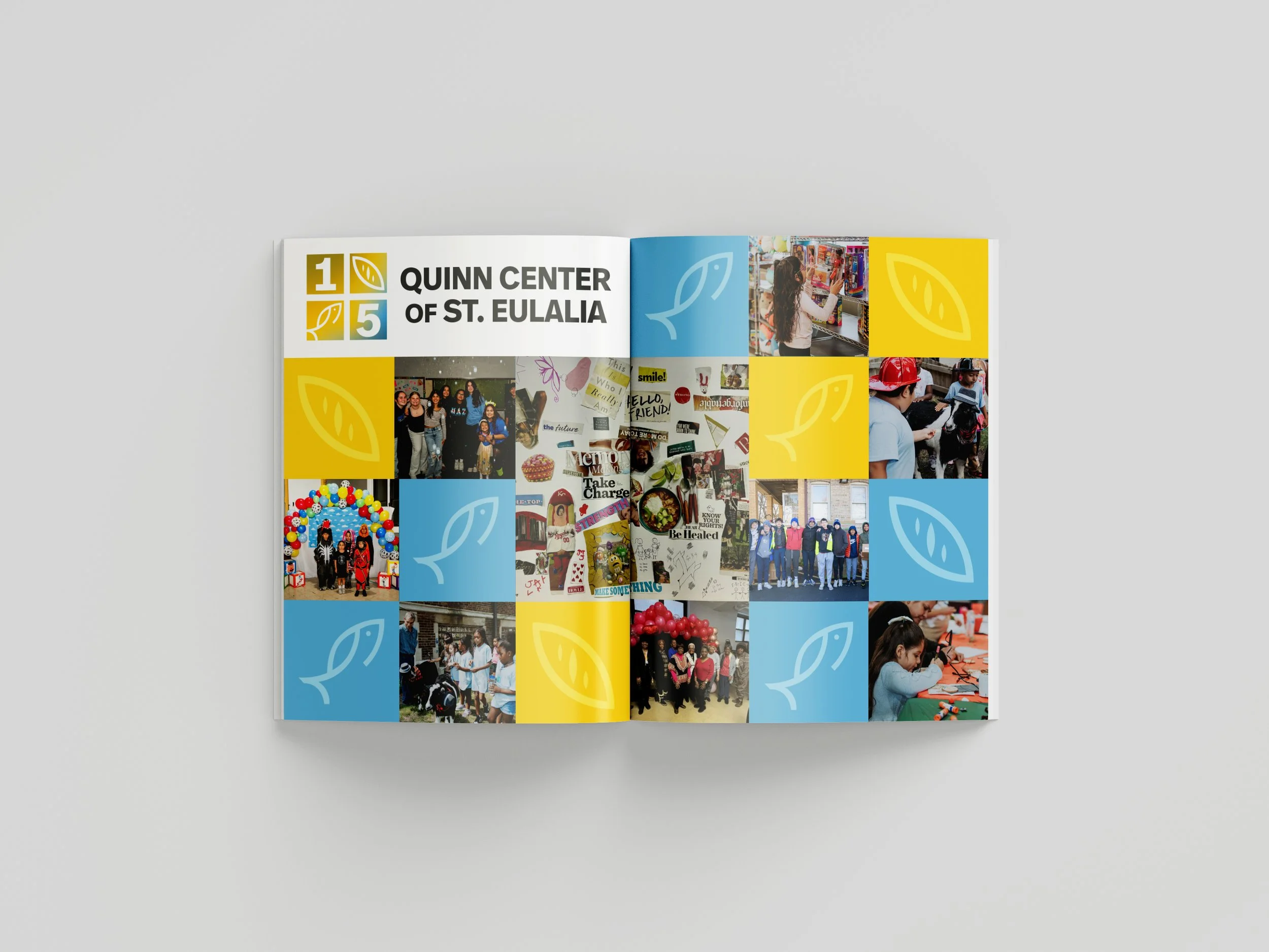
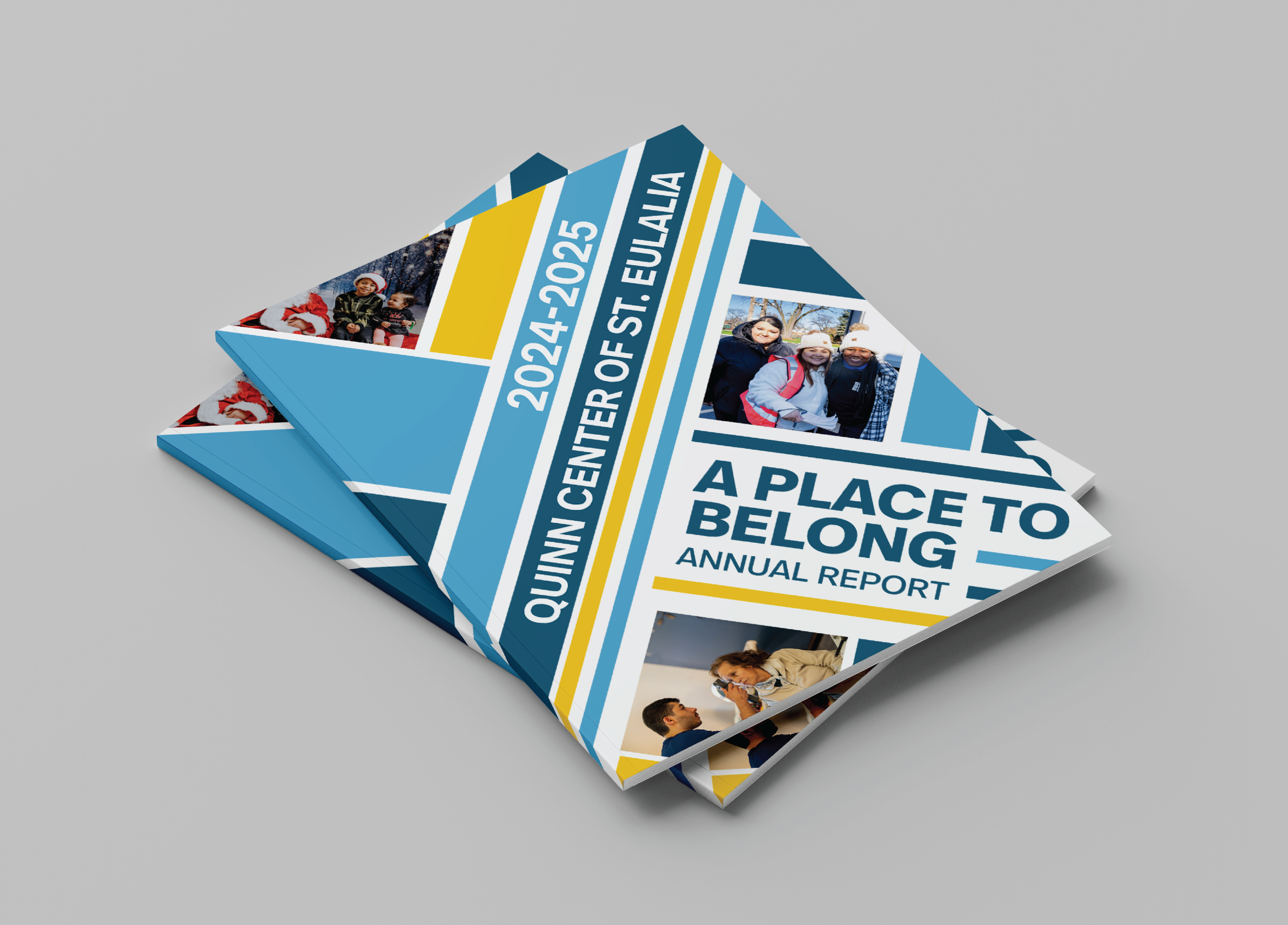
The client chose the extended version for its clarity and impact, allowing additional white space and imagery to highlight the Quinn Center’s 15-year milestone. Each section features a bold header and contextual image, with Bauhaus-inspired grids, color blocks, and typography guiding the design. Generous spacing ensures readability and accessibility, transforming dense information into a polished, engaging report that balances celebration with structure and makes key content easy to navigate.